- Home
- :
- All Communities
- :
- Products
- :
- ArcGIS Web AppBuilder
- :
- ArcGIS Web AppBuilder Ideas
- :
- Increase Graph/Infographic Capabilities in WAB and...
- Subscribe to RSS Feed
- Mark as New
- Mark as Read
- Bookmark
- Follow this Idea
- Printer Friendly Page
- Report Inappropriate Content
Increase Graph/Infographic Capabilities in WAB and Dashboard
- Mark as New
- Bookmark
- Subscribe
- Mute
- Subscribe to RSS Feed
- Permalink
- Report Inappropriate Content
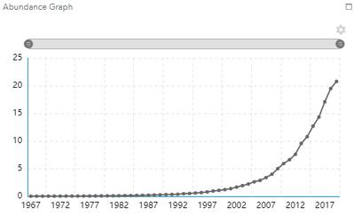
Recently, a project I have been working on a WAB (Dashboard theme) which has required a series of filters to pull out one layer of polygons onto a map. My stakeholders have requested a graph showing 50 years worth of data to correspond with each filter selection. The issue is, WAB reads in the data for a graph in a very nonsensical way. As of right now, the way I have the data designed has each year as its own field (as seen in picture) . This is to reduce the size of the data/ increase rendering speed. The graph from this data structure is also pictured.
As you can see, I accomplished my goal; however, my stakeholders want there to be multiple lines on this graph: 1 representing the median (as shown) and 2 more representing the Upper and Lower Confidence Levels. This is when this data structure breaks down. I have attempted several data restructurings to have this graph display properly including: creating 2 more fields per year (1 to represent upper and 1 to represent lower). This "failed" because there is was now way to tell the WAB infographic widget which values go with each line. Another approach was to create a field called "ValueType" with three different values (median, upper, and lower) and increasing the number of records in the table by a power of 3. This method failed because I could not get the graph to put the years on the x-axis AND group the values into each line. Finally, I attempted restructure the data by not putting each year as a field and simply creating one field called "Year" and creating fields for each value type (median, upper, and lower).This created an original issue where the data was too large to be drawn (over 2 million records).
**Note: I also attempted all of these data structures in Dashboard and Dashboard Beta to no success because the dashboard was unable to draw the size of my data.
The data structure needed to create a graph in WAB is not intuitive nor does it match how most data is structured.
The way I think about it, there are three possible solutions to this problem: 1) allow the graph to be pulled from a related table and allow the filters to act on the related table. 2) Adjust how the graph can read in data. 3) Increase the size of data which the Dashboard/(Beta) can draw and manage.
**Note: I worked with Esri Tech support through these issues and these were the conclusions.
You must be a registered user to add a comment. If you've already registered, sign in. Otherwise, register and sign in.

