- Home
- :
- All Communities
- :
- Products
- :
- ArcGIS StoryMaps
- :
- ArcGIS StoryMaps Ideas
- :
- Remove "zoom to" in story map popup
- Subscribe to RSS Feed
- Mark as New
- Mark as Read
- Bookmark
- Follow this Idea
- Printer Friendly Page
- Report Inappropriate Content
Remove "zoom to" in story map popup
- Mark as New
- Bookmark
- Subscribe
- Mute
- Subscribe to RSS Feed
- Permalink
- Report Inappropriate Content
Hi,
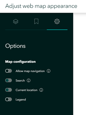
I have made a story map and for one of the web maps it is very important that it people cannot zoom in or navigate in the map. I have therefore set these settings in the story map:
But in the popups you can still see the "zoom to" button and zoom in to objects, so that map navigation is possible after all. It is important that the map only can be seen at a city level, not closer. How can I remove the "zoom to" function from the popup?
The popups in the story map are also quite wide and cover more than the popups in the original web map, is there a way to configure story map popups more?
Thanks in advance.
- Mark as Read
- Mark as New
- Bookmark
- Permalink
- Report Inappropriate Content
I'm sorry I can't offer any help, but I can commiserate. I am dealing with the exact same issue. The popups are too large, too much white space, and the 'zoom to' option makes the popup even larger, is sometimes on top and sometimes on the bottom (it does not look good when it's on top), and we don't need it.
- Mark as Read
- Mark as New
- Bookmark
- Permalink
- Report Inappropriate Content
Thanks for the feedback. We do have some pop-up improvements in our pipeline and I'll add these notes to what we're considering.
We're not currently doing anything different to the pop-ups, so I'm not sure what you both mean about how the pop-ups are larger or cover more area than they do in the original web map. Could you share some screenshots of what you are seeing so we can better understand?
- Mark as Read
- Mark as New
- Bookmark
- Permalink
- Report Inappropriate Content
Thanks for your response. Can't show our content, so my images will be a little constrained.
The popups in the Story Maps seem large, with a lot of white space. I think what is adding to it are a couple of elements that are not wanted, but I can't get rid of:
The 'docking option' ('x' is helpful, of course):
And the 'Zoom To' option, which seems to add a full space underneath your text, then adds the icon.
Another issue is that the 'Zoom To' is sometimes on top and sometimes on the bottom. It looks MUCH better when it's on the bottom, because it at least balances with the 'docking' icon on top. When they're both on top, it looks awkward. Since the user gets both options, it creates an inconsistent look as you select different features.
Appreciate the chance to provide feedback. The story maps are amazing, which is why we are using them :). Just nitpicking a bit...
Thank you,
Randy McGregor
- Mark as Read
- Mark as New
- Bookmark
- Permalink
- Report Inappropriate Content
Thanks for the additional feedback (and the kudos!), @RandyMcGregor3.
Right now, we're using the standard pop-ups that come along with the ArcGIS mapping APIs. To adjust some of these things you've mentioned, we'll have to take a look at designing our own custom pop-up just for StoryMaps. It's possible and we've discussed it in the past, but it's not trivial so it will take us some time. But I do see how these things are impacting your story, so we do understand how this improvement would bring value to your story.
I'll convert this thread to an idea so others can upvote it and add their comments as well.
- Mark as Read
- Mark as New
- Bookmark
- Permalink
- Report Inappropriate Content
You must be a registered user to add a comment. If you've already registered, sign in. Otherwise, register and sign in.


