- Home
- :
- All Communities
- :
- Products
- :
- ArcGIS StoryMaps
- :
- ArcGIS StoryMaps Ideas
- :
- StoryMaps- Build a Custom Theme from an Existing E...
- Subscribe to RSS Feed
- Mark as New
- Mark as Read
- Bookmark
- Follow this Idea
- Printer Friendly Page
- Report Inappropriate Content
StoryMaps- Build a Custom Theme from an Existing Esri Theme
- Mark as New
- Bookmark
- Subscribe
- Mute
- Subscribe to RSS Feed
- Permalink
- Report Inappropriate Content
Hi ArcGIS StoryMaps Team,
For those organizations who would like to use an existing theme but tweak it, It would be great to have the option to edit an existing Esri theme (versus starting blank and having to rebuild everything).

Just an idea that we'd really appreciate 🙂
Thanks,
Amanda
- Mark as Read
- Mark as New
- Bookmark
- Permalink
- Report Inappropriate Content
Hi @Amanda__Huber -- We did do a basic design for how it would work to create a new theme from one of the core themes, but we have't prioritized building it yet since we hadn't (until now 🙂 ) gotten any requests for this. Also, we figured the main thing authors might want to do if they like one of the core themes is add their own logo, and that is already available in the Design panel.
We do plan to add this feature at some point, but it is currently a lower priority. However, we'll monitor this idea to see how many votes it gets to see how much demand there is for this!
- Mark as Read
- Mark as New
- Bookmark
- Permalink
- Report Inappropriate Content
Great idea!
This is also on my list.
A first step can be, the documentation of the configuration of the basic themes.
Thanks Jaap
- Mark as Read
- Mark as New
- Bookmark
- Permalink
- Report Inappropriate Content
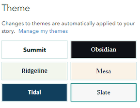
@Amanda__Huber @JaapSmit -- In our update last week we documented the colors and fonts for all the provided themes so you can more easily mimic them in your own custom theme.
See the table in this help topic: Set a theme—ArcGIS StoryMaps | Documentation
- Mark as Read
- Mark as New
- Bookmark
- Permalink
- Report Inappropriate Content
@OwenGeo amazing!
Thank you so much 🙂
- Mark as Read
- Mark as New
- Bookmark
- Permalink
- Report Inappropriate Content
@OwenGeo Thank you very much!
I see, you published the settings of:
Colors | Story header and footer Story background Accent colors |
Typography (font and color) | Title and headings Paragraph text Caption text |
Question
Can you also publish the following elements?
Buttons | Style and color |
Quotes | Style, color, and alignment |
Links | Style and color |
Separators | Style, color, and position |
Thanks, Jaap
- Mark as Read
- Mark as New
- Bookmark
- Permalink
- Report Inappropriate Content
@JaapSmit -- Fonts and colors are not easy to determine by looking at them, so that's why we included those in the doc.
We don't plan to add the styles to the doc since they are easily recognizable and there are only a small number of options for each, but here they are for reference...
| Theme | Button style | Quote style | Link style | Separator style |
| Summit | 1 | 1 | 1 | 1, left |
| Obsidian | 3 | 1 | 1 | 1, left |
| Ridgeline | 2 | 1 | 1 | 1, left |
| Mesa | 1 | 1 | 1 | 1, left |
| Tidal | 1 | 3, left | 1 | 3, center |
| Slate | 1 | 2, left | 1 | 2, full width |
The color of each element is the accent color, which is already documented for each standard theme (and is the default option in theme builder).
You must be a registered user to add a comment. If you've already registered, sign in. Otherwise, register and sign in.