- Home
- :
- All Communities
- :
- Developers
- :
- ArcGIS Pro SDK
- :
- ArcGIS Pro SDK Questions
- :
- ArcGIS Pro tab control
- Subscribe to RSS Feed
- Mark Topic as New
- Mark Topic as Read
- Float this Topic for Current User
- Bookmark
- Subscribe
- Mute
- Printer Friendly Page
ArcGIS Pro tab control

- Mark as New
- Bookmark
- Subscribe
- Mute
- Subscribe to RSS Feed
- Permalink
Hi Max,
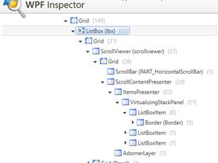
I had the same task few months ago. As I know there is no style exposed to public, but you can make it by yourself. This is a listbox with separators and horizontal items placement. You can find some solutions on the internet. After you can tune your solution using WPF inspector or Snoop which lets you to look inside wpf based application UI. You can find font information, triggers and other useful information.
It would be nice to have exposed to public that listbox style for future compatibility.
- Mark as New
- Bookmark
- Subscribe
- Mute
- Subscribe to RSS Feed
- Permalink
Hi Gintautas,
Yes, I've inspected standard controls to see what styles ESRI use, but I hoped they expose this stuff for developers. Also I believe that should be TabControl with custom style instead of just ListBox with buttons with changing of main area on their clicks.
Anyway thank you!
Max
- Mark as New
- Bookmark
- Subscribe
- Mute
- Subscribe to RSS Feed
- Permalink
Yes, I've implemented tab switchers as ListBox with custom items to mimic native ArcGIS Pro control. I hope Pro team will add this and other their controls to API.
- Mark as New
- Bookmark
- Subscribe
- Mute
- Subscribe to RSS Feed
- Permalink
As I recall there was an old sample on github that had a pane with the listbox panel selector code in it. Here is a link to the old file that had that code, you could try checking out that old branch and seeing it for yourself. I adapted that sample with some changes for my own controls and it did the trick.
- Mark as New
- Bookmark
- Subscribe
- Mute
- Subscribe to RSS Feed
- Permalink
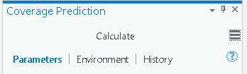
With the ArcGIS Pro 2.2 release (to be released soon), a new ListBox style will be available that can be used to create the text items with the separators in between. You will be able to use this to get the same UI design as the Catalog pane in Pro.

- Mark as New
- Bookmark
- Subscribe
- Mute
- Subscribe to RSS Feed
- Permalink
Hi Uma,
I am testing ArcGIS Pro 2.3 Beta and new style does not work on it. It worked fine In previous version (2.2) Are changes in using new Esri_ListBoxPanelIndicator style?
- Mark as New
- Bookmark
- Subscribe
- Mute
- Subscribe to RSS Feed
- Permalink
Hi,
The appearance for the tab control and the indicator has changed. When you run the Custom Catalog sample with 2.3, it looks like this (below) - which is different from 2.2. I made no code changes to the 2.2 sample, just ran it in 2.3 to see this. What do you see? Any errors?
