Turn on suggestions
Auto-suggest helps you quickly narrow down your search results by suggesting possible matches as you type.
Cancel
- Home
- :
- All Communities
- :
- Products
- :
- ArcGIS Pro
- :
- ArcGIS Pro Questions
- :
- Summarize value for attributes and display pie cha...
Options
- Subscribe to RSS Feed
- Mark Topic as New
- Mark Topic as Read
- Float this Topic for Current User
- Bookmark
- Subscribe
- Mute
- Printer Friendly Page
Summarize value for attributes and display pie charts in map
Subscribe
552
1
10-17-2019 12:21 AM
10-17-2019
12:21 AM
- Mark as New
- Bookmark
- Subscribe
- Mute
- Subscribe to RSS Feed
- Permalink
- Report Inappropriate Content
Hi all,
I have a long list of suppliers with lat and long and what they supply in different categories. I want to show a map of all suppliers with bubbles representing total volume per geographic location and divided into the different categories, ie a pie chart instead of a normal bubble.
I can make this display in Power Bi as per below example and want to reproduce this in ArcGis Pro but cannot find a way. I keep getting multiple bubbles per geographic location.
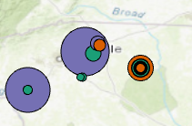
Wanted state:
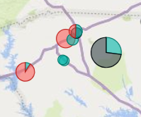
ArcGis representation:
Any ideas?
Best,
Marcus
1 Reply
11-10-2019
06:28 AM
- Mark as New
- Bookmark
- Subscribe
- Mute
- Subscribe to RSS Feed
- Permalink
- Report Inappropriate Content
Chart symbology is coming to ArcGIS Pro 2.5 in January.