- Home
- :
- All Communities
- :
- Products
- :
- ArcGIS Pro
- :
- ArcGIS Pro Questions
- :
- Re: How to keep label font sizes consistent betwee...
- Subscribe to RSS Feed
- Mark Topic as New
- Mark Topic as Read
- Float this Topic for Current User
- Bookmark
- Subscribe
- Mute
- Printer Friendly Page
How to keep label font sizes consistent between Layout View and Data View?
- Mark as New
- Bookmark
- Subscribe
- Mute
- Subscribe to RSS Feed
- Permalink
- Report Inappropriate Content
I am new to ArcGIS and am doing an online course. For a part in one of my assignments, I need to make a map and label counties with their respective names. I find that if I set an appropriate font size in my labels to make them legible in data view, they are much smaller when I look at my map in layout view. I can up the font size in layout view, however I want to have a consistent font size between data and layout view. Otherwise, the font becomes huge in data view.
Also, my layout view extent is based on the extent in the data view so I don't understand why there is a difference in sizes.
- Mark as New
- Bookmark
- Subscribe
- Mute
- Subscribe to RSS Feed
- Permalink
- Report Inappropriate Content
Matt,
If you're concerned about label sizes, I would stick with worrying about them only in layout view since this is what will matter when the map is printed (or exported).
The extents may be the same but you have to also consider the the 'viewer' sees, like if your layout view is at 100% or not (I hope that makes sense - I would include a screenshot but do not have Pro in front of me right now).
- Mark as New
- Bookmark
- Subscribe
- Mute
- Subscribe to RSS Feed
- Permalink
- Report Inappropriate Content
Thanks for your reply Adrian.
I ended up sticking with the layout view label sizes. Interestingly, I found a similar post here Symbol size in data v layout view that explains the same issue. I was just concerned about someone having to go poking around in data view and being met with different label sizes.
It strictly appears to just be some ArcGIS quirk. Labels in data view at font size of 16 are equivalent to labels in layout view that are up around size 40. The viewer can zoom in on the labels in layout view or data view and the labels won't resize themselves or anything, so I think it just has to do with label sizes appearing different in data view vs layout view for whatever reason.
https://www.arcgis.com/home/item.html?id=bc1a2fa0f277450e8ad5c9b7e5a75844
Here's a link to the map if you want to look around just to see what I mean.
- Mark as New
- Bookmark
- Subscribe
- Mute
- Subscribe to RSS Feed
- Permalink
- Report Inappropriate Content
Matt,
This seems to be expected behavior. I downloaded your data but I am not seeing all of the labels show up, so I'm not sure if I am seeing what I'm supposed to be seeing.
At 100% in layout view, this is how it looks:
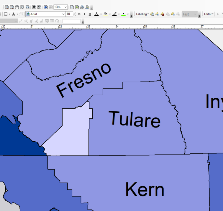
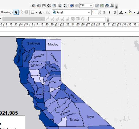
The way I saw it when I brought it in initially was like this (at 19% viewing):
When I look at the data view, initially the labels are not coming up (not sure if this is related to joined tables or not):

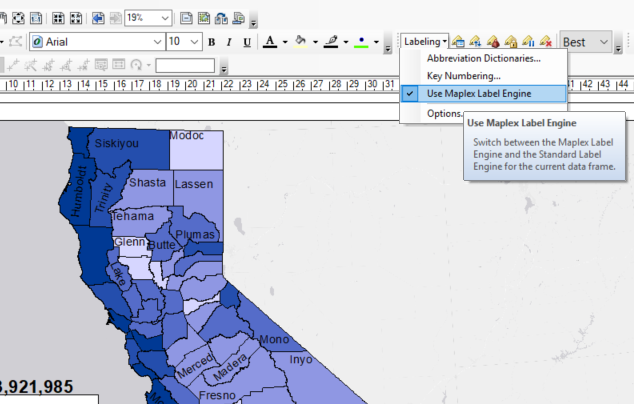
Turning on the Maplex Label Engine with "best" placement quality on labels, data view gave me this:
Maplex Label Engine with "best" in layout view (at 19%) shows this:
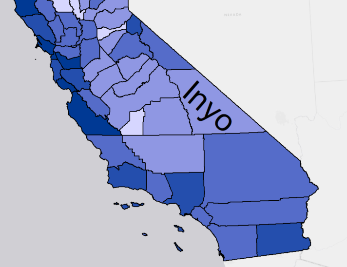
Zooming in on data view shows this:
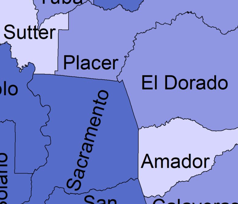
Anyways, this, to me, is expected behavior. Quirk or not, this is normal.
A few things to take note of. Of the 58 counties in California, you apparently have over 23,000 features representing the same thing. This making the database huge and very slow. This is likely the reason why I didn't see all the labels (this could also be a factor of sharing a map package, I'm not sure without see the original data). I would suggest redoing this feature class and have it only contain 58 features, unless for some reason, you need more than that.
I am not sure if this is helpful or not but that's what I could determine.
- Mark as New
- Bookmark
- Subscribe
- Mute
- Subscribe to RSS Feed
- Permalink
- Report Inappropriate Content
Thanks for taking the time to check the map out. I should have mentioned this, but the reason some labels appear and others don't is because of my label placement properties. I have it set to where they only show if they fit within the feature. It made the labels look far less cluttered. Interesting how one of the labels shows up with the maplex setting in data view, but with the default settings none of the labels are small enough to be considered within the feature.
Anyway, knowing about the label placement properties now, I think you can see what I mean in the pictures. In layout view, the labels are small enough to fit within the feature, so more counties are labeled. When switching to data view, however, the labels become much bigger and all of them become far too big to display within the feature, so none of the counties are labeled. To me that looks like an inconsistency. I guess it is not a big deal though.
The other real problem to me though is like you mentioned with the 23,000 features. It makes the thing so sluggish to work on. That's something that'll require me to rethink how to make this map. I have a lot of repetitive features with just a couple of different attributes for each, and that is the voting values ("yes" votes and total votes) in the precincts layer. I used a spatial join between the precincts and county layer. Initially I did a one-to-one join but that did not get all of the votes, it only got one precinct's voting results. I then did a one-to-many join and that made duplicate records for each county times the number of precincts in the respective county. The only difference then between each record for a county was the value for yes votes and total votes, and that was based off the voting results in the according precinct. After that, I was able to use the summary statistics tool to sum up the voting results for each county and make new tables containing the sums. It worked very well, but it does make the map file size way too large.
I don't think I'm explaining this totally right, I'm still working on wrapping my brain around it. I will look at the map again later.