- Home
- :
- All Communities
- :
- Products
- :
- ArcGIS Pro
- :
- ArcGIS Pro Questions
- :
- Re: Analysis of Plant-disease spread/distribution ...
- Subscribe to RSS Feed
- Mark Topic as New
- Mark Topic as Read
- Float this Topic for Current User
- Bookmark
- Subscribe
- Mute
- Printer Friendly Page
Analysis of Plant-disease spread/distribution in Forests
- Mark as New
- Bookmark
- Subscribe
- Mute
- Subscribe to RSS Feed
- Permalink
- Report Inappropriate Content
Hello everybody,
For my Bachelorthesis im doing a GIS-System in ArcGIS Pro showing the spread of a plant disease (Monilia) within 5 different production systems of cocoa.
For this system I first of all created 24 Polygon Layer which through a grid I shaped like to cacao-production system. Then I named each field accordingly to the provided data and imported the data of the research project into my System.
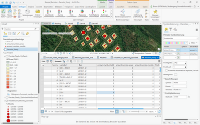
Through using the time function and Symbolisation of Dot density I am able to display each harvested cocoa pod, the healthy ones in green colour and the sick ones in red.
Using the Hot-Spot-Analysis I was able to see the hotspots of the years 2018-2019.
But more interesting is to visualize how the disease has spread within the systems.
Is there any way to map the distribution of diseases within my grid?
And afterwards I need to put this into the dependency of the productions system and evaluate if the disease is spreading more frequently/fast in for example monocultures than agroforestry systems.
Basically Im looking for ideas of how to map the spread of diseases and analyse the resistence of each tree in dependency to its production system.
Is this doable with ArcGIS Pro?
Here is a Video to my current System:
Any help and ideas are highly appreciated.
With kind regards from Germany
Bruno Göbel
- Mark as New
- Bookmark
- Subscribe
- Mute
- Subscribe to RSS Feed
- Permalink
- Report Inappropriate Content
Not my forte, but have you looked into the https://spatialstats.github.io/addin/?
- Mark as New
- Bookmark
- Subscribe
- Mute
- Subscribe to RSS Feed
- Permalink
- Report Inappropriate Content
When you map the distribution across each grid, do you wish to show it all at once? Or a distribution per time point e.g. per year? Also - just want to clarify the spatial res. terms - when you per grid, are you looking to show the density per large square area [approx. the 20 areas apps], or per small grid within each of these larger areas?
- Mark as New
- Bookmark
- Subscribe
- Mute
- Subscribe to RSS Feed
- Permalink
- Report Inappropriate Content
Hello Mary_Murphy,
I think either could be interesting to look at.
Here for 2018 I showed the density in each small field (tree) and the density for each big grid (parcela). Is that what you mean?
- Mark as New
- Bookmark
- Subscribe
- Mute
- Subscribe to RSS Feed
- Permalink
- Report Inappropriate Content
That's exactly what I was asking, thanks! In the total point dataset i.e. for all points [fruit], do you have a field that denotes the disease [if they had one], or whether they had no disease?
- Mark as New
- Bookmark
- Subscribe
- Mute
- Subscribe to RSS Feed
- Permalink
- Report Inappropriate Content
I have 3 fields which are symbolized with points: the total of collected fruits, healthy fruits, disease fruit
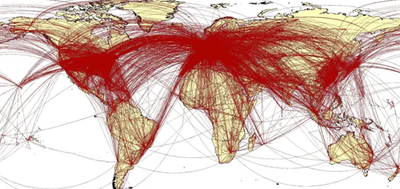
My thought was if it is maybe possible to map out the pattern of how the disease spread, like tracing lines between each upcoming diseased fruit over a timelapse
Something like that:
- Mark as New
- Bookmark
- Subscribe
- Mute
- Subscribe to RSS Feed
- Permalink
- Report Inappropriate Content
- Mark as New
- Bookmark
- Subscribe
- Mute
- Subscribe to RSS Feed
- Permalink
- Report Inappropriate Content
Link analysis might be what you are looking for? https://pro.arcgis.com/en/pro-app/latest/help/analysis/link-charts/link-analysis-with-arcgis-pro.htm


