- Home
- :
- All Communities
- :
- Products
- :
- ArcGIS Pro
- :
- ArcGIS Pro Ideas
- :
- Make Active Tab Colour and Hover-Over Tab Colour D...
- Subscribe to RSS Feed
- Mark as New
- Mark as Read
- Bookmark
- Follow this Idea
- Printer Friendly Page
Make Active Tab Colour and Hover-Over Tab Colour Different
- Mark as New
- Bookmark
- Subscribe
- Mute
- Subscribe to RSS Feed
- Permalink
Simple request, make these two colours different. Preferably, make the shade of the hover-over lighter than the active tab.
In this image, which tab is selected and which is highlighted?
![]()
To be fair, showing the little snippet doesn't provide the full context:

which tab is selected and which is highlighted?
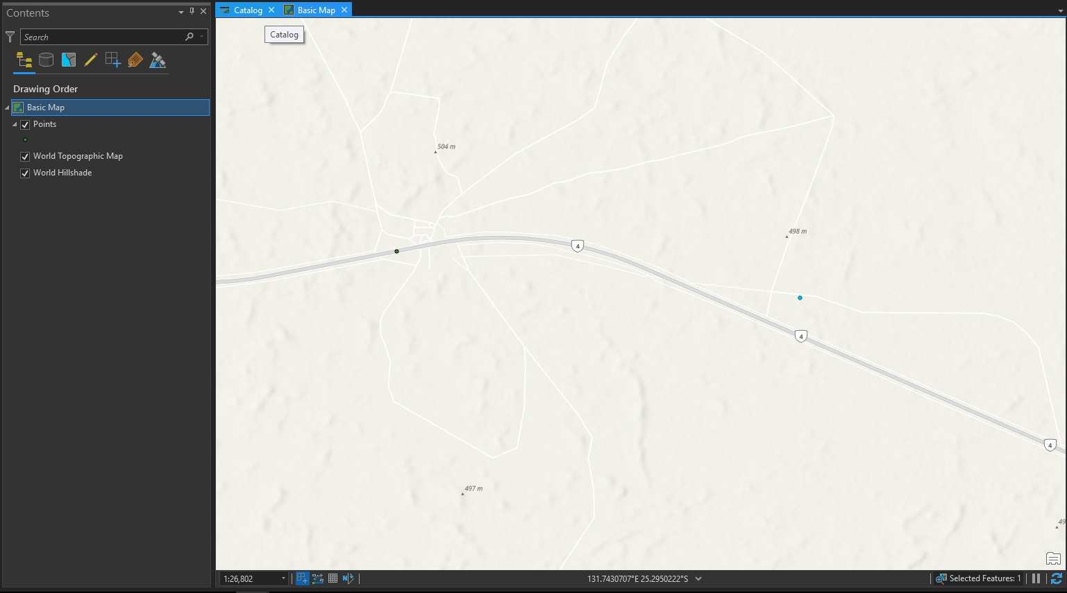
In the screenshot above, Basic Map is highlighted, because I can see the map view. And my mouse pointer (not captured in the screenshot) is hovering over the Catalog tab, and I get a hover tip that says Catalog.
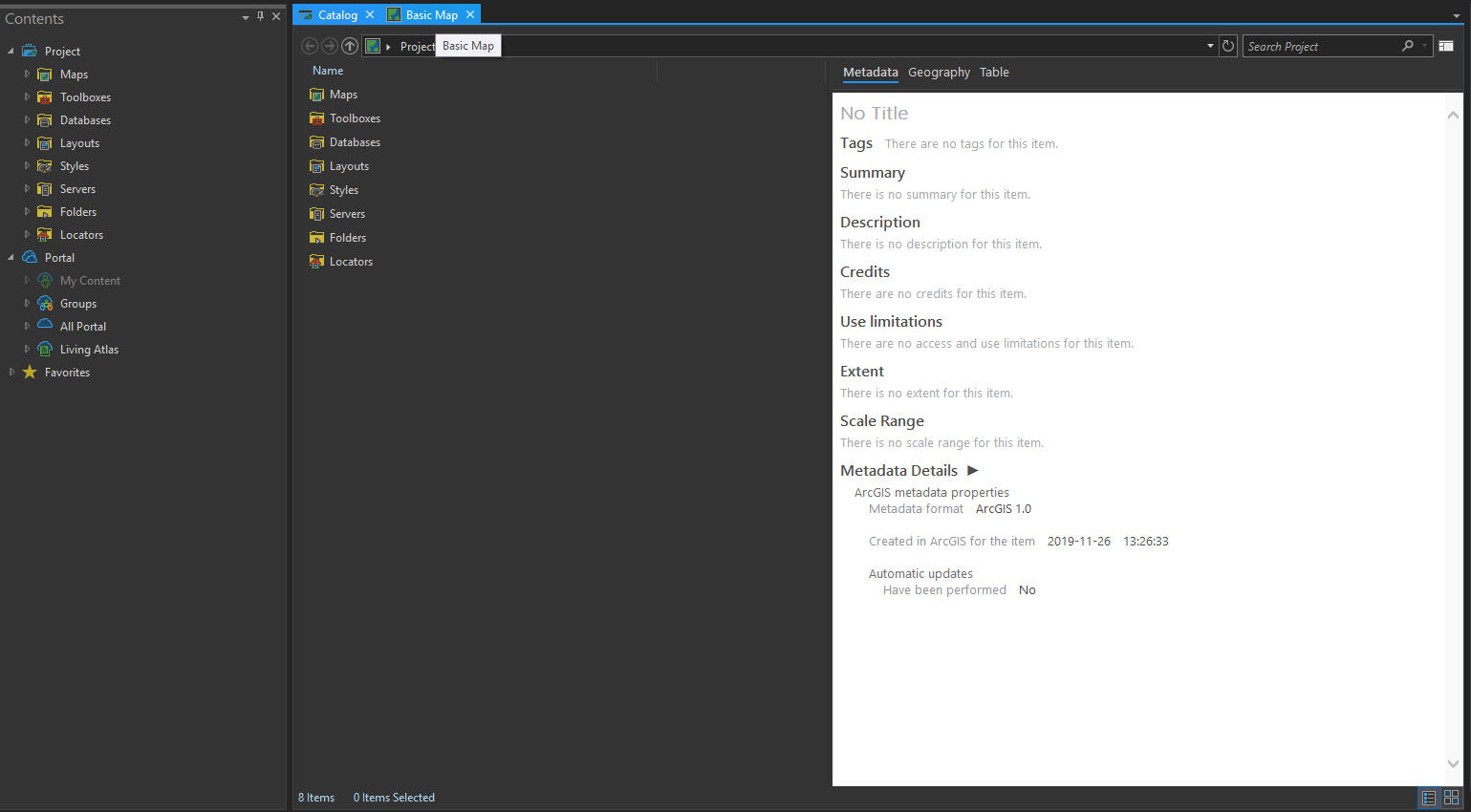
Below, I can see that the Catalog tab is in focus because the Catalog View is open:
I'm not saying that this issue is making tab identification unusable. More so that a colour distinction would make more sense and be a improvement on the user interface.
You're right that even if the tab I'm hovering over is the same colour as the tab that is active, I can still figure out what I'm hovering over, between the pop up and seeing what I have on screen. But having the hover over being identical to the active tab is anomaly when it comes to tab-based interfaces that stuck out to me when trying to transition to ArcPro.
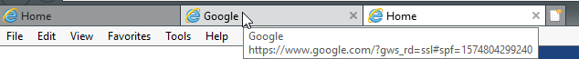
Google Chrome:

Microsoft Excel 2016:

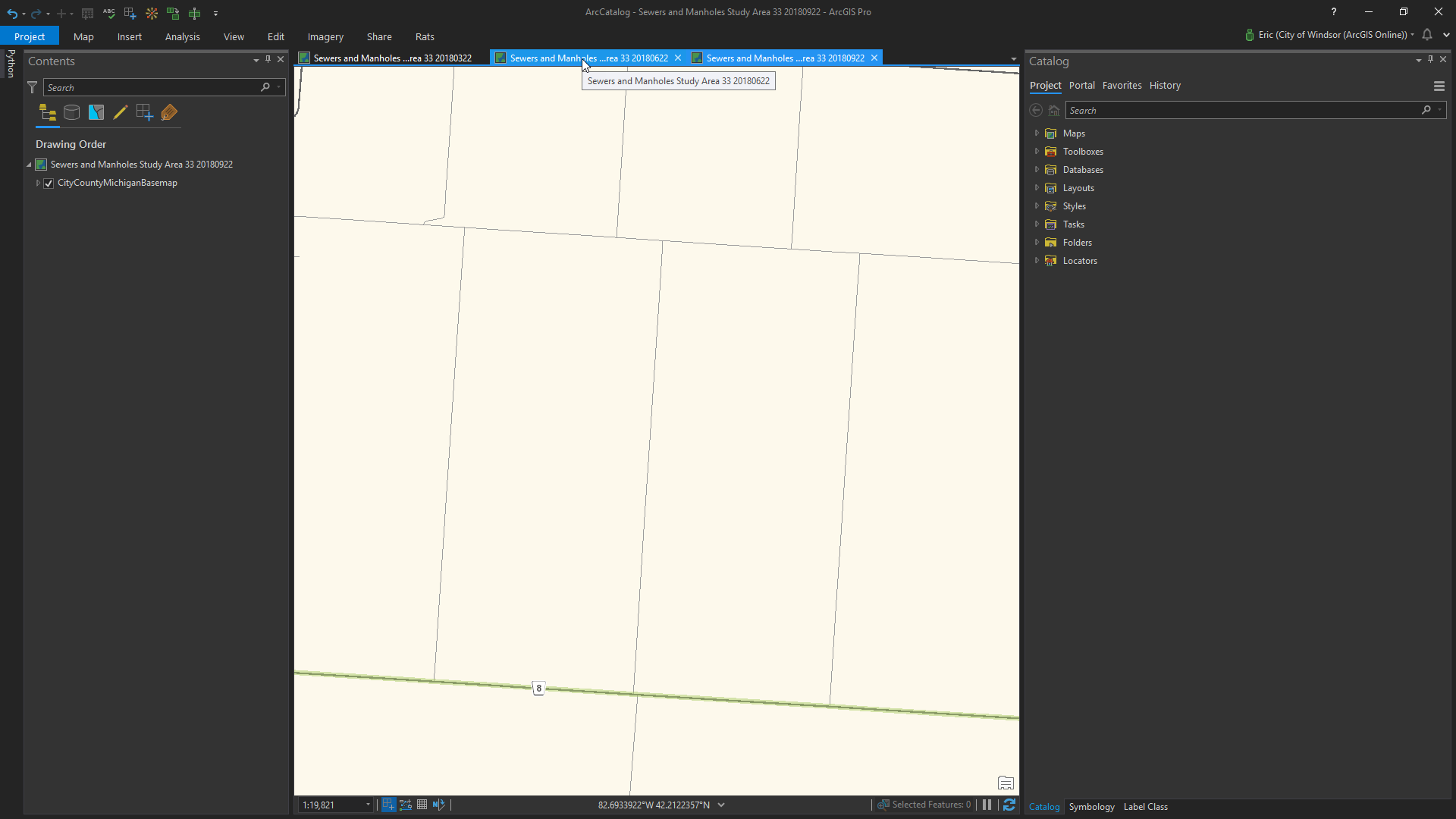
Internet explorer:
Also, while selecting between a map vs a catalog has a full screen distinction you can use, it's a lot less effective to rely on when you are switching between multiple similar maps of the same study area.
Good examples, Eric. Thank you!
You must be a registered user to add a comment. If you've already registered, sign in. Otherwise, register and sign in.