- Home
- :
- All Communities
- :
- Products
- :
- ArcGIS Pro
- :
- ArcGIS Pro Ideas
- :
- Improving the appearance of Grouped Layers in ArcG...
- Subscribe to RSS Feed
- Mark as New
- Mark as Read
- Bookmark
- Follow this Idea
- Printer Friendly Page
- Report Inappropriate Content
Improving the appearance of Grouped Layers in ArcGIS Pro Table of Contents
- Mark as New
- Bookmark
- Subscribe
- Mute
- Subscribe to RSS Feed
- Permalink
- Report Inappropriate Content
Something that has annoyed me for a long time is the difficulty that I sometimes find with identifying where a set of grouped layers ends and a new layer/layer group starts. The below example shows a set of layers grouped together with individual layers both above and below the group. At a glance, it is hard to tell where the group stops though.

It would be great if an improvement could be made that somehow highlights what layers are grouped together. Maybe a line/bracket down the side of the tree showing the grouping, a faint bounding box or a slight change in the background shading to show groups?


- Mark as Read
- Mark as New
- Bookmark
- Permalink
- Report Inappropriate Content
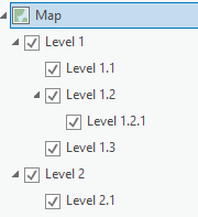
If a map has multiple levels of (group) layers, it can be hard to determine to which group layer a given layer belongs in the table of contents, because the indentation between the levels isn't big enough:
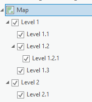
I would like the indentation between the different layer levels to be increased or to have an option to do so myself.
In my opinion, that would help clarifying the structure tremendously:
- Mark as Read
- Mark as New
- Bookmark
- Permalink
- Report Inappropriate Content
The TOC needs totally reworked, too much space between items, the fonts and patches are way too big, ArcMAP had a much better-looking Table of Contents, one can barely tell what layers have been placed under a Group.
- Mark as Read
- Mark as New
- Bookmark
- Permalink
- Report Inappropriate Content
@JohannesLindner idea of simply increasing the indentations is a good one. Clear separation between the check-boxes clears up the confusion. Overlapping check-boxes makes it too hard to discern where indentations align through the list.
You must be a registered user to add a comment. If you've already registered, sign in. Otherwise, register and sign in.