- Home
- :
- All Communities
- :
- Products
- :
- ArcGIS Online
- :
- ArcGIS Online Questions
- :
- Re: Quarantine Patient release time
- Subscribe to RSS Feed
- Mark Topic as New
- Mark Topic as Read
- Float this Topic for Current User
- Bookmark
- Subscribe
- Mute
- Printer Friendly Page
Quarantine Patient release time
- Mark as New
- Bookmark
- Subscribe
- Mute
- Subscribe to RSS Feed
- Permalink
- Report Inappropriate Content
Greetings All,
I would like to use ArcGIS Dashboard to show the remaining Quarantine time per patient. For Example, if a person comes into the country, they are required to quarantine for 14 days... Once a location point is created at their quarantine location, I would like to have a countdown showing the days remaining for each quarantine patient. When day 14 arrives, I would like that point to turn green indicating that the quarantine time is over. Based on my research it appears that I will have to do this from Arcade in ArcGIS online. Grateful if someone can provide some details of how to accomplish this. Thanks in advance
- Mark as New
- Bookmark
- Subscribe
- Mute
- Subscribe to RSS Feed
- Permalink
- Report Inappropriate Content
Never done it in arcade so just take this as an uneducated suggestion:
The Date functions Date Functions | ArcGIS for Developers
seem to list a DateDiff() and a Now() function.
I think creating a custom field/popup where you do something like
DateDiff(Now(), QuarantineDateTimeField, "days")
Then use classified symbology where x >=14 and x<14
but take that with a big pinch of trial and error.
- Mark as New
- Bookmark
- Subscribe
- Mute
- Subscribe to RSS Feed
- Permalink
- Report Inappropriate Content
- Mark as New
- Bookmark
- Subscribe
- Mute
- Subscribe to RSS Feed
- Permalink
- Report Inappropriate Content
When I say I've never done it, that's just my inadequacy with arcade. I'd bet my left kidney it can easily be done however.
I'll give it a test tomorrow if you like, re the dashboard you must also be able to do it with a filter (no kidney this time) but I think having the extra field with the number of days since quarantine would be the best option.
- Mark as New
- Bookmark
- Subscribe
- Mute
- Subscribe to RSS Feed
- Permalink
- Report Inappropriate Content
Greetings David,
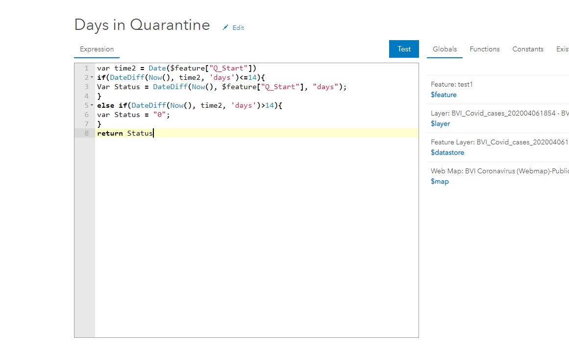
I made my first attempt with your solution (i.e. using the datediff function). Please see attached image. It seems to correctly do the calculation except with the decimal figures. I'm guessing there needs to be a round function somewhere based on my research? Also, can you explain the symbology part a bit more... I'm using ArcGIS online and Im guessing the last part of your solution refers to "change style" and adding a new expression in there? Please advise

- Mark as New
- Bookmark
- Subscribe
- Mute
- Subscribe to RSS Feed
- Permalink
- Report Inappropriate Content
My Javascript is pretty poor, but the following returned what I was suggesting (I manually entered the start date as I have no data).
var dateDiff = DateDiff(Now(), "2021-01-01 00:00:00", "days")

if (dateDiff >= 14){
    return "Quarantine Expired"
}
else{
    return "In Quarantine"
}
yours would look like this I guess:
var dateDiff = DateDiff(Now(), $feature["Q_Start"], "days")

if (dateDiff >= 14){
    return "Quarantine Expired"
}
else{
    return "In Quarantine"
}
regards the symbology, I would use this expression to create a new field such as "Quarantine_Y_N", then just use the normal symbology window to classify by field value (unique values etc.)
The decimal issue shouldn't be a problem, but it depends of course if you mean 14 days inclusive of that day so far, or 14*24 hours.
Although not rocket science, It would hurt my head too much at the moment to figure that out.
- Mark as New
- Bookmark
- Subscribe
- Mute
- Subscribe to RSS Feed
- Permalink
- Report Inappropriate Content
- Mark as New
- Bookmark
- Subscribe
- Mute
- Subscribe to RSS Feed
- Permalink
- Report Inappropriate Content
Glad it worked - Also you might just add a final Else statement to catch any cases where the logical test fail (e.g. a bad date has been entered) and then return "Error" or something. You can then easily find those records, but as it stands, those records wouldn't be populated anyway so you could easily identify them I guess (but it's less explicit).
Also just be aware of the 14 *24 hours thing still.
I've never used the beta if I'm honest, but my experience from a normal dashboard is that it would absolutely be possible - your dashboard links to a webmap which has a new custom field which you symbolise as-normal from, and can use to power any dashboard gauges, filters, indicators etc. - same as with any other field.