- Home
- :
- All Communities
- :
- Products
- :
- ArcGIS Online
- :
- ArcGIS Online Questions
- :
- Re: Arcade Symbology
- Subscribe to RSS Feed
- Mark Topic as New
- Mark Topic as Read
- Float this Topic for Current User
- Bookmark
- Subscribe
- Mute
- Printer Friendly Page
- Mark as New
- Bookmark
- Subscribe
- Mute
- Subscribe to RSS Feed
- Permalink
- Report Inappropriate Content
I am trying to display pavement condition inventory scores as groups, for instance 60-75 is okay, 76-89 is good, and 90-99 is excellent. I can do that in Map, but not Online. There is no grouping setting I can find. You can use Counts and Amounts and set the manual breaks, but you can't change individual colors in the ramp. I am not good with Arcade, but I found something that partially works. The problem is it only returns 3 categories. That may be all it is designed to do. Does anyone have any suggestions? Thanks!
if($feature.PCI >=90){
return "Great"
}
if (75<= $feature.PCI <90){
return "Better"
}
if (60<= $feature.PCI <75){
return "Okay"
}
if(40<= $feature.PCI <60){
return "Bad"
}
if($feature.PCI <40){
return "Awful"
}

Solved! Go to Solution.
- Mark as New
- Bookmark
- Subscribe
- Mute
- Subscribe to RSS Feed
- Permalink
- Report Inappropriate Content
Hey Xander,
Data stored is WeekNumber as Integer.
Applying your lines of code can gives me either of 4 answers.
1.
[19,null,null]
[1,0,0]
2.
[19,20,null]
[1,2,0]
3.
[19,20,30]
[1,2,3]
4.
[null,null,null]
[0,0,0]
Results return either 0, 1, 2, 3 as integer.
Symbology returns values 0 and 1.
- Mark as New
- Bookmark
- Subscribe
- Mute
- Subscribe to RSS Feed
- Permalink
- Report Inappropriate Content
Hi martijn.jansma_BTL ,
The results are as expected:
| Case | data | list | Max(list) |
|---|---|---|---|
| 1 | [19,null,null] | [1,0,0] | 1 |
| 2 | [19,20,null] | [1,2,0] | 2 |
| 3 | [19,20,30] | [1,2,3] | 3 |
| 4 | [null,null,null] | [0,0,0] | 0 |
Why is the symbology only 0 or 1?
- Mark as New
- Bookmark
- Subscribe
- Mute
- Subscribe to RSS Feed
- Permalink
- Report Inappropriate Content
Results are indeed as expected.
WHy the symbology only returns options for 0 and 1 is what puzzles me.
Ultimately I want to define the Symbology on the values 0 - 3, yet I am left with only 0 and 1 as options.
- Mark as New
- Bookmark
- Subscribe
- Mute
- Subscribe to RSS Feed
- Permalink
- Report Inappropriate Content
Hi martijn.jansma_BTL ,
Just to be sure... your data does contain all the different situations, right?
If you want me to take a look at it, you can share the map and data to a group and invite me to it (xbakker.spx).
- Mark as New
- Bookmark
- Subscribe
- Mute
- Subscribe to RSS Feed
- Permalink
- Report Inappropriate Content
Hi Xander,
I have added you to a group.
Problem seems to have been resolved now that more of the data was collected.
All possible situations were present at the time of testing though.
Does % of filled fields matter in this symoblogy?
eg. 1000 object, 500 contain Case 1 (as mentioned in your comment 15-5-2020), 80 contain Case 2, 20 Case 3, 400 Case 4.
- Mark as New
- Bookmark
- Subscribe
- Mute
- Subscribe to RSS Feed
- Permalink
- Report Inappropriate Content
Hi
Thanks for adding me to the group. I looked at the expression and it seems to work. It is a bit strange that the values 2 and 3 are not added directly to the legend, but you can include them clicking on the grey single arrows pointing north:
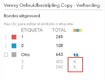
Then you will be able to define the symbology that you want to apply:
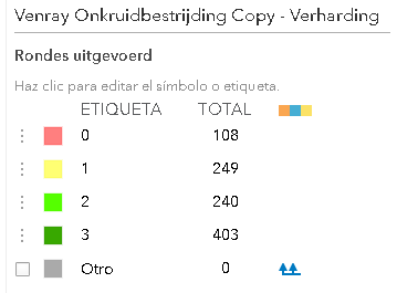
and every class will be visualized with the symbology defined by you:

- Mark as New
- Bookmark
- Subscribe
- Mute
- Subscribe to RSS Feed
- Permalink
- Report Inappropriate Content
Its just worth mentioning that the symbology in Webmaps will only use the maxrecordcount from the rest endpoint of the data you are using. This will normally be 2000 so if those values are in the the first 2000 records it will never come up.
- Mark as New
- Bookmark
- Subscribe
- Mute
- Subscribe to RSS Feed
- Permalink
- Report Inappropriate Content
This is good stuff!
I have this bit of code to assign intuitive labels to my categories, but Id also like to assign certain colors to each category, and order as in the code:
var dif=$feature["Alligator_Weed"];
if (dif <1){
return 'Zero';
}
else if (dif==1){
return '<1%';
}
else if (dif==2){
return '1-10%';
}
else if (dif==3){
return '10-25%';
}
else if (dif==4){
return '25-60%';
}
else if (dif==5){
return '>60%';
}
else if (dif==99){
return 'NOT TARGETED'
}
else {
return 'UNKNOWN'
}
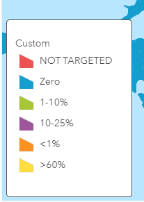
This is my results so far...
- Mark as New
- Bookmark
- Subscribe
- Mute
- Subscribe to RSS Feed
- Permalink
- Report Inappropriate Content
Hi Nathan Bush ,
The order of the items van be changed directly in ArcGIS Online. Just drag and drop the items in the order you want to use. You are missing two categories based on the expression you shared: 25-60% and UNKNOWN. It is possible that in the data used to generate the legend, these two clases are not present. It may be present later on, if this data is dynamic and you are in the process of collecting the data. ArcGIS Online is a bit limited in adding multiples classes to the legend.
To solve this, you can edit the actual json that defines the legend in the webmap using ArcGIS Online Assistant . Please make a copy first before editing the json of the web map.
- Mark as New
- Bookmark
- Subscribe
- Mute
- Subscribe to RSS Feed
- Permalink
- Report Inappropriate Content
Hi Xander,
I'm trying to get away from having to make manual changes to the order...I have over a hundred similar layers that need to be in the same order and same color for each category.
You're right about the missing categories, the data is just not present yet.