- Home
- :
- All Communities
- :
- Products
- :
- ArcGIS Online
- :
- ArcGIS Online Questions
- :
- 1 Feature Class and 85 different attributes...conu...
- Subscribe to RSS Feed
- Mark Topic as New
- Mark Topic as Read
- Float this Topic for Current User
- Bookmark
- Subscribe
- Mute
- Printer Friendly Page
1 Feature Class and 85 different attributes...conundrum
- Mark as New
- Bookmark
- Subscribe
- Mute
- Subscribe to RSS Feed
- Permalink
- Report Inappropriate Content
I have a Pipes Feature Class with 85 different piping systems in it. In other words, it is a Line Feature Class with 85 different types of lines. I need to show all 85 different piping systems as a different color in a Portal for ArcGIS Map.
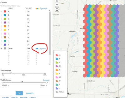
In Portal, I have a Map Image Layer and Feature Layer for the Pipes Feature Class. But, when displayed by piping system in a Map Viewer, it is only able to show 12 styles (categories) when I need it to show 85 different styles, one per piping system. Seems like AGOL and Portal have a limit of 12 styles maximum to display?
Is there any solution to this problem?
NOTE: I have been able to display all 85 different line types as different colors and symbols using a Map Service sourced from an MXD. I wonder if the same can be wholly inside AGOL or Portal without using a Map Service/MXD.
Solved! Go to Solution.
Accepted Solutions
- Mark as New
- Bookmark
- Subscribe
- Mute
- Subscribe to RSS Feed
- Permalink
- Report Inappropriate Content
Yes, there is a solution, but it is a bit tedious.
When you set the symbology to an attribute, it grabs the most common values and symbolizes those. To get the others into the list, you have to click Ungroup.
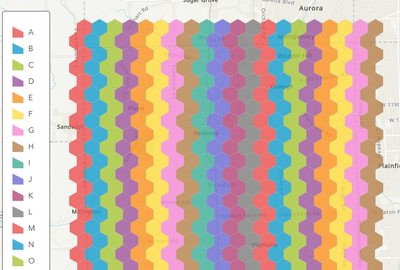
But then the color ramp starts to repeat after 12 values.
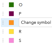
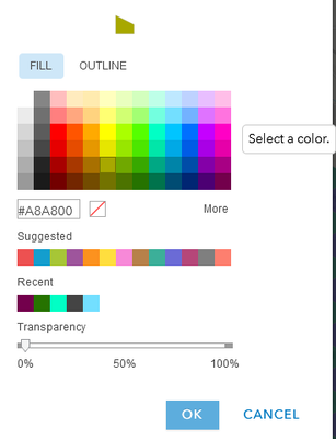
To adjust this further, simply click each category in the symbol settings, and from there you can manually change it.
With something like 85 unique values, this obviously leads to lots of clicking. Two ways you might get around this:
- Open the web map in Pro and change the symbology, then save the map.
- Use a script of some kind to change the layer's JSON definition, which defines the default symbology.
I'd probably work with the first option if Pro is available to you, and can elaborate on the second if it's something you'd want to pursue.
Kendall County GIS


