- Home
- :
- All Communities
- :
- Products
- :
- ArcGIS Online
- :
- ArcGIS Online Ideas
- :
- Disable selection highlight in Near Me WAB widget
- Subscribe to RSS Feed
- Mark as New
- Mark as Read
- Bookmark
- Follow this Idea
- Printer Friendly Page
- Report Inappropriate Content
Disable selection highlight in Near Me WAB widget
- Mark as New
- Bookmark
- Subscribe
- Mute
- Subscribe to RSS Feed
- Permalink
- Report Inappropriate Content
We've had some problems with the feature selection highlighting (that shows by default in a cyan color) that shows after you click to see the distance to nearby features working incorrectly in the Near Me WebAppBuilder widget, so it would be helpful if it were possible to disable the selection highlight altogether. This is related to this question in GeoNet: Near Me Widget Unusual Feature Highlight/Selection. 
- Mark as Read
- Mark as New
- Bookmark
- Permalink
- Report Inappropriate Content
We are looking to deploy the My Trash Services Local Government Solution which uses the Near Me widget in the web application that is created. When you enter an address, it zooms to the buffer around the address and you choose the trash, yard waste, or recycling collection to get more information about it. Once you make your selection, the polygon of the collection area is highlighted in the bright cyan color we've all come to know in love when we select a feature in ArcMap or ArcGIS Pro. 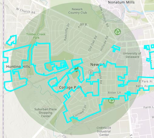
Because I've only drawn the polygons over the exact parcels that we collect from it looks like a jumbled mess at this scale. I've set all my symbology so the polygon have no color in either the fill or the outline, but because of the selection highlight it shows up anyway. I think it's very distracting and something the public, for whom this application is intended, does not need to see. So to be able to disable the selection color would be very useful.
You must be a registered user to add a comment. If you've already registered, sign in. Otherwise, register and sign in.