- Home
- :
- All Communities
- :
- Products
- :
- ArcGIS Online
- :
- ArcGIS Online Ideas
- :
- Allow Clustering Symbology by statistics other tha...
- Subscribe to RSS Feed
- Mark as New
- Mark as Read
- Bookmark
- Follow this Idea
- Printer Friendly Page
- Report Inappropriate Content
Allow Clustering Symbology by statistics other than Count or Average
- Mark as New
- Bookmark
- Subscribe
- Mute
- Subscribe to RSS Feed
- Permalink
- Report Inappropriate Content
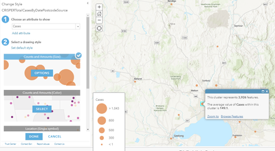
When using cluster symbology in a web map it is currently possible to symbolize by a value average by symbolizing a numeric field by counts and amounts, then turning on clustering. It would be extremely useful to be able to choose other basic statistics as alternatives to the average value for the symbol size option. For example:
Sum: The sum of the values in the target field in the cluster - This would differ from count in that it would allow for a greater range of values than a simple point count, and it would better represent values than items - for example, Total Sales $, number of residents at a location, etc.
Max: The max of the values in the target field in the cluster
Min: The min of the values in the target field in the cluster
Dif: The dif (max-min) of the values in the target field in the cluster
etc...
The choice of which value to be used for symbology could be defined in the popup configuration, ensuring symbology and popup content are consistent.
This sort of capability could help with the understanding of large point datasets, and would become even more useful when combined with the already available filtering tools available in dashboards.
Max/Min would help highlight the highs/lows in different areas
Dif would help highlight areas of significant variance
Sum would improve upon the already useful Count option.
Screen grab of clustered points with average values - Ideally other statistics would be options.
You must be a registered user to add a comment. If you've already registered, sign in. Otherwise, register and sign in.
