Turn on suggestions
Auto-suggest helps you quickly narrow down your search results by suggesting possible matches as you type.
Cancel
- Home
- :
- All Communities
- :
- Products
- :
- Mapping and Charting Solutions
- :
- Mapping and Charting Questions
- :
- arcpro chart format
Options
- Subscribe to RSS Feed
- Mark Topic as New
- Mark Topic as Read
- Float this Topic for Current User
- Bookmark
- Subscribe
- Mute
- Printer Friendly Page
arcpro chart format
Subscribe
301
0
12-04-2019 09:28 AM
12-04-2019
09:28 AM
- Mark as New
- Bookmark
- Subscribe
- Mute
- Subscribe to RSS Feed
- Permalink
- Report Inappropriate Content
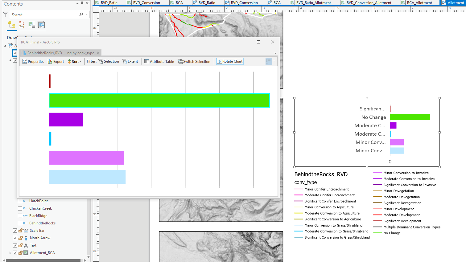
Hey ya'll, When I create the chart I remove all the axes labels, but when I insert it on a Layout the axes labels appear again, and there is a huge gap of wasted space. The labels are too long to read and it messes with the flow. I've tried inserting a legend in the chart, but the option is grayed out. Formatting the charts is the single most frustrating experience of my life and I want to write a strongly worded letter to someone. Thanks!! #display of charts
0 Replies