- Home
- :
- All Communities
- :
- Products
- :
- ArcGIS Insights
- :
- ArcGIS Insights Ideas
- :
- show more than 12 months in a bar or column chart
- Subscribe to RSS Feed
- Mark as New
- Mark as Read
- Bookmark
- Follow this Idea
- Printer Friendly Page
- Report Inappropriate Content
- Mark as New
- Bookmark
- Subscribe
- Mute
- Subscribe to RSS Feed
- Permalink
- Report Inappropriate Content
We have a dataset of millions of records that are incidents from our city 911 dispatch system. We would like to be able to show a rolling number of months (e.g. 12) in data in bar and column charts. Right now we can only filter by year or month, and if we turn off the year filtering it stacks multiple years (see attached chart -- notice how January is more overall, because it's three months of data, vs the other months have only two). I know Tableau can do this -- in fact, I think it defaults to this in some way. I've attached an example Tableau chart I found that shows this.
- Mark as Read
- Mark as New
- Bookmark
- Permalink
- Report Inappropriate Content
Here is a public facing page with some related data for my work, that shows 12 rolling months in Tableau...
- Mark as Read
- Mark as New
- Bookmark
- Permalink
- Report Inappropriate Content
Hello @PaulCone2
I think you should go for Pareto Analysis Chart.
You can create it with just few clicks, Visualization tool used in vid is ChartExpo™, It is both an Excel and Google Sheets plugin.
ChartExpo for Google Sheets: https://chartexpo.com/utmAction/MTErY29tbXVuaXR5K2dzK1NCK0VTUkkr
ChartExpo for Excel:
https://chartexpo.com/utmAction/MTErY29tbXVuaXR5K3hsK1NCK0VTUkkr
All the Best!
- Mark as Read
- Mark as New
- Bookmark
- Permalink
- Report Inappropriate Content
Hi @PaulCone2,
I took a look at the screenshot and what you are trying to achieve. I was wondering if you are restricted to use Bars or Stacked bar charts?
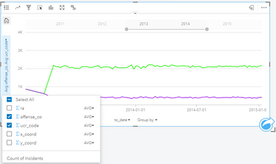
I think you can achieve this in several ways in insights. The easiest being the time-series chart by dragging and dropping a date field.
- It is easy to filter dynamically using the top slider bar
- You can have more than one series or group by a category
e.g.
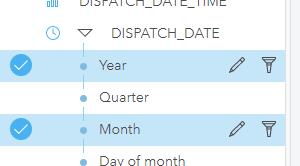
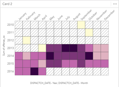
The second option, if you want to see Year/Month against a statistic a Heat chart or a data clock might be a good fit. From the date, components chose Year/ Month and a numeric field to create a Heat chart or a Data clock.
You can also pair this chart with a Cross filter or Pre-defined filter to choose single or multiple years. It should look something like the following. I personally find it more readable than stuffing many categories in one bar/column chart.
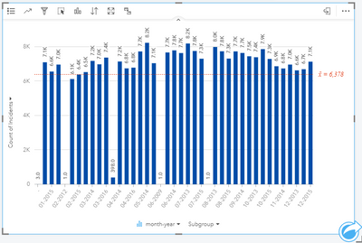
Lastly, If you need a bar or column chart (Stacked or unstacked) you can calculate a new field and use that instead of the date components.
- From Layer's menu open data table
- Add a new field called "Month - Year" and use
- `CONCATENATE(month,"-", year)`
- Use this new field to show a bar chart e.g.
Let me know if that helps. Sorry for the long post. Feel free to ask any questions.
Thanks,
Akshay
- Mark as Read
- Mark as New
- Bookmark
- Permalink
- Report Inappropriate Content
Thank you Akshay. I got distracted by other things but am back. I like your last two ideas and will give them a try.
- Mark as Read
- Mark as New
- Bookmark
- Permalink
- Report Inappropriate Content
@PaulCone2 No issues. give it a go and see if that works. If possible update your Insights. we have introduced a lot of new features since this post so you might find some pleasant surprises.
You must be a registered user to add a comment. If you've already registered, sign in. Otherwise, register and sign in.


