- Home
- :
- All Communities
- :
- Products
- :
- ArcGIS Hub
- :
- ArcGIS Hub Questions
- :
- Re: Hub Site Custom Header
- Subscribe to RSS Feed
- Mark Topic as New
- Mark Topic as Read
- Float this Topic for Current User
- Bookmark
- Subscribe
- Mute
- Printer Friendly Page
- Mark as New
- Bookmark
- Subscribe
- Mute
- Subscribe to RSS Feed
- Permalink
I am working on the Hub Site, in AGO and would like to create a custom header for my site. While what I got so far looks ok. There are a couple things I am struggling with. First it looks like there are two tiers in the header, and I would like the padding between to tiers to be smaller. My over all goal is to make the header section smaller. But I cannot figure out how to accomplish that. Second, if I resize my screen or pull up this site on the mobile device, the header doesn't have a true responsive mode, and the items from the header start running into each other, and behave chaotically.
Below is a link to my site, as well as the html and css for the header.
https://dchd-air-quality-dogis.opendata.arcgis.com
Any help would be greatly appreciated.
HTML
<nav class="navbar navbar-default navbar-static-top first-tier">
<div class="container">
<ul class="nav nav-pills pull-right" role="list">
<li><a href="https://www.douglascounty-ne.gov/" target="_blank">Douglas County</a></li>
<li><a href="https://www.douglascountyhealth.com/" target="_blank">DC Health Department</a></li>
<li><a href="https://www.cityofomaha.org/" target="_blank">City of Omaha</a></li>
<li><a href="https://gis.douglascounty-ne.gov/contact-us" target="_blank">Feedback</a></li>
</ul>
</div>
</nav>
<nav class="navbar navbar-inverse navbar-static-top second-tier" role="navigation">
<div class="container">
<img class = "text pull-left" src="https://s3.amazonaws.com/dcgis_photos/Air_Quality_Monitors/Web-DCHD-Logo-Tagline-Type_Color.png" alt="logo" width="25%" height="15%">
<div class = "text pull-left"> <h1 style="text-align: left;"><strong>Air Quality Monitoring</strong></h1><p style="text-align: left; "></p><h4 style="text-align: left;">Douglas County Health Department</h4><p></p>
<br>
<div class="btn-group">
<a button="" class="btn btn-default" type="button" id="dropdownMenu1" aria-haspopup="true" aria-expanded="false" href="https://dchd-air-quality-dogis.opendata.arcgis.com">Home</a>
</div>
<div class="btn-group">
<a button="" class="btn btn-default" type="button" id="dropdownMenu2" aria-haspopup="true" aria-expanded="false" href="https://dogis.maps.arcgis.com/apps/opsdashboard/index.html#/8725293d42fa4bcb8887f9e74ff46458" target="_blank">Interactive Map</a>
</div>
<div class="btn-group">
<button class="btn btn-default dropdown-toggle" type="button" id="dropdownMenu4" data-toggle="dropdown" aria-haspopup="true" aria-expanded="false">
Pollutants
<span class="caret"></span>
</button>
<ul class="dropdown-menu" aria-labelledby="dropdownMenu4">
<li><a href="https://dchd-air-quality-dogis.opendata.arcgis.com/pages/carbon-monoxide" target="_blank">Carbone Monoxide</a></li>
<li><a href="https://dchd-air-quality-dogis.opendata.arcgis.com/pages/nitrogen-oxides" target="_blank">Nitrogen Oxides</a></li>
<li><a href="https://dchd-air-quality-dogis.opendata.arcgis.com/pages/ozone" target="_blank">Ozone</a></li>
<li><a href=" https://dchd-air-quality-dogis.opendata.arcgis.com/pages/sulfur-dioxides" target="_blank">Sulfur Dioxides</a></li>
<li><a href="https://dchd-air-quality-dogis.opendata.arcgis.com/pages/particulate-matter" target="_blank">Particulate Matter</a></li>
<li><a href="https://dchd-air-quality-dogis.opendata.arcgis.com/pages/lead" target="_blank">Lead</a></li>
<li role="separator" class="divider"></li>
<li><a href="#">Other Pollutants</a></li>
</ul>
</div>
<div class="btn-group">
<a button="" class="btn btn-default" type="button" id="dropdownMenu2" aria-haspopup="true" aria-expanded="false" href="https://dchd-air-quality-dogis.opendata.arcgis.com/pages/pollen" target="_blank">Pollen</a>
</div>
<div class="btn-group">
<button class="btn btn-default dropdown-toggle" type="button" id="dropdownMenu4" data-toggle="dropdown" aria-haspopup="true" aria-expanded="false">
Monitoring Sites
<span class="caret"></span>
</button>
<ul class="dropdown-menu" aria-labelledby="dropdownMenu4">
<li><a href="https://dchd-air-quality-dogis.opendata.arcgis.com/pages/site-bellevue" target="_blank">Bellevue</a></li>
<li><a href="https://dchd-air-quality-dogis.opendata.arcgis.com/pages/site-blair" target="_blank">Blair</a></li>
<li><a href="https://dchd-air-quality-dogis.opendata.arcgis.com/pages/site-creighton-no-downtown" target="_blank">Creighton/North Omaha Downtown</a></li>
<li><a href="https://dchd-air-quality-dogis.opendata.arcgis.com/pages/site-central" target="_blank">Central Omaha</a></li>
<li><a href="https://dchd-air-quality-dogis.opendata.arcgis.com/pages/site-ncore" target="_blank">NCORE (Health Dept Campus)</a></li>
<li><a href="https://dchd-air-quality-dogis.opendata.arcgis.com/pages/site-ne-omaha1" target="_blank">Northeast Omaha 1</a></li>
<li><a href="https://dchd-air-quality-dogis.opendata.arcgis.com/pages/site-ne-omaha2" target="_blank">Northeast Omaha 2</a></li>
<li><a href="https://dchd-air-quality-dogis.opendata.arcgis.com/pages/site-ralston" target="_blank">Ralston</a></li>
<li><a href="https://dchd-air-quality-dogis.opendata.arcgis.com/pages/site-south-omaha" target="_blank">South Omaha</a></li>
</ul>
</div>
<div class="btn-group">
<button class="btn btn-default dropdown-toggle" type="button" id="dropdownMenu5" data-toggle="dropdown" aria-haspopup="true" aria-expanded="false">
Links
<span class="caret"></span>
</button>
<ul class="dropdown-menu" aria-labelledby="dropdownMenu4">
<li><a href="#EPA">EPA</a></li>
<li><a href="#NOAA" target="_blank">NOAA</a></li>
<li><a href="#AirVision" target="_blank">AirVision</a></li>
<li role="separator" class="divider"></li>
<li><a href="#">Other Documents</a></li>
</ul>
</div>
<div class="btn-group">
<a button="" class="btn btn-default" type="button" id="dropdownMenu2" aria-haspopup="true" aria-expanded="false" href="https://dchd-air-quality-dogis.opendata.arcgis.com/pages/about-air-quality-dchd" target="_blank">About</a>
</div>
</div>
</div>
<br>
</nav>
CSS
.first-tier {
height: 0px;
margin-bottom: 0px;
background-color: #ffffff;
}
.first-tier .nav>li>a {
margin-top: 5px;
padding: 3px 6px;
color: #5974ba;
}
.first-tier .nav>li>a:focus,
.first-tier .nav>li>a:hover {
background-color: #136fbf;
color: #5974ba;
}
.first-tier .site-logo img {
vertical-align: middle;
}
.first-tier h1 {
display: inline;
font-size: 25px;
}
.second-tier {
margin-bottom: 0px;
background-color: #fff;
color: #5974ba;
}
.site-header .navbar-header img {
vertical-align: middle;
height: 50px;
padding: 5px;
}
.header-container {
top: 80px;
margin: 0 auto;
max-width: 1440px;
position: absolute;
width: 100%;
transform: translateX(-50%);
left: 50%;
z-index: 10;
transition: max-width 250ms linear;
}
.header-container .navbar .container-fluid {
display: flex;
}
.header-container .navbar.navbar-default {
background-color: #fff;
border-color: transparent !important;
border-radius: 0;
}
.header-container .navbar.navbar-default .navbar-collapse.collapse {
display: flex !important;
flex: 1;
padding-right: 0;
}
.header-container .navbar.navbar-default .navbar-brand {
color: #333;
height: auto;
padding: 1rem;
}
.header-container .navbar.navbar-default .navbar-brand-img {
display: inline-block;
}
.header-container .navbar.navbar-default .navbar-nav {
flex: 2;
align-items: center;
justify-content: center;
margin: auto;
float: none;
}
.header-container .navbar.navbar-default .navbar-nav>li {
float: none;
display: inline-block;
}
.header-container .navbar.navbar-default .navbar-nav>li>a {
background: transparent;
color: #333;
font-size: 15px;
transition: all 250ms linear;
}
.header-container .navbar.navbar-default .navbar-nav>li>a:focus,
.header-container .navbar.navbar-default .navbar-nav>li>a:hover {
background: #3276AE;
color: #fff;
}
.header-container .navbar.navbar-default .navbar-right {
margin-right: 0;
flex: 1;
text-align: right;
}
.is-sticky {
position: relative;
z-index: 10;
}
.is-sticky .header-container {
max-width: 100%;
}
@media screen and (max-width: 768px) {
.header-container .navbar-header {
width: 100%;
}
.header-container .navbar-default .navbar-toggle {
margin-top: 18px;
}
.header-container .navbar .container-fluid {
display: block !important;
}
.header-container .navbar.navbar-default .navbar-collapse.collapse {
overflow: hidden;
display: none !important;
}
.header-container .navbar.navbar-default .navbar-collapse.collapse.in {
display: block !important;
}
.header-container .navbar.navbar-default .navbar-nav {
display: inherit;
padding: 0 0 1rem 0;
}
.header-container .navbar.navbar-default .navbar-nav > li {
display: block;
}
}
/* Editor adjustment for absolute positioned header */
header ~ .body-editor section:first-child { padding-top: 100px;}
Solved! Go to Solution.
- Mark as New
- Bookmark
- Subscribe
- Mute
- Subscribe to RSS Feed
- Permalink
Hi Klara Schmitt, I am working on another custom header for a hub page, and I seem to have an issue with the mobile view.
This is how my site's menu looks on the mobile view when I click to expand it: 
But then when I click to collapse it I am getting while box blow and cannot figure out how to get rid of it. 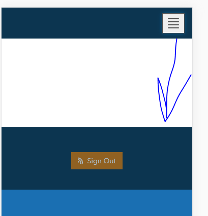
Thank you,
Nataliya
- Mark as New
- Bookmark
- Subscribe
- Mute
- Subscribe to RSS Feed
- Permalink
Hi Natallya,
Have you tried right-clicking the white area and selecting Inspect to look at the CSS in the browser dev tools? You can then turn on and off CSS rules until you see what might be affecting it. This is what I would do. I can look if you provide a link, but trying to diagnose a custom CSS issue with just a picture is really hard. If I had to guess, there's likely something amiss with how you're doing display level elements, positioning, or margins in your CSS.
- Mark as New
- Bookmark
- Subscribe
- Mute
- Subscribe to RSS Feed
- Permalink
Sorry, I should have included the link. Here is my test site link: Omaha Hotline - DEV .
I did look at the css, in a dev console, and it looks like the issue is with the elements padding, but I am not sure how to fix it in my site's css, I tried a few things but it didn't work.
Appreciate your help.
- Mark as New
- Bookmark
- Subscribe
- Mute
- Subscribe to RSS Feed
- Permalink
Hi Natallya,
I spoke to a colleague who explained the top-padding is generated to maintain fixed positioning for your custom header and to avoid having the header overlap your content. It appears the dropdown menu is taking up physical space rather than being an overlay, which is what is causing that white gap to appear. He recommends you add this to your custom header code to remedy that:
.navbar-collapse { position: absolute; width: 100%; } .navbar-collapse > ul.nav.navbar-right { margin-top: 0; }Hopefully that helps.
- Mark as New
- Bookmark
- Subscribe
- Mute
- Subscribe to RSS Feed
- Permalink
That worked! Thank you so much.
- Mark as New
- Bookmark
- Subscribe
- Mute
- Subscribe to RSS Feed
- Permalink
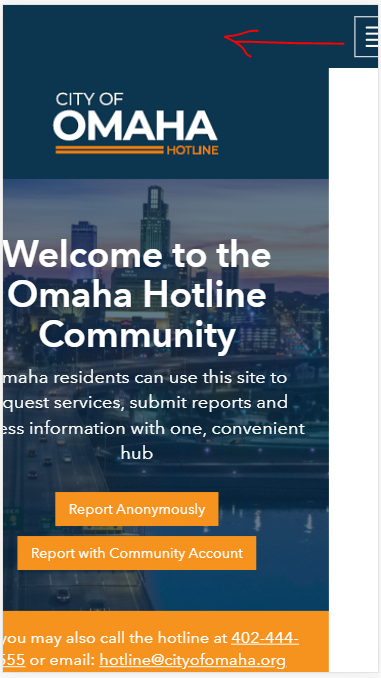
Hi Klara Schmitt I run into another issue with my mobile menu. When you get a minute would you please take a look. Now on the mobile my 'hamburger' menu is fully or partially hidden on the right (depends on a device size). Do you have any suggestions on how to fix this issue? This is a link to my test site: Omaha Hotline - DEV , and also if it would help I can provide my entire CSS.
Thank you for your time.
Nataliya
- Mark as New
- Bookmark
- Subscribe
- Mute
- Subscribe to RSS Feed
- Permalink
When you see something like this, where you have a header that's extended beyond the edge of your content, it's a good idea to scan your content and see if anything's overflowing its container. The header is fluid-width and will scale to be as wide as the widest piece of content on the site. In this case, it looks like your Google Play icon is falling outside of your content container, which is extending the width of your site. It's actually not an issue with the header. Change the width on the google play button or stack those vertically and this should go away.

- Mark as New
- Bookmark
- Subscribe
- Mute
- Subscribe to RSS Feed
- Permalink
Thank you very much. I really overlooked that, I was still working on the section with mobile icon, and didn't realize that overflow of the icons was causing the issue with the mobile menu until you pointed out. But it totally makes sense. Thank again. I really appreciate your quick response.
- Mark as New
- Bookmark
- Subscribe
- Mute
- Subscribe to RSS Feed
- Permalink
Klara,
Thank you! Between this and a few of your other articles and responses you have helped me so much. It took some trial and error, but I think I was able to get a responsive dropdown header built for my site.
I'm attaching a copy of my HTML and CSS. I did not go to school for GIS or computers. I'm a CJ major that was taught GIS in the military. Its rough, but it gets the job done. I'm sure in the hands of an experienced developer you could probably fix this up. Hope this can help someone!
Very Respectfully,
Brandon Wolfe
- Mark as New
- Bookmark
- Subscribe
- Mute
- Subscribe to RSS Feed
- Permalink
Hi Brandon,
I tried to use the html and css code as shared by you but I unable to hide the top bar as did in your site https://missouri-sema-organizational-maps-mosema.hub.arcgis.com/
Kindly suggest how to hide the top bar.
https://community.esri.com/t5/arcgis-hub-questions/hub-site-custom-header/td-p/104044/page/2
