- Home
- :
- All Communities
- :
- Products
- :
- ArcGIS Hub
- :
- ArcGIS Hub Documents
- :
- 3 ways to use the spacer card to improve site layo...
- Subscribe to RSS Feed
- Mark as New
- Mark as Read
- Bookmark
- Subscribe
- Printer Friendly Page
- Report Inappropriate Content
3 ways to use the spacer card to improve site layout - ArcGIS Hub or ArcGIS Enterprise Sites
3 ways to use the spacer card to improve site layout - ArcGIS Hub or ArcGIS Enterprise Sites
- Add to top and bottom of rows to add breathing room
- Use the 'hide on mobile toggle' to fine-tune space from desktop to mobile
- Add 1px spacer cards to the left and right of content to reduce the maximum width on larger windows
NOTE: To get an accurate view of how the spacer card displays, you will need to use the 'preview draft' or 'view published' options under the save menu. Why? The editor maintains space for controls, which can appear as though there is more or less space than displayed in some rows while in the editor. Make sure you save the draft before you view it so you don't lose changes!
1. Let your content breathe
Add a spacer card to the top and bottom of each row to separate concepts and make it easier for visitors to scan content.
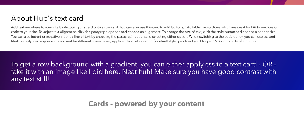
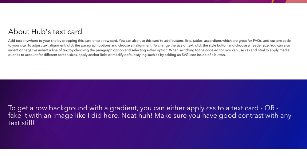
For example, all my content is smashed together before I added 50px spacer cards before and after content in these rows.
Before:
After:
How much space is up to you. For example, I could reduce the space in the row that has a white background to 30px, so it is closer to the content below but still easier to scan. But if I had an image in the background of that row, I might consider a larger amount of space so you can see more of the image.
2. Fine-tune for mobile
Depending on the visual style you are going for, you might want less space around content on mobile. Too much space means users will have to do a lot more scrolling, some could leave if it is not obvious there is more content. So the spacer card has a convenient toggle to 'hide on mobile'. You can also drag out two cards if you still want a little padding on mobile too.
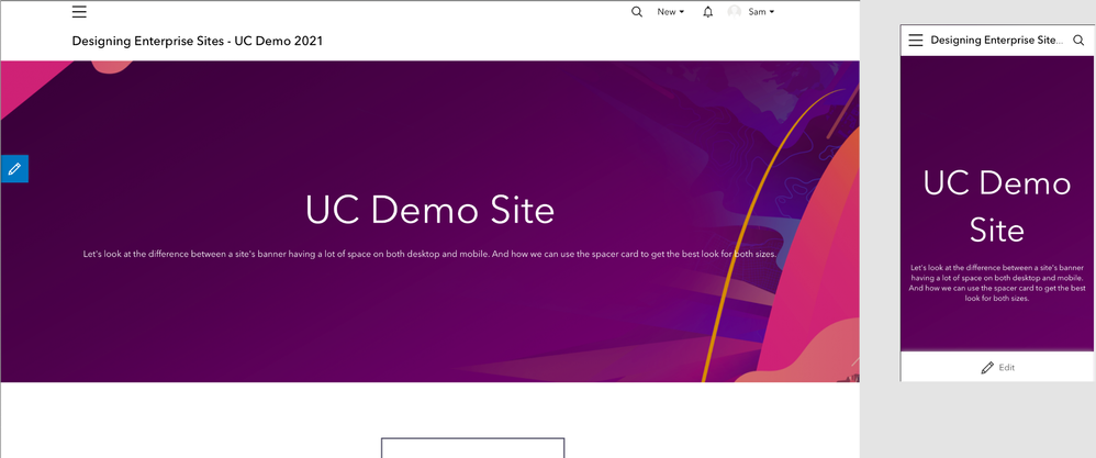
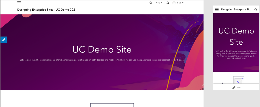
For example, if I want 150px padding on desktop but only 50px on mobile. Drag two spacer cards to the top of your row, setting one to 100px, and have the mobile toggle ON. And the second one to 50px with the mobile toggle left OFF. Repeat for the bottom of the row.
BEFORE: can't see much of the shapes on our background on mobile, so having so much extra space can be a waste.
AFTER: desktop is the same, while more content is in view on mobile.
3. Adjust content max-widths
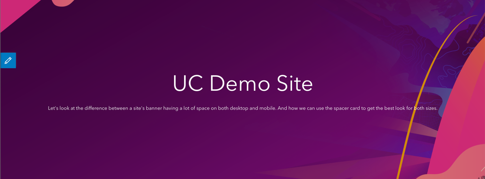
For this example, we'll pay attention to the supporting text below my section header in the images above starting with 'Let's look'. See how it is spanning the full width of the row on the desktop version?
I prefer maintaining shorter line lengths when possible. In this scenario, my text is bleeding into the shapes on my background image decreasing the visibility of the last few words. If I had another full-width row with many lines of text this wide, at this font size, it could also be a challenge for visitors to find the start of the next line since it is so far away.
You might ask, why don't you just add a manual soft line break? Once a window starts to narrow, the content could introduce awkward line-wrapping.
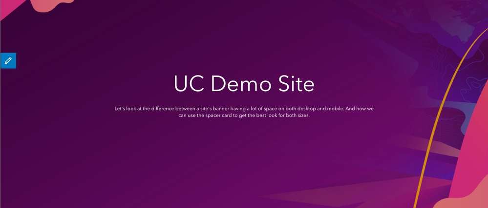
So we can use spacer cards as a way to control the maximum width of this text on wider windows. Drag a spacer card to the left and right of the text card. Set each one to 1px. We do not want the height to affect our layout for this use case. The purpose of these cards is to force the text into a narrower column without needing to apply custom code or manual line breaks.
Finally, use the arrows on the sides to reduce the width of the spacer cards on each side until you get the desired desktop width of your content (meaning you can do this trick on more than just the text card.)
BEFORE:
AFTER:
