- Home
- :
- All Communities
- :
- Products
- :
- ArcGIS for Power BI
- :
- ArcGIS for Power BI Questions
- :
- Re: Symbology Type for Categorical Data
- Subscribe to RSS Feed
- Mark Topic as New
- Mark Topic as Read
- Float this Topic for Current User
- Bookmark
- Subscribe
- Mute
- Printer Friendly Page
Symbology Type for Categorical Data
- Mark as New
- Bookmark
- Subscribe
- Mute
- Subscribe to RSS Feed
- Permalink
- Report Inappropriate Content
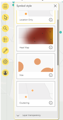
First time using ESRI in PBI so still pretty new to this. I was trying to change the symbology of my data by following this blog. As you can see the symbology type options are much more than what I have available.
What can I do have the the "type and size" symbology type available?
Purpose: To show categorical values using a color palette.
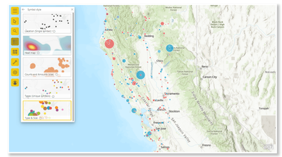
From the blog:
From PBI RS:
Update:
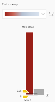
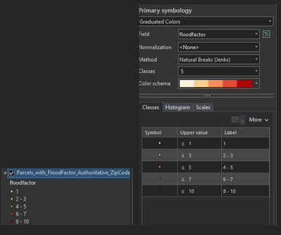
I was able find a way to select a color ramp by placing the data field in color. However, data is classified by count which I don't want as my data is categorical from 1-10. I want to give all the points with value 1 a very light color and so on ending 7-10 with reddish colors.
Desired output (screenshot from ArcPro):
- Mark as New
- Bookmark
- Subscribe
- Mute
- Subscribe to RSS Feed
- Permalink
- Report Inappropriate Content
You could create a new column already containing the categories you wish to use on your map


