- Home
- :
- All Communities
- :
- Products
- :
- ArcGIS Experience Builder
- :
- ArcGIS Experience Builder Questions
- :
- Filter/Display top 10 records
- Subscribe to RSS Feed
- Mark Topic as New
- Mark Topic as Read
- Float this Topic for Current User
- Bookmark
- Subscribe
- Mute
- Printer Friendly Page
Filter/Display top 10 records
- Mark as New
- Bookmark
- Subscribe
- Mute
- Subscribe to RSS Feed
- Permalink
- Report Inappropriate Content
I have a feature service that captures job safety information, including the type of work being performed and the hazards the crew feels are related to that work. The work, and the 80-some hazards, are each separate attributes. Crews utilize Survey123 to select the work they are doing from a list and then select "Yes" for any hazards.
Is there a way to count the number of times a particular hazard was selected so that I can display the top 10 most selected hazards. I'd like a general top 10 as well as being able to correlate a set of top 10 hazards with various job types (maybe have some type of interactive filter that shows the general top 10, but when a particular type of work is selected, the top 10 changes to show the top 10 hazards for that particular job).
- Mark as New
- Bookmark
- Subscribe
- Mute
- Subscribe to RSS Feed
- Permalink
- Report Inappropriate Content
I had part of the same question you asked last week. The best I could come up with is this:
[field] IN (SELECT TOP 1100 [field] FROM [layer] order BY [field])
The problem is that it is on the layer before it is published. I am not sure if it will update automatically. I am not sure there is a way to do it in survey123
- Mark as New
- Bookmark
- Subscribe
- Mute
- Subscribe to RSS Feed
- Permalink
- Report Inappropriate Content
Thanks for the reply. I should have specified that I'd like this top 10 to be displayed either in a dashboard or an Experience Builder webpage - I'd still like all 80-some hazards visible/selectable in Survey123. The dashboard will then display the 10 most selected hazards.
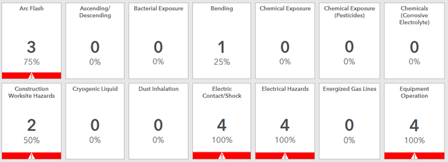
The issue I'm facing is that for every feature, there are over 80 attributes (one for each hazard that is yes/no selectable in Survey123). I've created a dashboard that has indicators for each one of the attributes, and included some conditional formatting to highlight any attribute where the count is 50% or above the total number of records; but, this grid-format of a bunch of numbers is hard to look at when there are over 80 blocks. The red indicator was the only way I could get the most selected hazards to stand out.
Here's a snippet of the dashboard:
