- Home
- :
- All Communities
- :
- Products
- :
- ArcGIS Experience Builder
- :
- ArcGIS Experience Builder Questions
- :
- is it possible to have different header arrangemen...
- Subscribe to RSS Feed
- Mark Topic as New
- Mark Topic as Read
- Float this Topic for Current User
- Bookmark
- Subscribe
- Mute
- Printer Friendly Page
is it possible to have different header arrangements Desktop / Tablet / Mobile ?
- Mark as New
- Bookmark
- Subscribe
- Mute
- Subscribe to RSS Feed
- Permalink
- Report Inappropriate Content
Hello,
is it possible to have different header arrangements Desktop / Tablet / Mobile ?
Currently everything always shifts the same.
However, I want a space-saving header in the tablet / mobile variant, but if I move or delete something there (for example, text or buttons) is also adopted in the desktop variant. (except widgets)


Solved! Go to Solution.
Accepted Solutions
- Mark as New
- Bookmark
- Subscribe
- Mute
- Subscribe to RSS Feed
- Permalink
- Report Inappropriate Content
The Foldable theme includes a premade header that isn't an "actual" header. It's made out of a Fixed Panel widget at the top of the canvas.
So, you can switch the canvas to automatic and adjust the contents of the fixed panel for smaller screens.
(You could also turn on the "actual" header and move all your header widgets there. Then you'll see the header's custom option.)
For tips about optimizing for different screen sizes I recommend this presentation from one of our Developer Summits. The main tools you'll use are size and position settings and the pending list.
- Mark as New
- Bookmark
- Subscribe
- Mute
- Subscribe to RSS Feed
- Permalink
- Report Inappropriate Content
Hi @CP_Leipzig ,
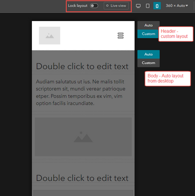
If you disable live view and lock layout, you can enable a Custom layout for header at different screen sizes.
Regards,
Shengdi
- Mark as New
- Bookmark
- Subscribe
- Mute
- Subscribe to RSS Feed
- Permalink
- Report Inappropriate Content
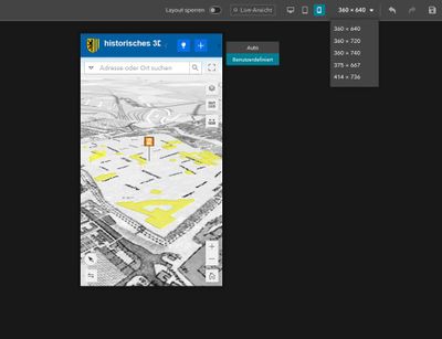
i have only the option "widgets" automatic or custom?
- Mark as New
- Bookmark
- Subscribe
- Mute
- Subscribe to RSS Feed
- Permalink
- Report Inappropriate Content
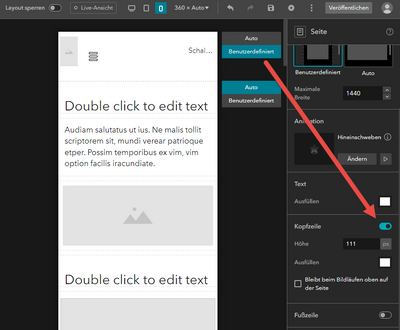
If you only see one Auto/Custom, it is because you don't have the Header enabled.
So, enabling custom means having a custom layout for body, but the result will be the same.
- Mark as New
- Bookmark
- Subscribe
- Mute
- Subscribe to RSS Feed
- Permalink
- Report Inappropriate Content
this option is not available in Foldable theme!
- Mark as New
- Bookmark
- Subscribe
- Mute
- Subscribe to RSS Feed
- Permalink
- Report Inappropriate Content
The Foldable theme includes a premade header that isn't an "actual" header. It's made out of a Fixed Panel widget at the top of the canvas.
So, you can switch the canvas to automatic and adjust the contents of the fixed panel for smaller screens.
(You could also turn on the "actual" header and move all your header widgets there. Then you'll see the header's custom option.)
For tips about optimizing for different screen sizes I recommend this presentation from one of our Developer Summits. The main tools you'll use are size and position settings and the pending list.


