Turn on suggestions
Auto-suggest helps you quickly narrow down your search results by suggesting possible matches as you type.
Cancel
- Home
- :
- All Communities
- :
- Products
- :
- ArcGIS Dashboards
- :
- ArcGIS Dashboards Questions
- :
- Why serial chart on ArcGIS dashboard is different...
Options
- Subscribe to RSS Feed
- Mark Topic as New
- Mark Topic as Read
- Float this Topic for Current User
- Bookmark
- Subscribe
- Mute
- Printer Friendly Page
Why serial chart on ArcGIS dashboard is different from MS Excel?
Subscribe
868
2
06-10-2020 12:48 PM
06-10-2020
12:48 PM
- Mark as New
- Bookmark
- Subscribe
- Mute
- Subscribe to RSS Feed
- Permalink
- Report Inappropriate Content
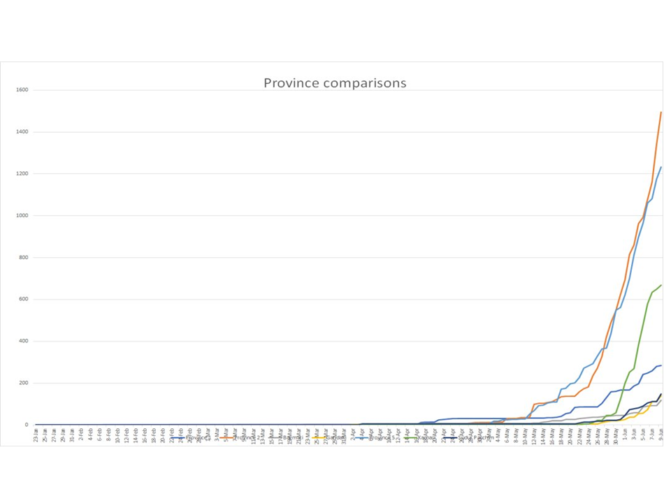
I would appreciate your help on this: What might have caused the graph look different for the same data in Operational Dashboard and Excel? The first graph is serial chart on Op Dashboard, and second graph is a line graph on MS excel. The MS Excel chart seems to be right. But why is the graph different in op dashboard? IS there something I am missing? I have attached the data table that created both graphs. Thank you.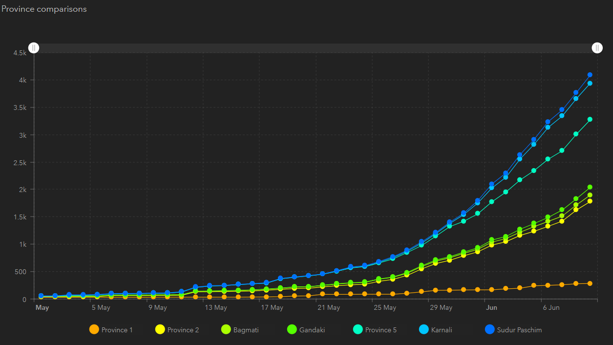
2 Replies
07-20-2020
07:24 AM
- Mark as New
- Bookmark
- Subscribe
- Mute
- Subscribe to RSS Feed
- Permalink
- Report Inappropriate Content
- did you try matching your x and y axis ranges across both charts , at the moment your dates span a large range in excel and your values increment in 500 on your operations dash board
08-11-2020
12:31 AM
- Mark as New
- Bookmark
- Subscribe
- Mute
- Subscribe to RSS Feed
- Permalink
- Report Inappropriate Content
Hi Paul,
I did not do anything to match the values. I found that the staggering option should be turned off for the series. The graph seems to work alright. It took long time to figure this out though. It would have been better if it was obvious and automatically handled.

Thank you.
Kind regards
Indra