- Home
- :
- All Communities
- :
- Products
- :
- ArcGIS Dashboards
- :
- ArcGIS Dashboards Questions
- :
- Re: Separate Fields Plotted on X and Y Axis in a S...
- Subscribe to RSS Feed
- Mark Topic as New
- Mark Topic as Read
- Float this Topic for Current User
- Bookmark
- Subscribe
- Mute
- Printer Friendly Page
Separate Fields Plotted on X and Y Axis in a Series Chart Created in an Operations Dashboard
- Mark as New
- Bookmark
- Subscribe
- Mute
- Subscribe to RSS Feed
- Permalink
Hi, This may have been answered elsewhere, but I have searched high and low to no avail. Is it possible when creating a series chart based on 1 data layer in an Operations Dashboard to have the x-axis pull data from one field and the y-axis pull data from another field? Both fields are included in the schema of the data layer the Series Chart is referencing. I am only able to plot more than 1 field as either separate series on 1 axis or separate categories on 1 axis.
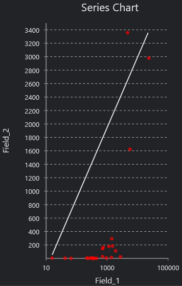
I am trying to achieve similar results to charts I have created in ArcGIS Pro that have different fields plotted on each axis to display trends in the scatter plot (see attached image). I was trying to avoid exporting the plots out as images to embed in the dashboard. I would like the data points represented in the series dynamically changing from filters that I select in the left panel. I can see how to achieve this through actions placed on the filters, but I need the data plotted appropriately first. Thanks in advance!

- Mark as New
- Bookmark
- Subscribe
- Mute
- Subscribe to RSS Feed
- Permalink
I want to do the exact same thing and am surprised it's not already an option.
- Mark as New
- Bookmark
- Subscribe
- Mute
- Subscribe to RSS Feed
- Permalink
To be honest, operation dashboard is far away from the mature stage. I wonder how come their development team does not develop this type of important and commonly used features. After developing a few dashboards, I came to the conclusion that its not a wise decision to use it. So many limitations and bugs
- Mark as New
- Bookmark
- Subscribe
- Mute
- Subscribe to RSS Feed
- Permalink
All,
Please submit an enhancement in the ArcGIS Ideas for Ops Dashboard site. This will help draw attention to the functionality you feel is missing and help us prioritize what to work on next, as we can gauge interest from the user community.
Hi Muhammad,
The Ops Dashboard Dev team are striving to make the best product possible. If you have specific issues, please mention them on GeoNet so we can take a look. Thanks.
Hope this helps,
- Mark as New
- Bookmark
- Subscribe
- Mute
- Subscribe to RSS Feed
- Permalink
It looks like you can do this using the serial chart option. You'll want to select the 'features' type. The category is your x value and the series is your y value. Took a second to work it out but it looks great! I wish we could add trendlines easier, though!