- Home
- :
- All Communities
- :
- Products
- :
- ArcGIS Dashboards
- :
- ArcGIS Dashboards Questions
- :
- Re: How to graph a data element that can have mult...
- Subscribe to RSS Feed
- Mark Topic as New
- Mark Topic as Read
- Float this Topic for Current User
- Bookmark
- Subscribe
- Mute
- Printer Friendly Page
How to graph a data element that can have multiple values?
- Mark as New
- Bookmark
- Subscribe
- Mute
- Subscribe to RSS Feed
- Permalink
I'm very new to dashboards. I'm creating my first dashboard from the results of a Survey123 form. The survey has some demographic data. For the ethnicity question, one or more values from the following list can be selected:
1 = Asian
2 = Black/African American
3 = Hispanic/Latino(a)
4 = Middle Eastern or South Asian
5 = Native American
6 = Pacific Islander
7 = White
The result of this ethnicity question is a string of values separated by a comma ",". Here are some examples:
3
2,3
7
1,2,3
4
How can I show the results in a serial or pie chart? I'm not sure how to accurately depict the answers to ethnicity question. Most graphs I've seen show the totals for each ethnicity and don't attempt depict multiple values in one answer. I'm trying to find out my options with dashboard as well as best practices to depict these data.
Solved! Go to Solution.
Accepted Solutions
- Mark as New
- Bookmark
- Subscribe
- Mute
- Subscribe to RSS Feed
- Permalink
Chuck,
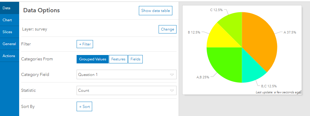
I generated an example using a multiple choice question in Survey123. What result do you get when selecting a pie chart and assigning the following parameters? Picture for reference.
-Categories From = Grouped Values
-Category Field = ethnicity question
-Statistic = Count
Jake
- Mark as New
- Bookmark
- Subscribe
- Mute
- Subscribe to RSS Feed
- Permalink
Jake,
Thanks for your response. I've given this more thought. I think that I need the option of showing percentages for each individual ethnicity. I expect thousands of responses. Given that there are 7 possible answers, there could be 25, 50, or 100 different combinations. This would make it challenging or impossible to add the correct labels as well. I think that my only option is to add 7 calculated fields to my survey (hidden from the user) to keep totals for each individual response. Then, in my dashboard show those 7 fields in a serial or pie chart. I may need to break it down by gender as well. Do you think that will work?
Thanks,
Chuck
- Mark as New
- Bookmark
- Subscribe
- Mute
- Subscribe to RSS Feed
- Permalink
I found the answer here: https://community.esri.com/thread/231709-survey-results-in-operations-dashboard