- Home
- :
- All Communities
- :
- Products
- :
- ArcGIS Dashboards
- :
- ArcGIS Dashboards Ideas
- :
- Separate fields plotted on X and Y axis in a serie...
- Subscribe to RSS Feed
- Mark as New
- Mark as Read
- Bookmark
- Follow this Idea
- Printer Friendly Page
- Report Inappropriate Content
Separate fields plotted on X and Y axis in a series chart created on the operations dashboard.
- Mark as New
- Bookmark
- Subscribe
- Mute
- Subscribe to RSS Feed
- Permalink
- Report Inappropriate Content
I have noticed that the operation dashboard does not give liberty to select the Y-axis value when you create a series chart. This is one of the common, basic, and frequently used feature present in all dashboard building software and statistical tools. I am literally surprised that how could you miss such an important feature from the dashboard. I have been working on dashboard applications for more than two years now. I have started using an operation dashboard for about two months now. I don't have a very good feeling to keep using the operation dashboard or recommending other colleagues to use the operation dashboards due to limited functionality and bugs present in your application.
- Mark as Read
- Mark as New
- Bookmark
- Permalink
- Report Inappropriate Content
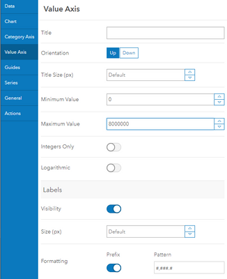
@MuhammadYasir Could you please provide more details? In their default orientation, the Y-Axis of a serial chart what we call the Value Axis. The values displayed on that axis can be determined automatically or set manually. Is that the feature you are looking for, or something else altogether?
- Mark as Read
- Mark as New
- Bookmark
- Permalink
- Report Inappropriate Content
Closing due to inactivity and lack of engagement by the community. Can re-open if more details are provided.
You must be a registered user to add a comment. If you've already registered, sign in. Otherwise, register and sign in.
