- Home
- :
- All Communities
- :
- Products
- :
- ArcGIS Dashboards
- :
- ArcGIS Dashboards Ideas
- :
- Allow sorting by statistic in stacked dashboard se...
- Subscribe to RSS Feed
- Mark as New
- Mark as Read
- Bookmark
- Follow this Idea
- Printer Friendly Page
- Report Inappropriate Content
Allow sorting by statistic in stacked dashboard serial chart
- Mark as New
- Bookmark
- Subscribe
- Mute
- Subscribe to RSS Feed
- Permalink
- Report Inappropriate Content
Please allow us to sort by the statistic in the serial chart widget in ArcGIS Dashboards when stacking & splitting by a field.
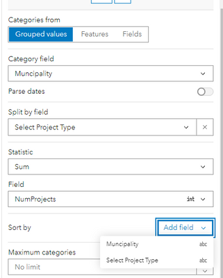
As of Oct 2022 in the new Dashboards in ArcGIS Online, I cannot sort these columns so that the tallest one is first. In this example, I have category (horizontal axis) = municipality, split by (colors) = project type, and statistic (height of columns) = SUM of field "# of projects". I would like to be able to sort by the statistic so that the municipality with the greatest total # of projects" is first.
- Mark as Read
- Mark as New
- Bookmark
- Permalink
- Report Inappropriate Content
There have been some recent improvements to serial charts and the ability to sort by both the category field and the split field.
- Mark as Read
- Mark as New
- Bookmark
- Permalink
- Report Inappropriate Content
Hi @patrickb , it does not look like this has been implemented and now I can no longer sort by the statistic when using "Split by Field". I'm using the new dashboards (not classic) in ArcGIS Online.
Interestingly, if I select "Split by Field" after everything is set up, "Sort by Statistic" stays. But still, this only sorts the colors within the column and not the columns themselves. Right now, I can only do that with Municipality name (the Category), so alphabetically.
Is there a way I can sort my graph so that the tallest column (most total projects) is first?
- Mark as Read
- Mark as New
- Bookmark
- Permalink
- Report Inappropriate Content
@ChelseaRozek Thanks for staying on this, I'm seeing the exact same thing.
@patrickb Perhaps the status of this idea should still be Open?
- Mark as Read
- Mark as New
- Bookmark
- Permalink
- Report Inappropriate Content
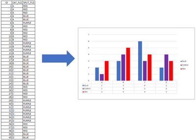
Thanks for the feedback (and apologies for the delay). When a serial chart is configured to use the split by option, the end result is a chart that has multiple categories (the categorized field) and multiple series (determined by the split by field). When displayed, the categories are displayed along the category axis and within each category there will be a data point for each series.
The improvement we made to serial chart in the split by case is that you can now (predictably) sort the series within the categories. This sorting shows up in the legend (if you choose to display it). Conceptually, we are building a dataset something like the following that can be handed off to the chart for rendering:
In previous releases, we exposed the statistic as a sorting option in the split by case. This was actually a bug/oversight in our testing, and not in harmony with the chart we had envisioned and spec'd out. Selecting that config option did not (predictably) affect the chart that got rendered, and this explains why it was removed. Unfortunately, your observation that "if I select "Split by Field" after everything is set up, "Sort by Statistic" stays ... is another oversight in our testing.
With the above in mind, your use case for sorting data points based on their calculated statistic within each category might make sense for some workflows. For that, I would suggest submitting a new idea for the community to vote on. It would have a descriptive title, and perhaps some quick mockup diagrams of the desired chart. (I can re-open this idea, but cannot change the title. With the current title, the idea was not gaining much traction).
- Mark as Read
- Mark as New
- Bookmark
- Permalink
- Report Inappropriate Content
Hi @patrickb, thanks for the insight and feedback! I agree my idea was confusing. I've remade the title and description to clarify. If you think it's ok now, would you mind reopening the idea?
- Mark as Read
- Mark as New
- Bookmark
- Permalink
- Report Inappropriate Content
- Mark as Read
- Mark as New
- Bookmark
- Permalink
- Report Inappropriate Content
I logged exactly this issue as a bug. ESRI states that this is a "known limitation" and though their documentation and promotional materials mention this capability as an option, it has not been implemented.
This is an "enhancement" request now, and "might" get addressed in a future AGOL release.
You must be a registered user to add a comment. If you've already registered, sign in. Otherwise, register and sign in.


