- Home
- :
- All Communities
- :
- Products
- :
- ArcGIS Business Analyst
- :
- ArcGIS Business Analyst Questions
- :
- Re: Is there a way to copy custom Business Analyst...
- Subscribe to RSS Feed
- Mark Topic as New
- Mark Topic as Read
- Float this Topic for Current User
- Bookmark
- Subscribe
- Mute
- Printer Friendly Page
Is there a way to copy custom Business Analyst Online (BAO) reports between countries?
- Mark as New
- Bookmark
- Subscribe
- Mute
- Subscribe to RSS Feed
- Permalink
- Report Inappropriate Content
I'm new to working with BAO so forgive me if this has been asked before. Our organization creates a lot of custom reports for many different countries around the world. The reports have a lot of commonalities like headers, footers, nearby location tables pulling from our hosted layers in AGOL, and other custom formatting.
Every time I want to create a new report for a new country I have to create the entire report over from scratch unlike If I'm working in the same country where I can pull in sections from existing reports which is super useful.
Is there a way to share specific custom report sections so they can be used in any custom report for any country in BAO?
Thanks,
Ian
- Mark as New
- Bookmark
- Subscribe
- Mute
- Subscribe to RSS Feed
- Permalink
- Report Inappropriate Content
Hello Ian,
Thank you for your question. It is a good one!
One way to accomplish this is to use custom infographics that, similar to custom reports, can have custom headers, footers, nearby location tables pulled from your hosted layers in AGOL, and other custom formatting. You can download custom infographic templates and import them in other countries.
More details on this are in the second topic in the blog here: https://www.esri.com/arcgis-blog/products/bus-analyst/analytics/whats-new-in-business-analyst-decemb... and in the My templates section in the help documentation here: http://doc.arcgis.com/en/business-analyst/web/building-infographic-reports.htm#ESRI_SECTION1_6F191F7...
Hope this helps.
I am also curious to understand if some of your trade areas are crossing multiple countries?
Thank you,
Praveen Srivastava
ArcGIS Business Analyst Team
- Mark as New
- Bookmark
- Subscribe
- Mute
- Subscribe to RSS Feed
- Permalink
- Report Inappropriate Content
Thanks for the reply, Praveen. That's good to know that you can copy sections from custom infographics. We haven't really used the infographics much but I'll certainly look into them more given that it looks like this is going to be the easiest way to do it.
One feature the we really like with the reports that I'm wondering if it can be replicated in the infographics is the ability to have demographics data from three different buffer rings in a table side by side. Right now, users have to toggle between pages on the infographic to view information for different buffer sizes which doesn't seem like that big of a deal but if you're looking a lot of different locations, it's considerably easier to just view the demographic information for the different buffer sizes on the same page.
We don't have trade areas that cross country borders, mainly because of the delay and complexity of getting across international borders in the areas we operate. People would chose to go to a location in their own country rather than cross the border so the trade area stays in one country.
Thanks,
Ian
- Mark as New
- Bookmark
- Subscribe
- Mute
- Subscribe to RSS Feed
- Permalink
- Report Inappropriate Content
Yes, please try out infographics and let me know if it works well for you. Any feedback is welcome too!
Actually, using multiple buffer sizes on the same page is possible in infographics as well. Please refer to the infographics section here: https://doc.arcgis.com/en/business-analyst/web/building-infographic-reports.htm#ESRI_SECTION1_6F191F.... There are several standard panels that allow comparing multiple buffers in one view. You can create custom ones too.
Also, thanks for answering my question about trade areas crossing multiple countries.
Praveen
- Mark as New
- Bookmark
- Subscribe
- Mute
- Subscribe to RSS Feed
- Permalink
- Report Inappropriate Content
Hi Praveen, I just wanted to post an update.
The multiple buffer sizes in the infographic seem to work well for the most part, however I have come across an issue when using them in an infographic that's run from the Business Analyst Report Widget in the Web App Builder.
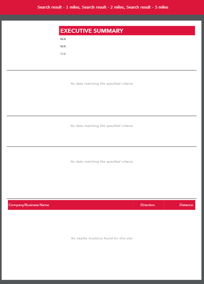
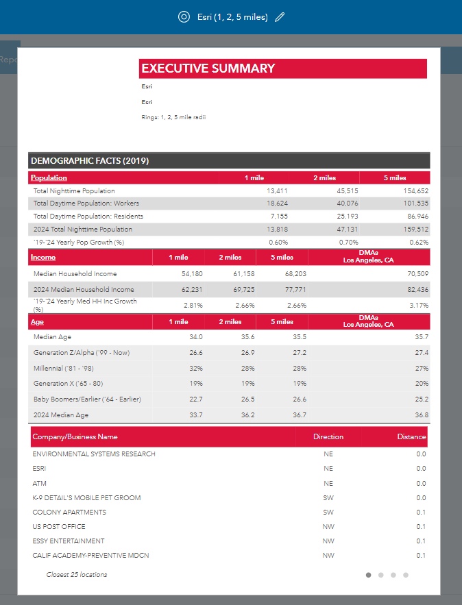
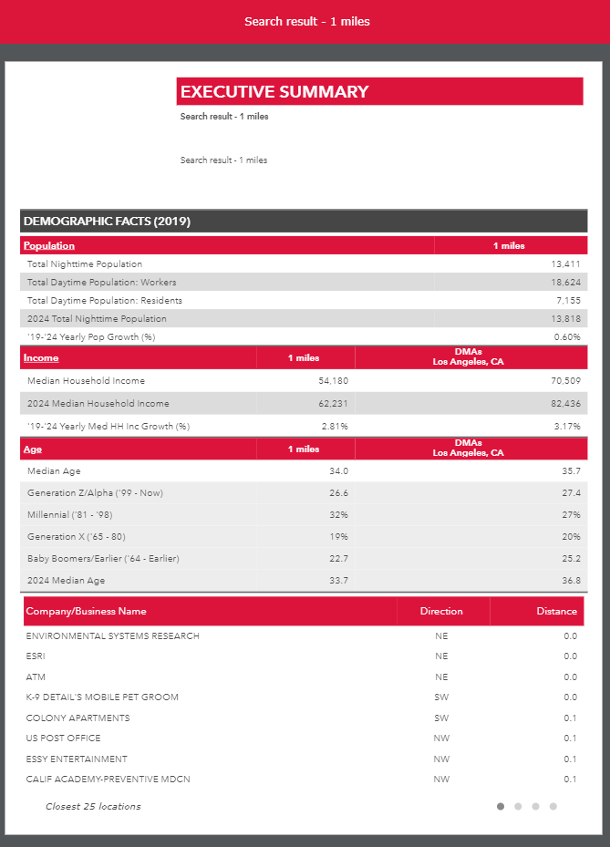
If I create an infographic with just the comparison table and run it from the widget in the web app builder using three distance rings everything works fine (see Report 1 image). However, when I add a Near table to the infographic and run it again from the widget in the web app builder using three distance rings, the entire infographic is blank (see Report 2 image). Interestingly enough, if I run the same infographic with the Near table from Business Analyst Online, everything works fine (see Report 3 image). Finally, if I only use one buffer ring or a polygon to run the infographic using the widget in the web app builder, everything works fine (see Report 4 image).
So there seems to be a problem when you combine a table that uses multiple buffer sizes and a table/infographic that lets you pick the specific ring from the drop down at the top of the screen when you run the infographic from
he Business Analyst Report Widget in the Web App Builder.
Also, on a different note I think I found another issue with data filters not working on feature classes from ArcGIS Online that have more than one sublayer. Where would be the best place to report this issue?
Thanks,
Ian
Report 1

Report 2
Report 3
Report 4
- Mark as New
- Bookmark
- Subscribe
- Mute
- Subscribe to RSS Feed
- Permalink
- Report Inappropriate Content
Hi, Ian,
Thanks for noting these. You can report bugs by clicking on "report bug" link under our support page here: https://support.esri.com/en/request-case
Thank you!
Helen
- Mark as New
- Bookmark
- Subscribe
- Mute
- Subscribe to RSS Feed
- Permalink
- Report Inappropriate Content
Hello Ian,
Thanks for reporting the issue with the BA widget in WAB when the infographic template contains a comparison and nearby table. We are able to reproduce the issue and we have an internal bug to track it.
Best regards,
Fasil T.
Business Analyst Team
- Mark as New
- Bookmark
- Subscribe
- Mute
- Subscribe to RSS Feed
- Permalink
- Report Inappropriate Content
Great, thanks for the update