- Home
- :
- All Communities
- :
- Products
- :
- ArcGIS Business Analyst
- :
- ArcGIS Business Analyst Questions
- :
- Create My Custom Infographic
- Subscribe to RSS Feed
- Mark Topic as New
- Mark Topic as Read
- Float this Topic for Current User
- Bookmark
- Subscribe
- Mute
- Printer Friendly Page
Create My Custom Infographic
- Mark as New
- Bookmark
- Subscribe
- Mute
- Subscribe to RSS Feed
- Permalink
Hello Everbody!
1 - I want create my infographics using points and not services areas or other radial circles.It´s Possible?
If not possible, step to the next remaining questions.
2 - I have 1500 attributes, will I have to create custom infographics for each one, or is there a dynamic formula like there are in the pop-ups config?
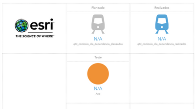
3 - Why do my variables appear as follows? You can see the image below.
Best regards
- Mark as New
- Bookmark
- Subscribe
- Mute
- Subscribe to RSS Feed
- Permalink
Hello @JoaoPinto',
Let me start by answering your last question (#3). I encourage you read this blog first as I already covered why your infographics might return N/A values: https://community.esri.com/t5/arcgis-business-analyst-blog/best-practices-when-sharing-and-running/b...
Please note that using infographics is a two step process:
Step 1: Build your infographics using your data source.
Step 2: Run the infographics you created by selecting your desired sites.
Decide which data source option (out of the first 4 options I mentioned in the blog) works best for you and make sure you follow the instructions.
#1. You can create/build your infographics by adding your point layer using the first 4 options I mentioned in the blog. However, how you can run the infographics depends on which option you used. For example, if you used Map Layers option, you have to click on the point features on the map > create a buffer and then run the infographics. Although you are creating a buffer here on the point feature, the infographics will simply return the attributes from that point feature.
Note: You run infographics on buffers, polygons, geographies, ring, drive times, and walk times areas. I assume this will answer your first question.
#2. No, you can add as many variables as you need to your infographics from your point layer. Once the infographics is created, you can run it again and again on any desired location to get the attributes. For example, let's say your point layer covers multiple states and you want to summarize the number of point features in each state. You will build the infographics using the nearby table option and then run the same infographics by defining your states from the Define Areas > Select Geography workflow in the application.
You mentioned that this is a country wide project so I assume you want to summarize the attributes from your point layer. So all you need to do is decide which data input type will work best for you and then build your infographics. Then run the infographics at country level or state level.
I hope this help.
Fasil T.
BA Team
- Mark as New
- Bookmark
- Subscribe
- Mute
- Subscribe to RSS Feed
- Permalink
Hello @FasilTiru !
Thanks for your great help! it has been very helpful!
I will explain in more detail.
I have 500 train stations and I have to create an infographic for each one with the following variables:
Passenger entries and exits in 2019 and 2020; Train entry and exit in 2019 and 2020 and finally, the type of train used in 2019 and 2020)
I'm only using a feature layer for this, it was the only way to project the data (My source goes through Site Attributes).
But the ideal was to cross information from anothers layers or in this case, each layer, a corresponding variable.
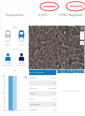
Another very important question will be how to filter values or create a filter as shown in the following example: (Filter by Year and Filter By Type of Train)
Best Regards
- Mark as New
- Bookmark
- Subscribe
- Mute
- Subscribe to RSS Feed
- Permalink
Hi @JoaoPinto,
Are the attributes you described for 2019 and 2020 for each train station in the same feature? Looking at your infographic above, it looks like the site attributes are currently shown for 2019 only for each feature.
If your goal is to get additional information about the same train station from a different layer that is overlapping, I suggest trying the nearby panel.
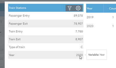
This panel will allow you to show the desired attributes from another point features within your site. For example, I was able to show both the 2019 and 2020 information about the same train station as follows:
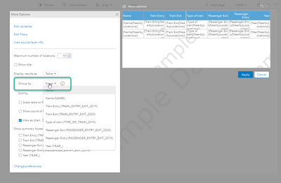
A nearby table will also allow you to group your attributes as needed.
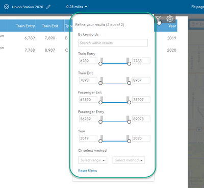
Then when you run the infographics, you will see the option to filter by any attributes:
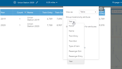
And group by any attribute:
I am not sure how you can accomplish filter by additional attributes otherwise as your data input is the site attributes from that specific train station. When you use site attributes in a table format, you can only show the attributes from that train station only.
I hope this helps. If you need additional assistance, I recommend connecting with out tech support.
Best Regards,
Fasil T.
- Mark as New
- Bookmark
- Subscribe
- Mute
- Subscribe to RSS Feed
- Permalink
Hello @FasilTiru
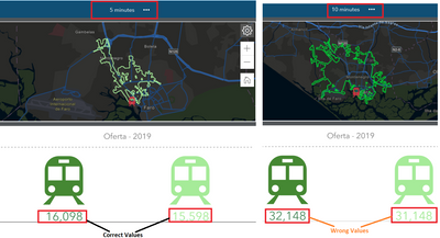
I don't want services areas option. Because the second(10mins) and third(15mins) image data are already invented.
How do I analyze without these time or km options?
Best regards
- Mark as New
- Bookmark
- Subscribe
- Mute
- Subscribe to RSS Feed
- Permalink
Hi @JoaoPinto,
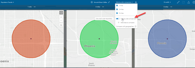
I see that you are using side-by-side comparison option. That is why you see all 3 sites. You can toggle that off here:
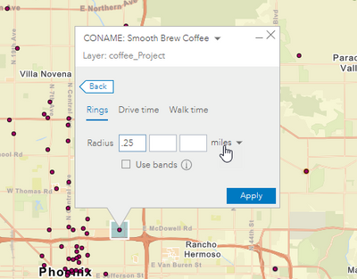
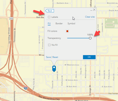
Please note that you have to define an area (ring, drive time, walk time, polygon, or geography) to run infographics. And if you are trying to hide the site areas from the infographics, you can either use the smallest values allowed for rings and drive times or use transparency on your sites.
I hope this answers your question.
Fasil
- Mark as New
- Bookmark
- Subscribe
- Mute
- Subscribe to RSS Feed
- Permalink
Thanks @FasilTiru by the answer.
But is there, for example, creating infographics without defining areas by time or kilometers?
because the data for the 5 mins or 1 km is correct, the data for the 10 mins or other next kms option is invented.
The data doesn't make any sense for the following options, nor do I know where the platform will get those values.
Can't I also remove these options that you see with the rings on the dashboard?
Thank you for all
