- Home
- :
- All Communities
- :
- Products
- :
- ArcGIS Business Analyst
- :
- ArcGIS Business Analyst Questions
- :
- BA Infographic inconsistent population count
- Subscribe to RSS Feed
- Mark Topic as New
- Mark Topic as Read
- Float this Topic for Current User
- Bookmark
- Subscribe
- Mute
- Printer Friendly Page
- Mark as New
- Bookmark
- Subscribe
- Mute
- Subscribe to RSS Feed
- Permalink
- Report Inappropriate Content
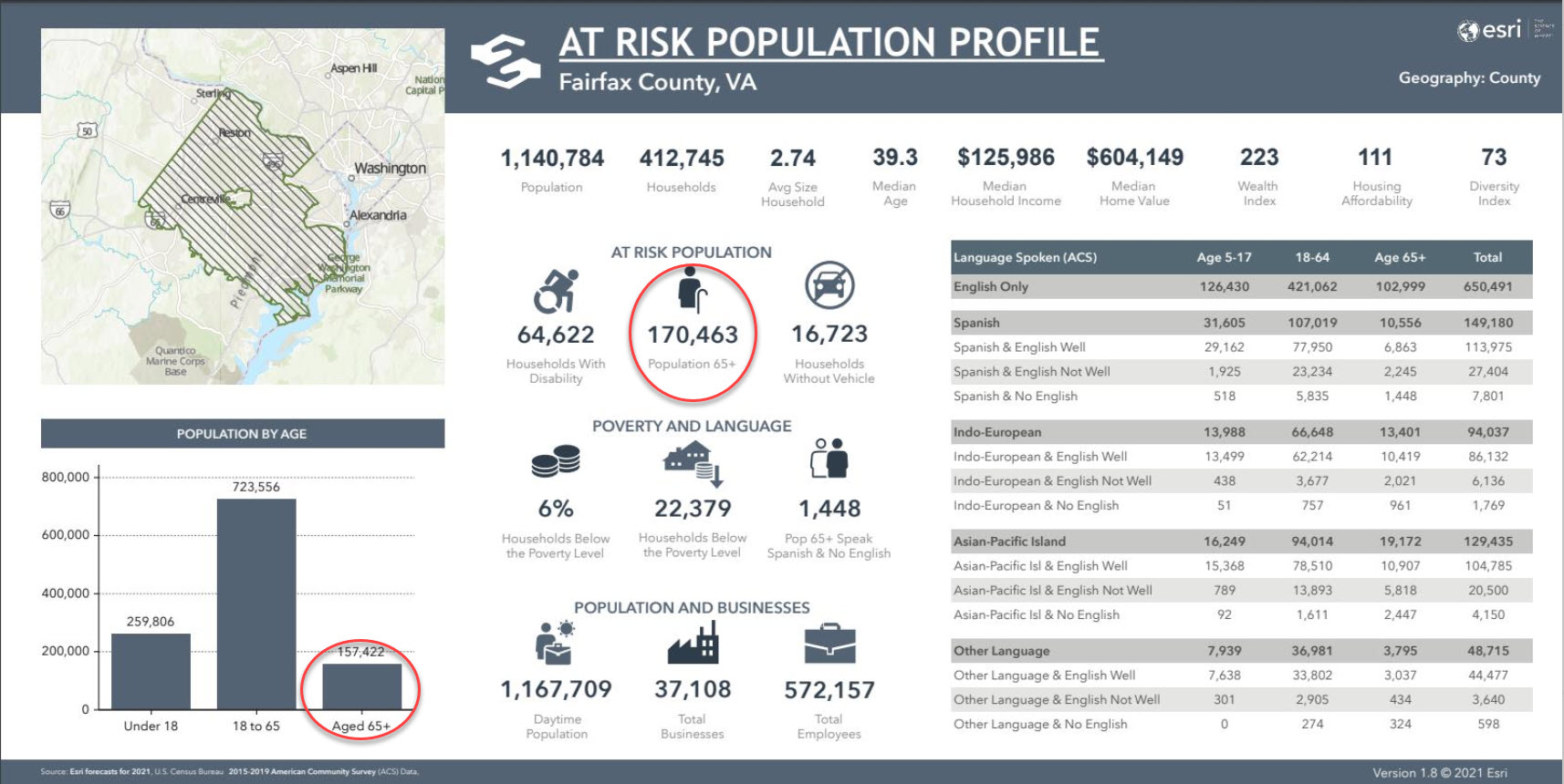
Why am I getting different population counts for the 65+ age demographic? Population by age graph adds up correctly to total population. Probably a 2 dataset source issue giving different counts, understandable but difficult to explain to upper management without sited data sources. Infographics are slick, pretty and fast. But also a kind of a black box. If I am missing explanatory documentation, pls let me know!
ArcPro 2.8.3
Geoprocessing > Summary Reports > Tapestry Seg Area Profile
Environment > Data Source > United States (Portal)
Solved! Go to Solution.
Accepted Solutions
- Mark as New
- Bookmark
- Subscribe
- Mute
- Subscribe to RSS Feed
- Permalink
- Report Inappropriate Content
This is a good catch! The mismatch is happening because the Aged 65+ bar in the chart is not using the Total Population Age 65 variable. This variable is being used in the Age 18-65 bar. This is incorrectly configured and we will get this fixed. The value of Population 65+ in the At Risk Population panel is correct (this does include Population Age 65).
Please let me know if you have any questions.