- Home
- :
- All Communities
- :
- Products
- :
- ArcGIS Business Analyst
- :
- ArcGIS Business Analyst Blog
- :
- How to dynamically update the data in an exported ...
How to dynamically update the data in an exported or shared custom infographics?
- Subscribe to RSS Feed
- Mark as New
- Mark as Read
- Bookmark
- Subscribe
- Printer Friendly Page
- Report Inappropriate Content
Overview
In a previous article, we covered the various data sources you can use to build custom infographics with your own data. One of those data sources is Map Layers. In this article, we will discuss a special feature available when building infographics with this type of data source, and export the infographics to dynamic HTML, or share it in ArcGIS Dashboard and StoryMaps.
One of the main advantages of building your infographics from map/feature layer attributes is that you get the latest data whenever you run the infographics. This is very import if your data is frequently updated and you want those changes reflected in your custom infographics right away.
You can also enable this functionality when exporting your infographics to dynamic HTML, or share it via Dashboard and StoryMaps. Let's use the following use case to demonstrate this functionality.
Build infographics with map layer attributes
Let's say our task is to build a custom infographics that shows the daily Covid-19 trends in US counties. The first step is find the right data source and use the Map Layer attributes from that feature/map layer.
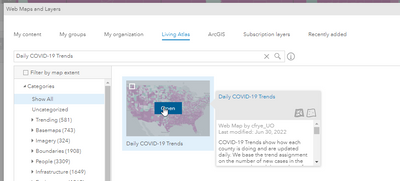
1. Go to Maps tab > Add Data > Web Maps and Layers
2. Click on the Living Atlas tab > and search for "Daily COVID-19 Trends"
3. Click Open to add it to the map.
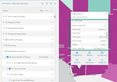
4. Click on one of the counties on the map and expand the attributes. We will build a sample infographics using some of these attributes.
5. Go to Reports > Build Report > Build Infographics
6. Click Add element > Infographic > click + Create infographic panel
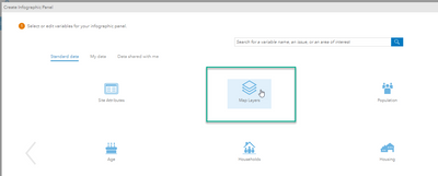
7. You will see the Map Layers category. Click and open it. Please note that this option becomes available only when you have map layer on the map.
8. You will see two layers listed for the Daily COVID-19 Trends web map you added above. Expand the County Trends (Map Layers) and select the following 3 variables: Total Cases, Trend Rank, and Trend Type
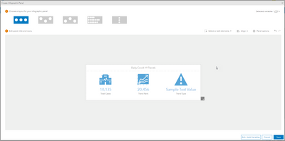
9. You can further customize your infographic panel to look something like this.
10. Save the panel and add it to your template. Then save the template.
Run and export infographics with map layer attributes
We are now ready to run the sample custom infographics.
1. Switch to the Maps tab and click on any county on the map. The site menu will open.
2. Click the Infographics button and select the custom infographic from the list.
Since the data source is updated daily, this infographics will show the latest values from today. Now, let's export this to a dynamic HTML.
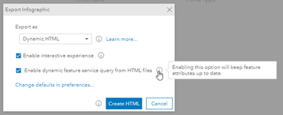
3. Click Export infographic and select Dynamic HTML from the list. Notice the option to Enable dynamic feature query from HTML files is available because the infographic template contains attributes from a Map Layers data source.
4. When this option is enabled, the exported infographic HTML will automatically update with the latest data from the feature/map layer whenever you open or refresh it. Please note that the data source (feature/map layer) must be publicly accessible for this functionality.
Sharing infographics with map layer attributes to ArcGIS Dashboard and ArcGIS StoryMaps
Instead of exporting individual infographic to HTML one at a time, you might want to share it in a dashboard/storymaps by embedding the infographics for multiple sites or export the Dynamic HTML for multiple sites using Run Infographics workflow.
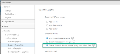
1.Go to Preferences > Reports > Infographics > Export infographics > check this option:
2. Click Save and Close
3. Let's say we want to share this infographic to a dashboard by including only the counties in Arizona.
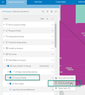
4. Expand the project table of contents and click the Filter by attributes option for the County Trends layer.
5. Filter the layer using State Abbr. and selecting AZ from the list. Notice only the counties in Arizona are shown on the map now. Click Done.
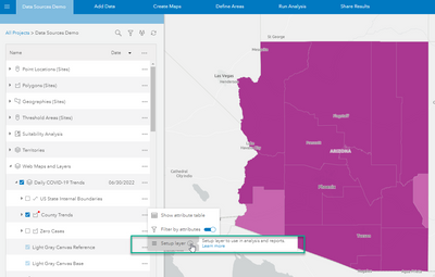
6. Click the action option for the County Trends layer again and click Setup layer to prepare the layer for use in analysis and reports.
7. Select County Name as item name and click Setup Layer
8. You can leave the default Polygon layer option and click OK.
9. Now we're ready to create a dashboard. Go to Maps tab > Share Results > ArcGIS Dashboard
10. Select Many sites ---> Same infographic option. And then Side layout
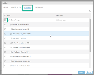
11. Click Add Sites and select the From layers tab. Select all counties in Arizona and Apply
12. Click Next and select the custom infographic from the list.
13. Add a title to the dashboard and click Create.
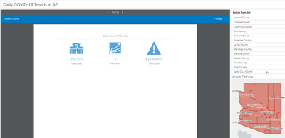
14. Open the dashboard app when ready. The embedded infographics will dynamically update for each county when the data is updated daily from the data source. This is a great feature to have since your audience will see the latest daily data whenever they access the dashboard application.
You can apply the same workflow when sharing the infographics in StoryMaps.
Additional notes:
You can use attributes from Map Layers in other infographic elements like charts, advanced texts, and tables. Simple calculations (sum and average) created from these attributes are also supported.
Currently, only infographics with attributes from feature/map layers support this dynamic update feature. Custom data or other Esri standard variables do not dynamically update after being exported/shared.
This functionality is also available when adding nearby panels in infographics using your own point feature layers. Please note that the feature/map layers must be publicly available for the data update query to work. Otherwise, users will be prompted to sign in to access the data source when opening the exported infographics.
This functionality is not available in the Business Analyst Widgets for Web AppBuilder and Experience Builder.
You must be a registered user to add a comment. If you've already registered, sign in. Otherwise, register and sign in.
