- Home
- :
- All Communities
- :
- Developers
- :
- JavaScript Maps SDK
- :
- JavaScript Maps SDK Questions
- :
- Re: Disable Expand widget responsive
- Subscribe to RSS Feed
- Mark Topic as New
- Mark Topic as Read
- Float this Topic for Current User
- Bookmark
- Subscribe
- Mute
- Printer Friendly Page
- Mark as New
- Bookmark
- Subscribe
- Mute
- Subscribe to RSS Feed
- Permalink
- Report Inappropriate Content
My expand widget height gets too big and looks really bad in responsive mode. For example, when I add a print widget to the expander and the browser width is resized the expanded content increases the height and snaps to the edge of the browser. This makes it difficult to see and even use the print export controls. I am looking for a way to keep the size of the expanded content equal size in either desktop or mobile. Is there CSS I can add to override this? Thanks!
The expanded content here has good dimensions when not in responsive mode
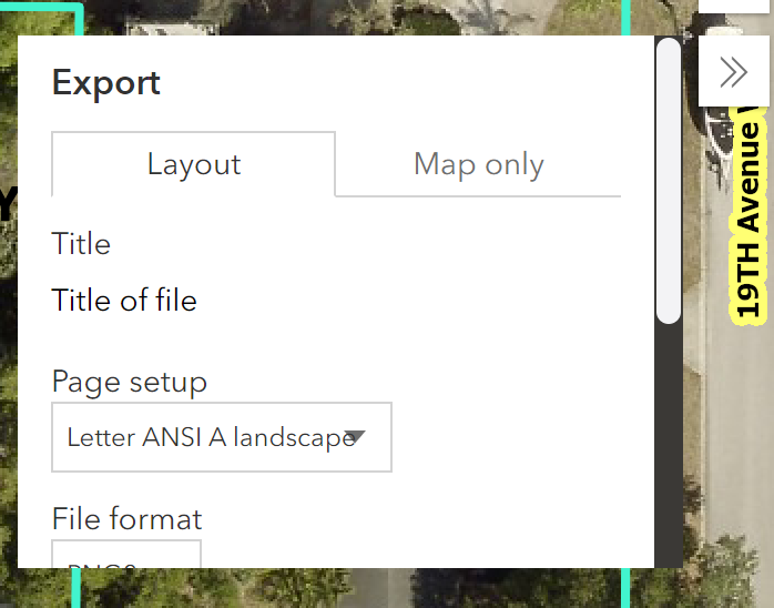
Responsive mode

Solved! Go to Solution.
Accepted Solutions
- Mark as New
- Bookmark
- Subscribe
- Mute
- Subscribe to RSS Feed
- Permalink
- Report Inappropriate Content
You can define the expand.mode as "floating" to keep the expand widget from changing based on the browser width.
Expand | ArcGIS API for JavaScript 4.17
const expand = new Expand({
  content: widget,
  mode: "floating"
});- Mark as New
- Bookmark
- Subscribe
- Mute
- Subscribe to RSS Feed
- Permalink
- Report Inappropriate Content
Exactly what I needed. Thanks!