- Home
- :
- All Communities
- :
- Products
- :
- ArcGIS Pro
- :
- ArcGIS Pro Ideas
- :
- Wrap Chart Labels in ArcGIS Pro
- Subscribe to RSS Feed
- Mark as New
- Mark as Read
- Bookmark
- Follow this Idea
- Printer Friendly Page
- Report Inappropriate Content
- Mark as New
- Bookmark
- Subscribe
- Mute
- Subscribe to RSS Feed
- Permalink
- Report Inappropriate Content
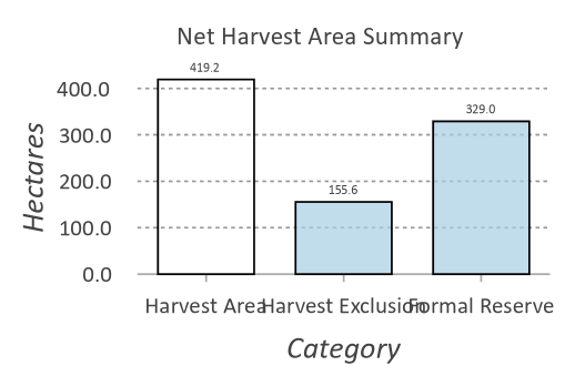
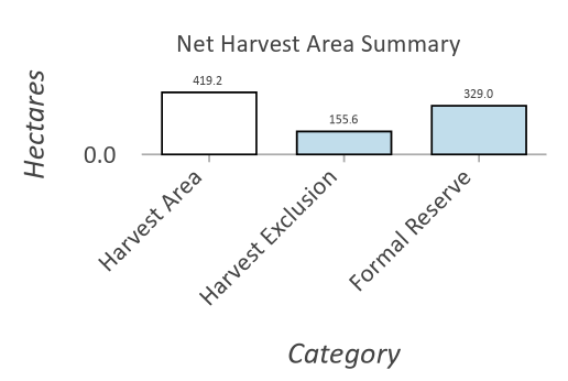
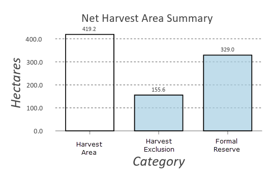
I've been playing around with charts in ArcGIS Pro as a way of showing statistics for data within the map fram (i.e. Sum of feature area by category). These products are map focused products with the statistics as a feature in the legend. Obviously, it would be handy if I could just have the statistics (i.e. in a Pivot Table style product, but thats a separate request). My issue is that the space for the chart is limited, and the labels are often too long to fit nicely. It would be good if in the Chart Formatting the labels on the X axis could be wrapped so that they use multiple lines instead of overlapping each other.
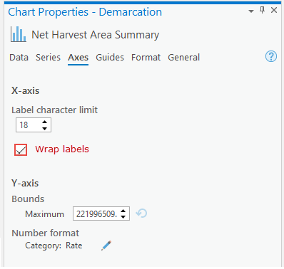
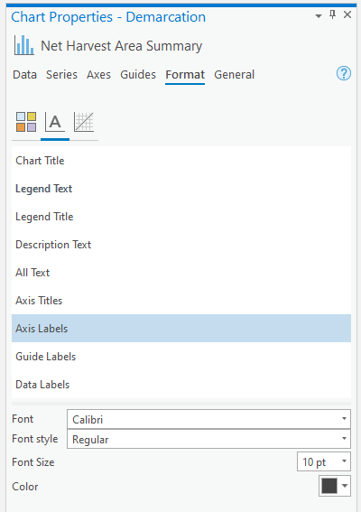
Currently, the formatting either has the labels slightly overlapping (1st image), or changes it completely to be at an angle (2nd image). I'd like to see an option in the Chart Formatting pane (4th image) to show something like in the 3rd image. Also, it would be good if you could format the X labels and Y labels separately so that they could be different text sizes. Currently these are formatted together (as per the last image).
_________________________________________________
_________________________________________________
- Mark as Read
- Mark as New
- Bookmark
- Permalink
- Report Inappropriate Content
It would be good to see extra options for formatting text items in charts like this. I would find wrapped text easier to read than angled text for occasions where the label is longer than the space permits for single line display.
You must be a registered user to add a comment. If you've already registered, sign in. Otherwise, register and sign in.