Turn on suggestions
Auto-suggest helps you quickly narrow down your search results by suggesting possible matches as you type.
Cancel
- Home
- :
- All Communities
- :
- Products
- :
- ArcGIS Dashboards
- :
- ArcGIS Dashboards Ideas
- :
- Line Graph does not display accurate visuals
Options
- Subscribe to RSS Feed
- Mark as New
- Mark as Read
- Bookmark
- Follow this Idea
- Printer Friendly Page
- Report Inappropriate Content
Line Graph does not display accurate visuals
Follow this Idea
432
1
09-04-2018 05:12 AM
Status:
Closed
- Mark as New
- Bookmark
- Subscribe
- Mute
- Subscribe to RSS Feed
- Permalink
- Report Inappropriate Content
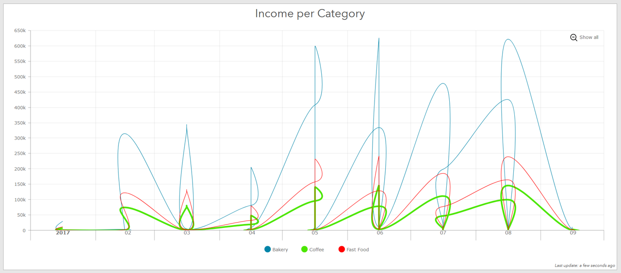
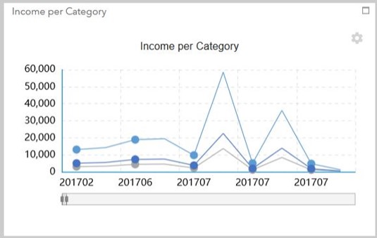
The line graphs do not look how they are supposed to, or as compared to WebApp Builder - Infographics.Both graphs below have the exact same data source.
Operations Dashboard:
WebApp Builder - Infographics:
Please fix the visualizations to accurately represent the data? Is there a work around?
1 Comment
- Mark as Read
- Mark as New
- Bookmark
- Permalink
- Report Inappropriate Content
Status changed to:
Closed
@AmyWootton1 We've not seen that using our datasets and would need a reproducible case in-house before we could action anything. If this is an issue that is still happening with your data, please considering engaging with Esri's Support team as they are best equipped to handle things like this.
You must be a registered user to add a comment. If you've already registered, sign in. Otherwise, register and sign in.