Turn on suggestions
Auto-suggest helps you quickly narrow down your search results by suggesting possible matches as you type.
Cancel
- Home
- :
- All Communities
- :
- Products
- :
- ArcGIS Hub
- :
- ArcGIS Hub Ideas
- :
- Open Data Charts - Bar Separation
Options
- Subscribe to RSS Feed
- Mark as New
- Mark as Read
- Bookmark
- Follow this Idea
- Printer Friendly Page
- Report Inappropriate Content
- Mark as New
- Bookmark
- Subscribe
- Mute
- Subscribe to RSS Feed
- Permalink
- Report Inappropriate Content
When using the charting capabilities in Open Data - using the Simple Chart Card or within the attributes section on the datasets page - it would be useful to have a consistent separation space between bars by default. Currently, ‘Date or Time’ fields typically have very little separation between bars making the look inconsistent among charts and making it hard for users to distinguish between bars.
Charting on Date or Time Fields:
Ex: 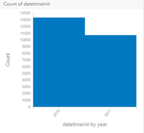 AND
AND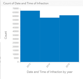
Compared to other data types such as number or text which typically have more defined separation between bars:
Ex: 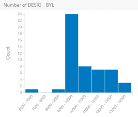 AND
AND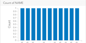
You must be a registered user to add a comment. If you've already registered, sign in. Otherwise, register and sign in.