- Home
- :
- All Communities
- :
- Products
- :
- ArcGIS Survey123
- :
- ArcGIS Survey123 Blog
- :
- How to Perform Spatial Analysis on Survey123 Resul...
How to Perform Spatial Analysis on Survey123 Results using the Business Analyst Online Reporting and Infographic services
- Subscribe to RSS Feed
- Mark as New
- Mark as Read
- Bookmark
- Subscribe
- Printer Friendly Page
- Report Inappropriate Content
Spatial analysis is a key component in GIS work, it allows us to understand the spatial relationship between our data and the world around us. ArcGIS Survey123 is a great resource to efficiently capture data either using the Web App as well as the Field App to take surveys. The Survey123 platform also provides tools to easily extract that data using Feature Reports. Survey123 Feature Reports which came out of beta in the 3.5 release of Survey123 is a great service to quickly consume data in a format that is defined and customized by the user. Survey123 Feature Reports are effective in understanding your data and responses obtained, but what about performing spatial analysis on your Survey123 results?
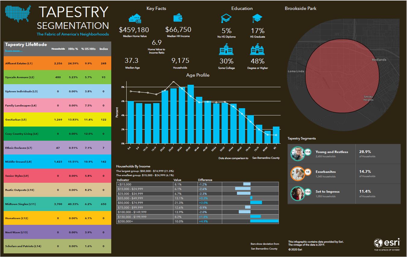
In this blog post, I will describe how to analyze your Survey123 results using the Business Analyst Online Reporting and Infographic Services to further understand your data and extract additional information that may not easily be apparent in your survey results. The Infographics or Reports obtained from Business Analyst Online can then be exported and used in larger applications. Infographics can be exported as PDF, an image, or Dynamic HTML that can be embedded into another website. Reports can be exported as PDF’s, Excel documents, or both. The example below shows the default Tapestry Segmentation report for an Area of Interest, although both Infographics and Reports are highly customizable to look how you like and can include a wide variety of available data that can be viewed from this data browser.
This blog will follow an example for city park inspections with the goal of utilizing ArcGIS Survey123 to provide a temporal system of record for the city’s parks that will update every so often tracking historical changes. Using the GIS data collected from the survey the example will further identify community factors around the parks.
With the brainstorming help from James Tedrick and our conversation on the workflow, it seemed appropriate to create a little blog outlining the ideas discussed. I would also like to thank Ismael for his suggestions and feedback on the article I appreciate his time reviewing it and passing along his thoughts.
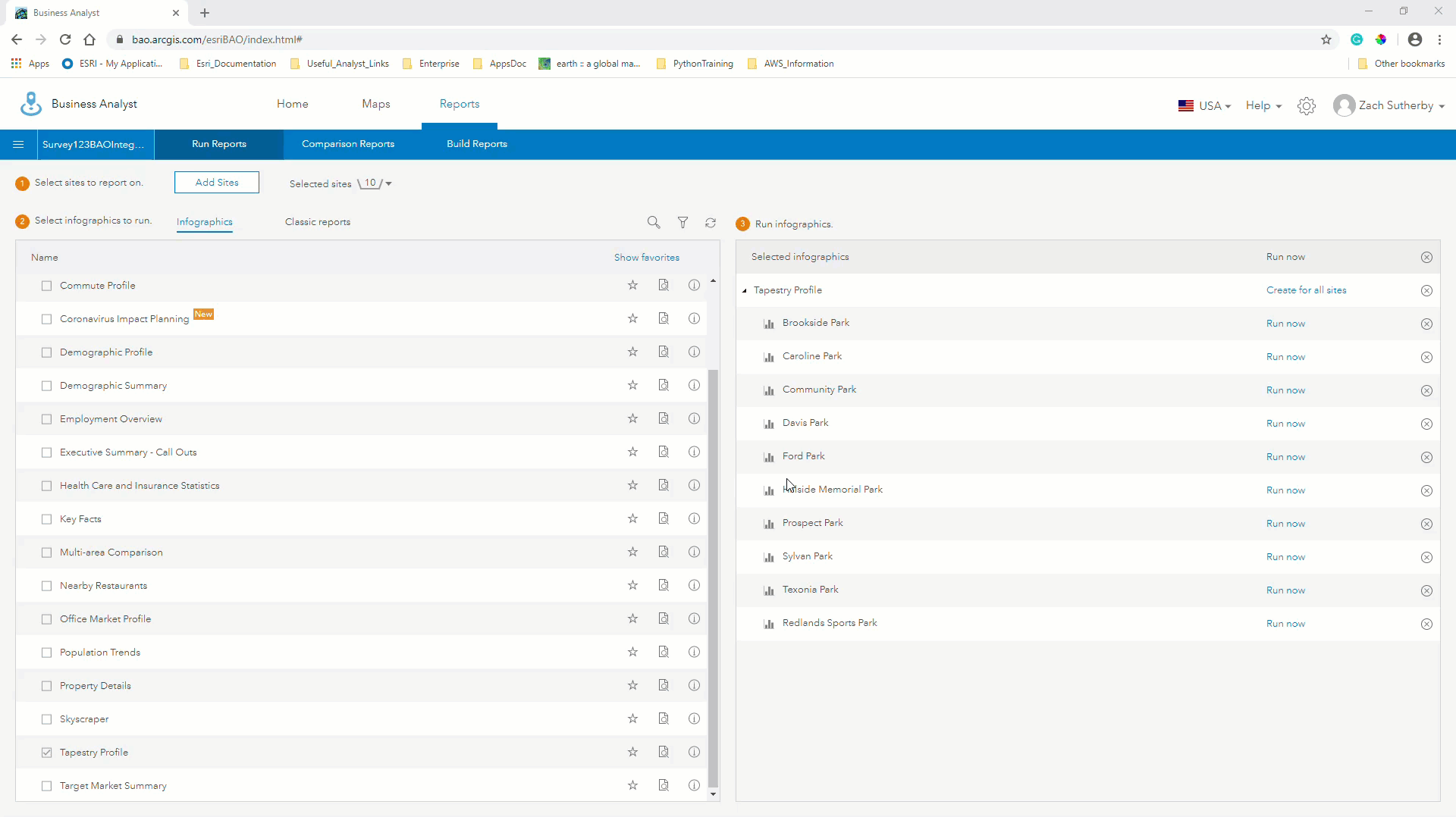
Below is a workflow for using Survey123 results to run Business Analyst Online Reports and Infographics:
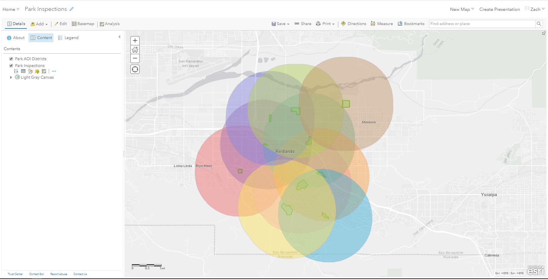
Once the park data was collected in the hosted feature layer since the GeoShape question type was used to outline the park boundaries, the service was pulled into a Web Map to define areas of interest surrounding the data. Unfortunately, Rings can only be added to center points in Business Analyst Online so the areas of interest needed to be specified using the Create Buffers tool in the Web Map’s Analysis tools.
A new Business Analyst Online project was created and the Web Map was imported into the project.
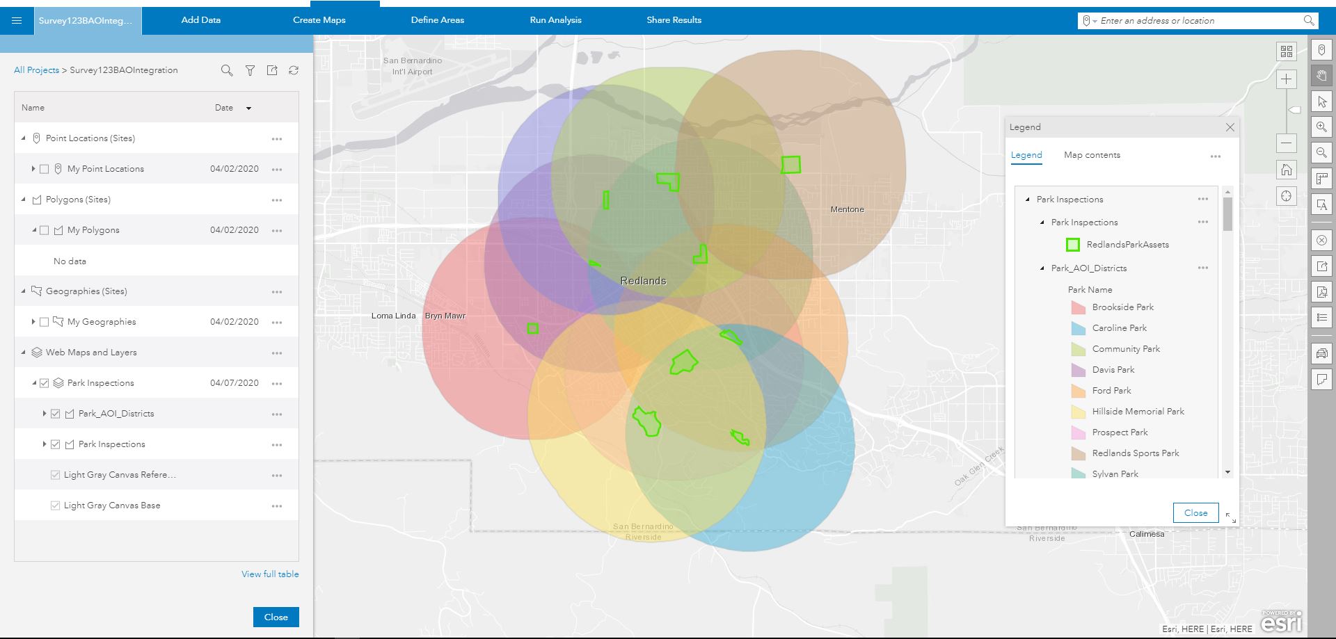
After pulling the Web Map into Business Analyst Online areas can be set up to be used in Reports or Infographics.
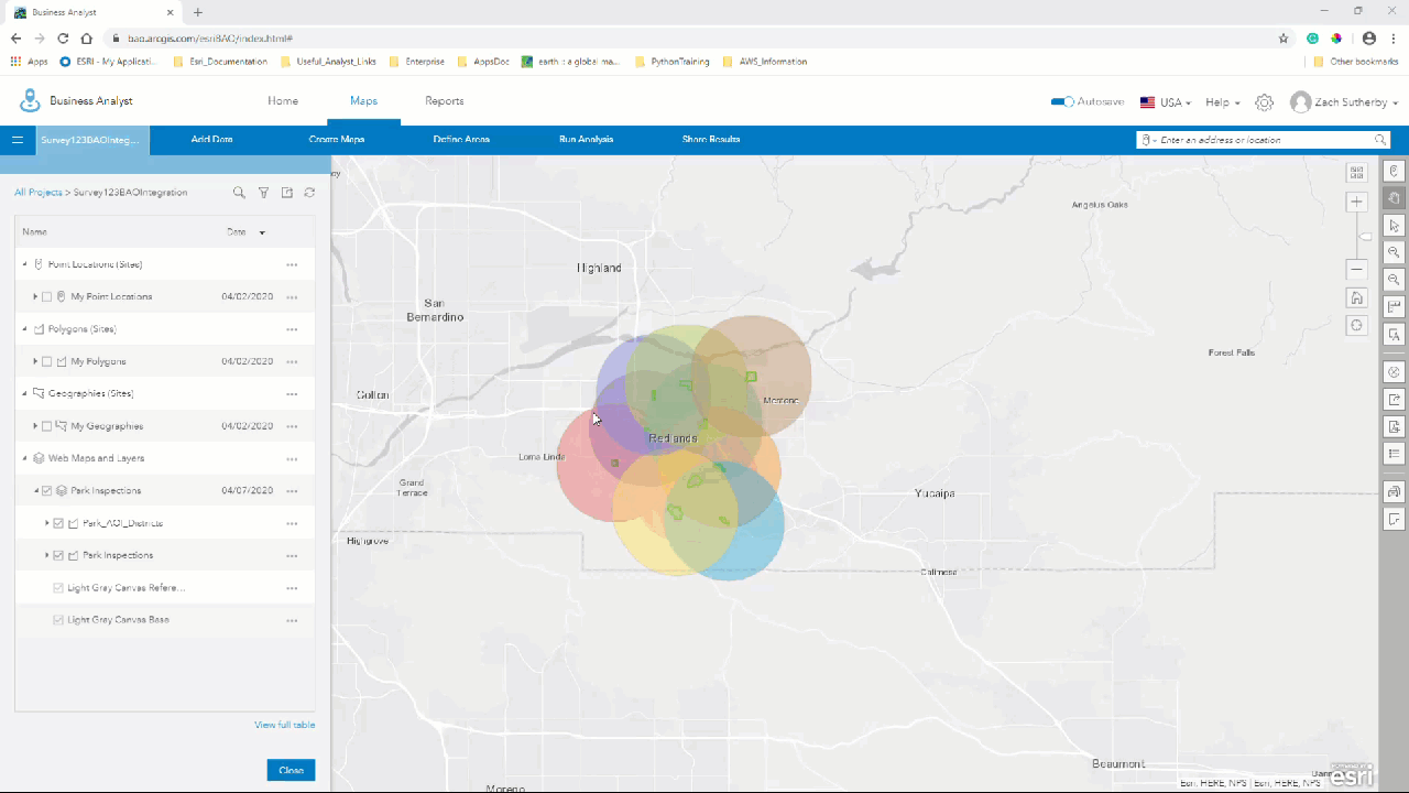
Once the areas are configured any Reports or Infographics that were created or shared with me can be run with my survey results.
Getting started:
Just like Survey123, Business Analyst Online also has great resources to get started with creating a project and creating your first Reports and Infographics. As mentioned previously Infographics and Reports are highly customizable to meet your organization’s needs. Infographics and Reports can highlight different variables than configured in the default templates and really be customized to show the exact information your organization is looking for.
In more current events using the workflow above with the Esri demographics data can also help identify socioeconomic trends with the spread of COVID-19. Many organizations are making use of ArcGIS Survey123 to monitor resources and supplies, people, and assets. Esri has many great resources to leverage like the Coronavirus Response Website tutorial and Operations Dashboard to implement these surveys and make them widely available.
The geographic results of these projects can be further assessed using the tools present in Business Analyst Online. For example, the John Hopkins Coronavirus dashboard has recently implemented a U.S. Map section that utilizes the COVID-19 Status Reporting Infographic present in Business Analyst Online.
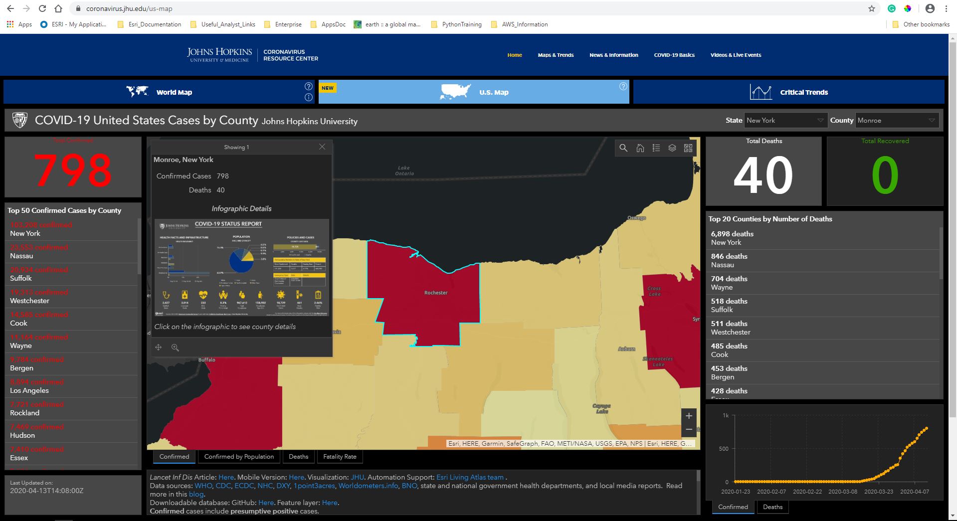
John Hopkins University is using County polygons to run these reports, but the workflow outlined in this article can be used to make connections between your Survey123 results and the socio-economic factors around your data. Dashboards and Web Apps are great options to highlight those connections and shared across organizations.
Please follow the Survey123 Twitter feed to stay updated with examples from the community.
Supplemental information and potential use cases:
https://htorpey.maps.arcgis.com/apps/opsdashboard/index.html#/1544144ccd6e4d4a8db71a8c74cc18b1
You must be a registered user to add a comment. If you've already registered, sign in. Otherwise, register and sign in.