Turn on suggestions
Auto-suggest helps you quickly narrow down your search results by suggesting possible matches as you type.
Cancel
- Home
- :
- All Communities
- :
- Services
- :
- Esri Training
- :
- Esri Training Matters Blog
- :
- Easy-Button Method to Create a Web Map
Easy-Button Method to Create a Web Map
Subscribe
1226
0
01-04-2013 04:49 AM
- Subscribe to RSS Feed
- Mark as New
- Mark as Read
- Bookmark
- Subscribe
- Printer Friendly Page
- Report Inappropriate Content
01-04-2013
04:49 AM
Updated March 11, 2015
While I work at the motherland of GIS services and web maps, I don't have ArcGIS Server or even a web server installed on my local machine. Odds are, many of you don't either. For me, getting set up with a virtual machine configured with all the right software is completely doable...but not done. Things came to a head recently when I wanted to visualize some Excel data on a web map.
Of course, I could bring the Excel data into ArcMap and visualize it there, but I wanted to make a web map so I could easily share it with coworkers who don't use ArcGIS in their day to day.
Lacking the ability to publish a map service myself, I opted to go the minimalist route—that is, use the ArcGIS Online map viewer. If you have access to an ArcGIS Online organizational account, you can map your data right inside Excel using Esri Maps for Office.
A viable alternative for those without an organizational account is to add a .csv file (text file of comma-separated values) to the map viewer and save the map to their ArcGIS Online public account. An Excel spreadsheet is easily saved as a .csv file. To be mapped, the spreadsheet must have fields that store location data—latitude and longitude values, GPX coordinates, or addresses.
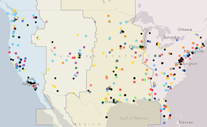
I wanted to visualize the locations of individuals in the U.S. who attended the Creating Hosted Map Services with ArcGIS Online live training seminar. Understanding the geographic distribution of our viewers is useful to evaluate seminar broadcast times. All I had to do to create a web map was follow these easy steps.Step-by-Step Example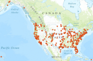
Point features can be drawn on the map with a single symbol, unique symbols based on an attribute, or as a heat map. To quickly see the point distribution, I'll choose to use a single symbol for all the features. Clicking Select under Location (single symbol), then Done displays the points on the map.
In less than two minutes, I'm visualizing my data as points on a pretty map. I can click each point and see the associated data from the Excel spreadsheet in a pop-up. Easy. Except...
I only want to show certain columns, and I don't like the names of those columns. I also decide I'd like to symbolize the points by self-reported industry.
I can address all of these issues right in the viewer.
In the symbol preview, I notice an industry category named Other. For my purposes, Other is the same as no data. It's easy to change the Other symbol label.
So, in just a few more minutes, I've mapped viewer distribution and self-reported industry. Next, I'll configure the pop-ups.
Now when I click points on the map, I see only the information of interest. I also notice something.
When I zoom in to a large scale, the Topographic basemap gets very detailed. Building footprints and local streets display. Some of my symbol colors blend into the basemap features.
Switching to the Light Gray Canvas basemap is a quick solution. This basemap, with its subdued colors and less detail at large scales, is a better backdrop for my data.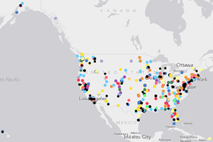
Finally, I want to show time zones on the map. I don't have a layer of time zones but I'll search ArcGIS Online content to see if anyone has shared this data.
In less than 20 minutes, I've "mappified" my Excel data and added context to it. To generate a link to the map that I can embed in a web page, e-mail, or social media post, I just need to save the map to my public account, add a title, some tags, and a brief description, then share the map.
Related posts:
While I work at the motherland of GIS services and web maps, I don't have ArcGIS Server or even a web server installed on my local machine. Odds are, many of you don't either. For me, getting set up with a virtual machine configured with all the right software is completely doable...but not done. Things came to a head recently when I wanted to visualize some Excel data on a web map.
Of course, I could bring the Excel data into ArcMap and visualize it there, but I wanted to make a web map so I could easily share it with coworkers who don't use ArcGIS in their day to day.
Lacking the ability to publish a map service myself, I opted to go the minimalist route—that is, use the ArcGIS Online map viewer. If you have access to an ArcGIS Online organizational account, you can map your data right inside Excel using Esri Maps for Office.
A viable alternative for those without an organizational account is to add a .csv file (text file of comma-separated values) to the map viewer and save the map to their ArcGIS Online public account. An Excel spreadsheet is easily saved as a .csv file. To be mapped, the spreadsheet must have fields that store location data—latitude and longitude values, GPX coordinates, or addresses.
I wanted to visualize the locations of individuals in the U.S. who attended the Creating Hosted Map Services with ArcGIS Online live training seminar. Understanding the geographic distribution of our viewers is useful to evaluate seminar broadcast times. All I had to do to create a web map was follow these easy steps.Step-by-Step Example
- Open the Excel spreadsheet and save it as a .csv file.
- Go to www.arcgis.com and sign in to your public or organizational account.
- Click the Map link at the top (or bottom) of the page.
- In the map viewer, zoom to the data's extent.
- Keep the default Topographic basemap or click the Basemap Gallery button and choose a different basemap.
- To the left of the Basemap Gallery button, click Add > Add Layer from File, browse to the .csv file, then click Import Layer. (If you're using Firefox or Chrome, you can just drag and drop a .csv file into the map viewer.)
- Note: You may get prompted to specify which fields contain location information (e.g., your address or lat-long field names). There is also a 250-feature limit when adding .csv files to the map viewer.

Point features can be drawn on the map with a single symbol, unique symbols based on an attribute, or as a heat map. To quickly see the point distribution, I'll choose to use a single symbol for all the features. Clicking Select under Location (single symbol), then Done displays the points on the map.
In less than two minutes, I'm visualizing my data as points on a pretty map. I can click each point and see the associated data from the Excel spreadsheet in a pop-up. Easy. Except...
I only want to show certain columns, and I don't like the names of those columns. I also decide I'd like to symbolize the points by self-reported industry.
I can address all of these issues right in the viewer.
- In the Contents pane to the left of the map, mouse over the layer name and click the arrow next to it, then click Change Style.
- Under Choose an attribute to show, choose the field that stores the values you want to show.
- For the drawing style, select Types (Unique symbols).
In the symbol preview, I notice an industry category named Other. For my purposes, Other is the same as no data. It's easy to change the Other symbol label.
- Click Options, click the label next to the Other symbol, then type a new label (No Information is more understandable for this map). If I wanted, I could click the symbol and assign a different symbol to distinguish this category.
- Click OK, then Done.
 Takeaway #1: Explore your data and decide how you want to present it before putting it on a map. In the map viewer, it's easy to change the display properties, but you can't modify the data itself.

So, in just a few more minutes, I've mapped viewer distribution and self-reported industry. Next, I'll configure the pop-ups.
- In the Contents pane, click the arrow next to the layer name again and choose Configure Pop-up.
- Enter a descriptive pop-up title or select an attribute to use as the title.
- Click Configure Attributes and uncheck fields you don't want to display, then make sure the fields you do want to display are checked. You can also use the arrow buttons to reorder the fields. Be sure to type a friendly alias for each field that will display, then click OK.
- At the bottom of the Configure Pop-up pane, click Save Pop-up.
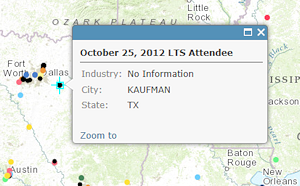

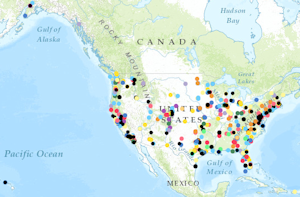
Now when I click points on the map, I see only the information of interest. I also notice something.
When I zoom in to a large scale, the Topographic basemap gets very detailed. Building footprints and local streets display. Some of my symbol colors blend into the basemap features.
Switching to the Light Gray Canvas basemap is a quick solution. This basemap, with its subdued colors and less detail at large scales, is a better backdrop for my data.

- Takeaway #2: Before deciding on a basemap, explore it at large (and small) scales to understand the level of detail and assess its appropriateness for your mapping purpose. It's important to choose symbol colors that will stand out against the basemap at various scales.
Finally, I want to show time zones on the map. I don't have a layer of time zones but I'll search ArcGIS Online content to see if anyone has shared this data.
- Click Add > Search for Layers.
- In the Find text box, type time zones, choose to search in ArcGIS Online, then click Go.
- The search results include several time zone feature services. After adding one of them to the map, I change its symbology to unique symbols so each zone will have a different color and I increase the layer transparency value so the time zone features don't obscure the other data.

In less than 20 minutes, I've "mappified" my Excel data and added context to it. To generate a link to the map that I can embed in a web page, e-mail, or social media post, I just need to save the map to my public account, add a title, some tags, and a brief description, then share the map.
- Takeaway #3: There are lots of ways to create, save, and share a web map these days. If you don't have access to software for creating GIS services, you're not out of luck. Creating a high-performing web map with the ArcGIS Online map viewer really is an easy—and useful—method.
Related posts:
Labels
You must be a registered user to add a comment. If you've already registered, sign in. Otherwise, register and sign in.
About the Author
Suzanne is a Maryland native who enjoys writing about Esri technology and other topics. She is the Training Marketing Manager with Esri Training Services in Redlands, California.
Labels
-
ArcGIS Desktop
25 -
ArcGIS Step by Step
40 -
Class Resources
14 -
e-Learning
46 -
MOOCs
20 -
Software Demos
9 -
Technical Certification
12