- Home
- :
- All Communities
- :
- Products
- :
- ArcGIS Maps for Adobe CC
- :
- ArcGIS Maps for Adobe CC Blog
- :
- Making Choropleth Maps Easy for Graphic Designers
Making Choropleth Maps Easy for Graphic Designers
- Subscribe to RSS Feed
- Mark as New
- Mark as Read
- Bookmark
- Subscribe
- Printer Friendly Page
- Report Inappropriate Content
In this blog post, you'll read about how to create a choropleth map of Minnesota population density using the ArcGIS Maps for Adobe Creative Cloud extension that we are building at Esri.
Last month I had a wonderful time presenting cartography to graphic designers as a guest for three sessions of Adobe Live at Adobe's headquarters in San Francisco. During these live-streams, artists design bits of - or complete - projects, and discuss their process while they design. An audience of creatives viewing the livestream can live chat with the artists as they design. Although I already knew that a lot of today's designers are making maps for their clients, it is always a totally elucidative experience talking about mapping with designers, most of whom have not been formally trained in cartography or GIS. In fact, it's quite humbling. Designers come to mapping with totally fresh eyes that are not weighted down by staying within a box of cartographic rules. The results are stunning. I am always so grateful for these reminders to bend the rules and continue to discover.
Here's the process to make one of the maps I built during an Adobe Live session. It's a choropleth map made with ArcGIS Maps for Adobe Creative Cloud via Illustrator. This is a great exercise for graphic designers who are looking to explore cartography and dataviz a bit more.
TIP - If you don't have it already, you'll need to install ArcGIS Maps for Adobe CC (M4CC) from Adobe Exchange.
Draw Mapboard and Name it
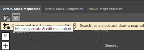
Once you have opened Illustrator and logged into the M4CC extension, zoom to your desired extent, and draw your Mapboard. To do this, click on the Mapboard tool in the upper-left of the Mapboards tab, and draw a box around the area you want to map.
Click on the Mapboard tool in the upper-left of the Mapboards tab
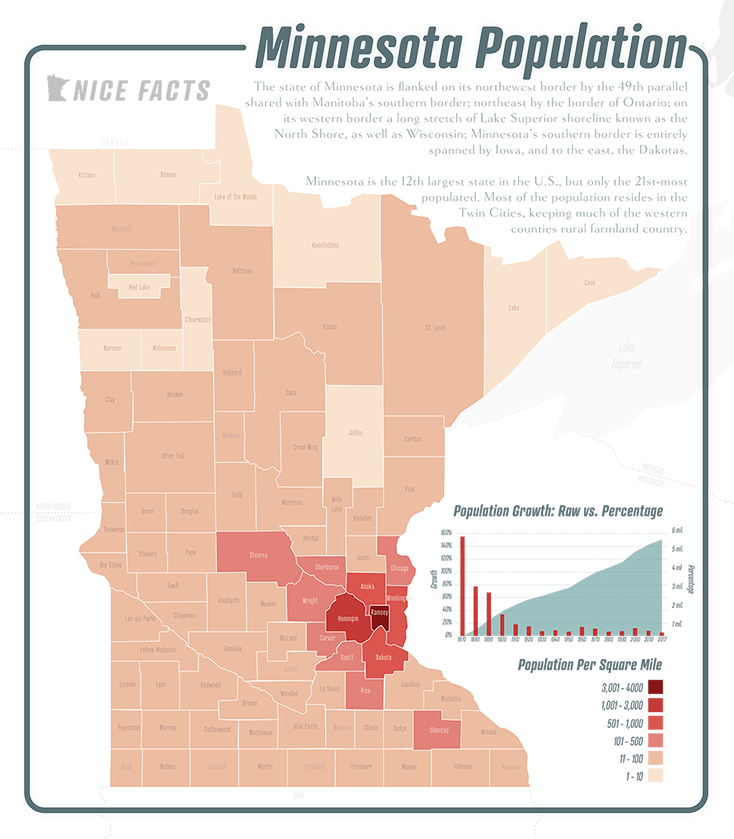
For this map, I'm making a choropleth map of population density in Minnesota. Really quick, a choropleth map uses color saturation and/or hue to indicate a statistic's value or intensity within usually-adjacent polygons - or as some non-mappers might call them - color-coded maps.
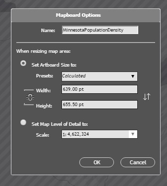
Once you've drawn your mapboard over the extent that you want to map, you'll be prompted to give your mapboard a name in the Mapboard Options dialog. You'll also be able to specify your map's size here. I've named mine "MinnesotaPopulationDensity" and I left the scale and size as they were.
TIP - Whatever you name your mapboard will also be the name of your downloaded Illustrator file. If your mapboard name is identical to an AI file in the same file location where you will download your map, then you will be prompted to give your mapboard a new name.
Name your mapboard.
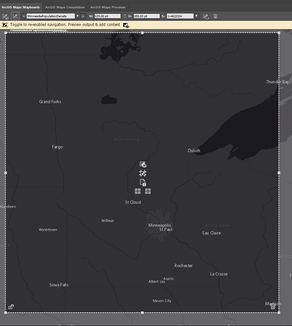
Full mapboard extent over Minnesota
Add Map Data in the Compilation Window
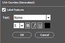
Go to the M4CC Compilation window. This might be hiding underneath your Mapboards window. In the image above, I've docked the Compilation and Processes windows together with my Mapboards window.
When you get to the Compliation Window, you'll see a preview of your map. The current version of the M4CC extension uses a raster basemap for reference. You can zoom to make this preview larger, but note that the raster basemap, and any raster data that you add to this map will be a bit blurry in the preview if you do. To zoom back out, just press the Alt key while zooming.
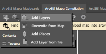
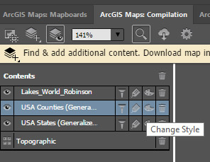
There are a few different ways of adding data, and a few different data types you can add. For this demo, I'm going to add the "USA Counties" map layer that is available on ArcGIS Online. This is all made possible because this extension leverages the "Cloud" part of the Adobe Creative Cloud, and therefore allows you to access ArcGIS Online within Adobe Illustrator and Photoshop. Click the Search and Add Content button, and select Add Layers from the menu. This will bring up the Add Layers dialog.
Click the Search and Add Content button, and select Add Layers from the menu
Adding Counties to the Map
In the Add Layers dialog choose "ArcGIS Online" from the Browse Location dropdown, and type "USA Counties" in the search box next to it. You can also filter to "Show Vector Layers" from the data type dropdown beneath the search box. Then click on the plus ("+") icon in the "USA Counties (Generalized)" layer from the list of data layers that appear. This will add the layer to your map. Note - You may need to scroll a little to get to this layer.
Add the "USA Counties (Generalized)" layer to your map

Compilation window preview after adding the "USA Counties (Generalized)" layer

Adding States to the Map
You could sync/download this map now, and make a map with just the counties. However, let's add some reference spatial data to this map. We'll start with state boundaries. Performing the same steps as above, click the Search and Add Content button, and select "Add Layers" from the menu. This time type "USA States" in the search box, and scroll until you see "USA States (Generalized)." Click the plus ("+") icon, adding this layer to your map.

Adding the Great Lakes to the Map
The Great Lakes are a huge part of the spatial identity for much of the Upper Midwest. There is a good reason for this: the Great Lakes region is magnificently beautiful. Even though this map is not about lakes, we can add Lake Superior to this map in a sleek way so that it doesn't distract from the map's population density theme. In fact, adding Lake Superior and the states as map data with a low visual hierarchy will give a nice spatial reference for people who may not be familiar with the exact geography of Minnesota. In other words, let's not have a map where Minnesota is a floating island if we don't have to.
Performing the same steps that you did to add the counties and states, search for "Lakes_World" and add the "Lakes_World_Robinson" layer. This is a layer hosted by Esri's GeoInquiries™ for schools, which is a great GIS education resource.
Styling the Choropleth
Since the map you are building in the Compilation Window is essentially being built in the ArcGIS Online environment, you have access to a lot of ArcGIS Online styling tools. Instead of raving about how amazing it is that you can access ArcGIS Online map data and leverage the fantastic ArcGIS Online geo-dataviz styling tools inside of Illustrator I'll move on. (Seriously, though. ArcGIS Online map styling is really great).
Click on the Change Style painter's palette icon in the "USA Counties (Generalized)" layer. This will bring up ArcGIS styling tools.
Click on the Change Style painter's palette icon
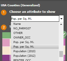
 From the Choose an attribute to show dropdown menu, choose the top "Pop. per Sq. Mi." from the list as this is the most current population data for this layer. These values from which you're choosing are U.S. Census data attributes for each of the USA counties.
From the Choose an attribute to show dropdown menu, choose the bottom "Pop. per Sq. Mi."
Now, you get to choose a drawing style. Among the four choices you're provided, Counts and Amounts (Color) and Counts and Amounts (Size) make the most sense for a population density map. Since we're making a choropleth, choose Counts and Amounts (Color) by clicking the Options button. This will bring up some dataviz decision tools. If you're comfortable with dataviz, then feel free to style the data as you wish. For the purpose of this demo, here are some useful instructions on updating the dataviz for this choropleth.
Update Class Breaks
Change the Class Breaks number to "6" by either typing the number in the box, or clicking the up arrow once.
*IMPORTANT* The choropleth in the Compilation window is created from all USA counties, the most densely populated being nearly 70 thousand people per square mile. Minnesota's most dense county is Ramsey County, at just above 3 thousand people per square mile. For this reason, this demo will have all values above 3,000 in the highest category in the Compilation window. This will be addressed in the downloaded AI file.
Because a lot of Minnesota's counties are really sparsely populated, the first category will be 1-10 people per square mile. To do this, very carefully click on the bottom value in the Change Symbol Style dials and in the entry box type "10" just like the image below.
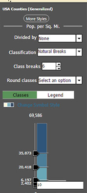 Now your first category will be 0-10. You can click on the Legend tab (seen in the image above next to the Classes tab) to view this new category you just updated. Now, back in the Classes tab, use the same process to create the following categories:
- >3,000 to 70,267 (this monstrosity of a category will be addressed in the downloaded map)
- >1,000 to 3,000
- >500 to 1,000
- >100 to 500
- >10 to 100
- 0 - 10
Click OK. Your map should look something like this:
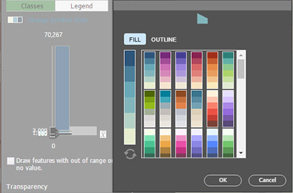
 TIP - If you would like to update the colors of the choropleth, you can choose among several gorgeous ArcGIS Online color palettes by clicking Change Symbol Style. For this map, make sure you are choosing a sequential (a sequence of light-to-dark) color scheme and that the lighter color represents the category with the smallest values.
Label the Counties
Another really convenient mapping option you have with this extension - all made possible by accessing ArcGIS Online through the Cloud - is that you can add labels. Let's add county labels. The database that makes up the counties has a column of the county names. We can use this column to add the labels. To do this, click on the Manage Labels tool in the USA Counties layer that you just styled:
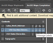 The "Name" category should automatically be chosen for you. If not, just select "Name" from the Text dropdown menu. The default size of the labels is too big to allow all the Minnesota county names to fit. For this reason, you'll want to change the font size to "5" and un-bold the labels. Then click OK. Don't worry about the font because you can update that in Illustrator,
 Download/Sync Your Map into Illustrator
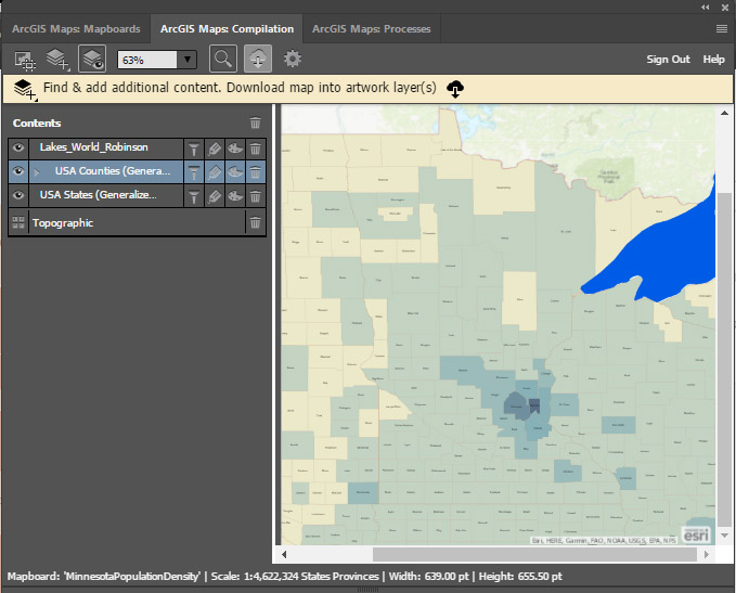
Now you should have tiny labels in each of the Minnesota counties, a choropleth that indicates counties' population density, part of Lake Superior, and a USA States layer. This means that you're ready to download the map into Illustrator and start designing!
Style Your ArcGIS-created Map in Illustrator!
Your downloaded map is ready to be styled. Here are a few tips to follow to make a Minnesota Population Density Map from the map you just downloaded (for all these tips to make sense, see the completed map that follows):
- Delete all the counties outside of Minnesota since this is a Minnesota-specific map.
- Remove the Fill color from your USA States (Generalized) layer. Also, make sure this layer is above your counties layer.
- Remove the basemap, and allow the area in Canada to be a space for your map's title.
- It's pretty cool that you get a scalebar, but it isn't necessary or advised for this type of map. Delete both of them.
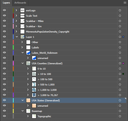
- Build a legend based upon the categories that you built in the Compilation window. These categories are conveniently preserved in the layer structure:
IMPORTANT - When building your legend, make sure the highest category is no higher than 4,000. Remember that the densest county in Minnesota only has 3,100 people per square mile.
Completed Project
Of course, depending on your style your map will look slightly or even drastically different. Still, here's my finished map of Minnesota Population density. Happy mapping!
You must be a registered user to add a comment. If you've already registered, sign in. Otherwise, register and sign in.