- Home
- :
- All Communities
- :
- ArcGIS Topics
- :
- Applications Prototype Lab
- :
- Applications Prototype Lab Blog
- :
- Building the Cumulative Exposure to Climate Change...
Building the Cumulative Exposure to Climate Change App
- Subscribe to RSS Feed
- Mark as New
- Mark as Read
- Bookmark
- Subscribe
- Printer Friendly Page
- Report Inappropriate Content
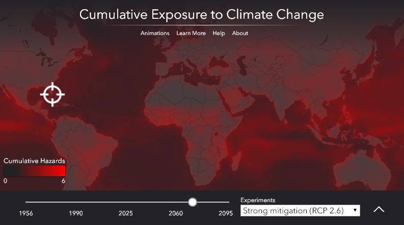
In June of 2017 we began another collaboration with Dr. Camilo Mora of the University of Hawaii, Department of Geography. This came on the heels of our previous project with Dr. Mora to develop a web mapping application to display his team's research on climate change and deadly heatwaves. For their next project they had expanded their research to include multiple cumulative hazards to human health and well-being resulting from climate change. These hazards include increased fires, fresh water scarcity, deforestation, and several others. Their new research was recently published in the journal Nature Climate Change. Several news outlets published stories on their findings, including these from The New York Times, Le Monde, and Science et Avenir. For our part, the Applications Prototype Lab developed an interactive web mapping application to display their results. To view the application, click on the following image. To learn how to use the application, and about the research behind it, click on the links for "Help" and "Learn More" at the top of the application.
In this post I'll share some of the technical details that went into the building of this application.
The Source Data
For each year of the study, 1956 - 2095, the research team constructed a series of global data sets for 11 climate-related hazards to human health and well-being. From those data sets they built a global cumulative hazards index for each year of the study. For information about their methods to generate these data sets, refer to their published article in Nature Climate Change. Each data set contains the simulated (historical) or projected (future) change in intensity of a particular hazard relative to a baseline year of 1955. For the years 2006 - 2095, hazards were projected under three different scenarios of greenhouse gas (GHG) emissions ranging from a worst-case business-as-usual scenario to a best-case scenario where humanity implements strong measures to reduce GHG emissions. In total, they produced 3828 unique global data sets of human hazards resulting from climate change.
Data Pre-processing
We received the data as CSV files which contained the hazard values on a latitude-longitude grid at a spatial resolution of 1.5 degrees. The CSV data format is useful for exchanging data between different software platforms. However, it is not a true spatial data format. So we imported the data from the CSV files into raster datasets. This is typically a two-step process where you first import the CSV files into point feature classes and then export the points to raster datasets. However, since the data values for the 11 hazards were not normalized to a common scale, we added a step to re-scale the values to a range of 0 - 1, according to the methodology of the research team, where:
- 0 equals no increase in hazard relative to the historical baseline value.
- 1 equals the value at the 95th percentile or greater of increased hazard between 1955 and 2095 for the "business-as-usual" GHG emissions scenario.
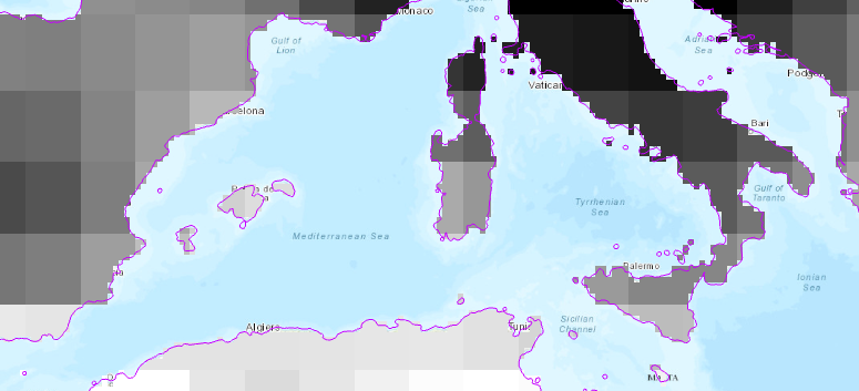
With a spatial resolution of 1.5 degrees, each pixel in the output raster datasets are approximately 165 Km in width and height. This was too coarse for the web app, because the data for land-based hazards such as fire and deforestation extended quite a distance beyond the coastlines. So we added another processing step to up-sample each dataset by a factor of ten and remove the pixels from the land-based hazards raster datasets whose centers were outside of a 5 Km buffer of the coastlines.
We automated the entire process with Python scripts, using geoprocessing tools to convert the source data from CSV to raster dataset, build the coastal buffer, and up-sample and clip the land raster datasets. To re-scale the data values, we used mathematical expressions. At the end of these efforts we had two collections of raster datasets - one for the 11 hazards indexes, and another for the cumulative hazards index.
Data Publishing
We built two mosaic datasets to organize and catalog each collection of raster datasets. From each mosaic dataset we published an image service to provide the web application with endpoints through which it could access the data. On the application, the map overlay layer is powered by the image service for the cumulative hazards index data. This layer is displayed in red with varying levels of transparency to indicate the level of cumulative hazards at any location. To support this type of rendering, we added a custom processing template to the image service's source mosaic dataset. The processing template uses the Stretch function to dynamically re-scale the floating-point data values in the source raster datasets to 8-bit integers, and the Attribute Table function to provide the color and transparency values of the exported image on a per-pixel basis.
The Animations
We built short video animations of the change in cumulative hazards over time using the Time and Animation Toolbars in ArcGIS Pro. You can access those animations from the application by clicking on the "Animations" link at the top of the application window. We used the cumulative hazards index image service as the data source of the animation. This service is time-aware, enabling us to define a timeline for the animations. Using the capabilities in the Animations Toolbar, we defined properties such as the time-step interval and duration, total duration, output format and resolution, and the various overlays such as the legend, watermarks, and dynamic text to display the year. We filtered the data in the image service by GHG emissions scenario using definition queries to create three separate animations of the change in cumulative hazards over time.
The Web Application
We built the web application using the ArcGIS API for JavaScript. To render the cumulative hazards map layer, the application requests the data from the image service in the LERC format. This format enables the application to get the color and transparency values for each pixel from the attribute table to build a client-side renderer for displaying the data. The chart that appears when you click on the map was built with the Dojo charting library. This chart is powered by the image service with the 11 individual human hazards index data. To access the hazards data, the web application uses the Identify function to get the values for each of the 11 hazards at the click location with a single web request to the service.
In Summary
Building this application gave us the opportunity to leverage many capabilities in the ArcGIS platform that are well suited for scientific analysis and display. If you are inspired to build similar applications, then I hope this post provides you with some useful hints. If you have any technical questions, add them into the comments and I'll try to answer them. I hope this application helps to extend the reach of this important research as humanity seeks to understand the current and projected future impacts of climate change.
You must be a registered user to add a comment. If you've already registered, sign in. Otherwise, register and sign in.