- Home
- :
- All Communities
- :
- Products
- :
- ArcGIS Hub
- :
- ArcGIS Hub Documents
- :
- Tips: Create Custom Cards with HTML
- Subscribe to RSS Feed
- Mark as New
- Mark as Read
- Bookmark
- Subscribe
- Printer Friendly Page
- Report Inappropriate Content
Tips: Create Custom Cards with HTML
Tips: Create Custom Cards with HTML
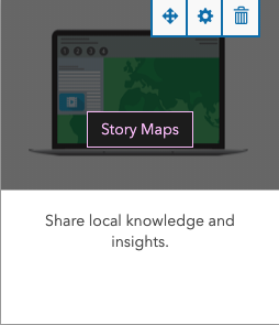 Update 08/15/2019: If you have a site that is still using cards like the one pictured on the right (a card showing image and description with an overlay button that appears on hover), we strongly recommend using one of the card patterns found on this page: http://esri.github.io/calcite-bootstrap/patterns.html. The hover style of cards that we used to include on older site templates was not found to be mobile-friendly or accessible to keyboard users. New site and page templates all now use Calcite Bootstrap cards.
Alternatively, if you are using cards to highlight content (apps, data, web maps to name a few) from inside your organization, we've put a lot of effort into making our Gallery Card easier to use. If you use the dynamic option, we'll automatically add anything that meets the filter criteria to your Gallery, or if you prefer to control the order, you can use our manual option to pick featured content. Under the Style options, you can then set border radius, drop shadow, image or icon, and button text/color.
All examples featured in this post can still be used as they rely on custom CSS and not the outdated code.
--------------
Here are some other types of HTML cards you can build using the text card and embedded or inline CSS.
Before we begin, there are a few important things to note:
- Some of these patterns use embedded <style></style> tags in a text card.
- Any embedded styles can affect your entire homepage if you do not target specific selectors correctly.
- Never use an ember-# ID selector as these are dynamic and will change with each page refresh.
Clickable Image Card

1. Add a row card. Set the row background color.
2. Add a text card, switch to code view. (We will be using Bootstrap's grid to create columns rather than using multiple text cards.)
3. In the text card, paste the following snippet, then toggle out of code view:
<style>
.featured-gallery .caption {
width:100%;
bottom: 0px;
position: absolute;
background-color: rgba(52,82,80,0.7);
}
.featured-gallery .thumbnail {
border: 0 none;
box-shadow: none;
margin:0 0 30px 0;
padding:0;
}
.featured-gallery .caption strong {
color: #fff;
-webkit-font-smoothing: antialiased;
}
</style>
<div class="col-xs-12 col-sm-6 featured-gallery">
<div class="col-sm-12 thumbnail text-center">
<img alt="regional park A" class="img-responsive" src="https://cloud.githubusercontent.com/assets/7389593/23568903/d8df22e4-002a-11e7-9645-da4471a5991d.jpeg">
<div class="caption">
<strong>Check out our hiking trails</strong>
</div>
</div>
</div>
<div class="col-xs-12 col-sm-6 featured-gallery">
<div class="col-sm-12 thumbnail text-center">
<img alt="regional park B" class="img-responsive" src="https://cloud.githubusercontent.com/assets/7389593/23568903/d8df22e4-002a-11e7-9645-da4471a5991d.jpeg">
<div class="caption">
<strong>Check out our hiking trails</strong>
</div>
</div>
</div>(If you keep the current grid structure from this snippet, your replacement images need to be at least 540px wide.)
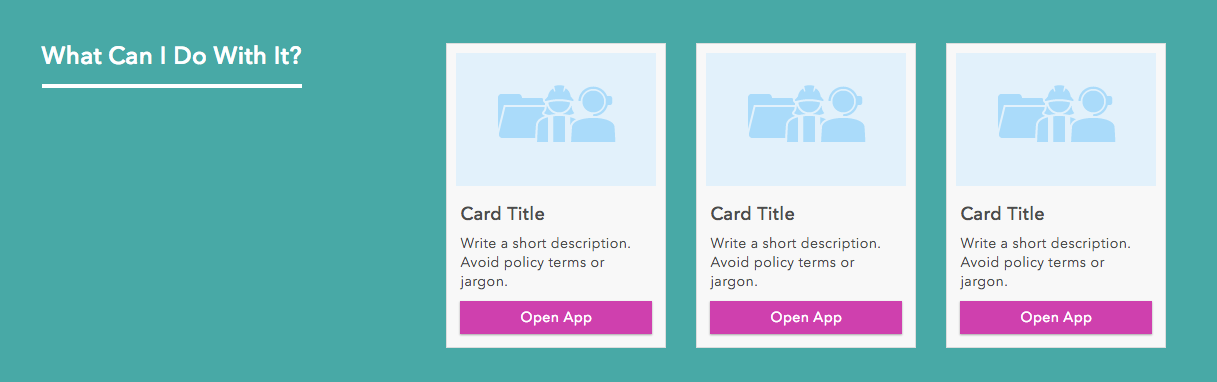
Heading + Highlight Card
1. Add a row card. Set row background color and row text color.
2. Add two text cards to that same row.
3. In the text card to be the heading, paste the following snippet:
<h2 style="padding-bottom: 15px; border-bottom: 4px solid #fff; display: inline-block; margin-top: 30px;">
What Can I Do With It?
</h2>4. In the text card to be the showcase, paste the following snippet:
<div style="margin-top: 30px; margin-bottom: 30px;">
<div class="col-xs-12 col-sm-6 col-md-4">
<div class="thumbnail">
<img src="https://d1yzezhhfj4ndu.cloudfront.net/default-project-thumbnail-250c773441bf9b5b2b363f3f403d4fa4.png" alt="Card Thumbnail" style="padding: 0px; margin-top: 5px;">
<div class="caption">
<h4>Card Title</h4>
<p style="font-size: 14px">Write a short description. Avoid policy terms or jargon.</p>
<a href="#" class="btn btn-primary center-block" role="button">Open App</a>
</div>
</div>
</div>
</div>
5. Narrow the heading card by two columns in order to achieve the layout shown in the example above.
(If you keep the current grid structure from this snippet, your replacement images ought to be 200x133px.)
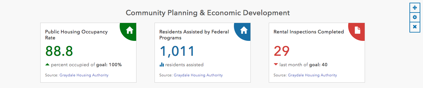
KPI Card Style #1 (Non-Dynamic)
1. Add a row card. Set the row background color.
2. Add a text card to that row, open code view. (We will be using Bootstrap's grid to create columns rather than using multiple text cards.)
3. In the text card, paste the following snippet, then toggle out of code view:
<style>
h2.headings {margin-bottom: 20px;}
.stat-card h3{font-size: 16px; margin-top: 5px; line-height: 20px; padding-right: 45px; color: #333; text-align; left;}
.stat-card {position: relative; display: inline-block; background-color: #fff; width: 320px; min-height: 170px; text-align: left; padding: 15px; border-width: 1px;border-style: solid; border-color: rgb(204, 204, 204); border-image: initial; overflow: hidden;}
.stat-icon {position: absolute;top: 0px;right: 0px;width: 60px;height: 60px;line-height: 60px;text-align: center;}
.stat-icon.right {right: 0px;}
.stat-icon span {position: absolute;z-index: 8;top: -40px; left: 5px; width: 100px;height: 100px; line-height: 120px;border-radius: 50%;}
.stat-icon i {padding-left: 15px; color: rgb(255, 255, 255); z-index: 9; font-size: 24px;}
.bg-target {background-color: #E07000;}
.txt-target {color: #E07000;}
.bg-ontrack {background-color: #007613;}
.txt-ontrack {color: #007613;}
.bg-failing {background-color: #D43E3A;}
.txt-failing {color: #D43E3A;}
.bg-measure {background-color: #186EA5;}
.txt-measure {color: #186EA5;}
.stat-card h4.stat-num {font-size: 45px; text-align: left;}
.stat-card .subtext {font-size: 15px;}
.stat-card .source {font-size: 12px; margin-top: 15px;}
.stat-card .open-btn {margin-top: 15px;}
</style>
<h2 class="headings text-center">Community Planning & Economic Development</h2>
<ul class="cards-list">
<li class="col-xs-12 col-sm-6 col-md-4">
<div class="stat-card">
<div class="stat-icon right"><span class="bg-ontrack"></span><i class="glyphicon glyphicon-home"></i></div>
<h3>Public Housing Occupancy Rate</h3>
<h4 class="stat-num"><span class="txt-ontrack">88.8</span></h4>
<div class="subtext"><i class="glyphicon glyphicon-triangle-top txt-ontrack"></i> percent occupied of <strong>goal: 100%</strong></div>
<div class="source">Source: <a href="#">Graydale Housing Authority</a></div>
</div>
</li>
<li class="col-xs-12 col-sm-6 col-md-4">
<div class="stat-card">
<div class="stat-icon right"><span class="bg-measure"></span><i class="glyphicon glyphicon-home"></i></div>
<h3>Residents Assisted by Federal Programs</h3>
<h4 class="stat-num"><span class="txt-measure">1,011</span></h4>
<div class="subtext"><i class="glyphicon glyphicon glyphicon-stats txt-measure"></i> residents assisted</div>
<div class="source">Source: <a href="#">Graydale Housing Authority</a></div>
</div>
</li>
<li class="col-xs-12 col-sm-6 col-md-4">
<div class="stat-card">
<div class="stat-icon right"><span class="bg-failing"></span><i class="glyphicon glyphicon-file"></i></div>
<h3>Rental Inspections Completed<br /> </h3>
<h4 class="stat-num"><span class="txt-failing">29</span></h4>
<div class="subtext"><i class="glyphicon glyphicon-triangle-bottom txt-failing"></i> last month of <strong>goal: 40</strong></div>
<div class="source">Source: <a href="#">Graydale Housing Authority</a></div>
</div>
</li>
</ul>