- Home
- :
- All Communities
- :
- Products
- :
- ArcGIS Dashboards
- :
- ArcGIS Dashboards Docs
- :
- Operations Dashboard for ArcGIS 0.8 Beta Released!...
- Subscribe to RSS Feed
- Mark as New
- Mark as Read
- Bookmark
- Subscribe
- Printer Friendly Page
- Report Inappropriate Content
Operations Dashboard for ArcGIS 0.8 Beta Released!!
Operations Dashboard for ArcGIS 0.8 Beta Released!!
This blog post was written by Patrick Brennan, Lead Product Engineer for Operations Dashboard for ArcGIS and Derek Law, Technology Evangelist.
It’s only been a few weeks since the last Operations Dashboard for ArcGIS beta update, but we’ve been hard at work on a few things many of you have been patiently waiting for. With this release, we are pleased to introduce interactive dashboards!
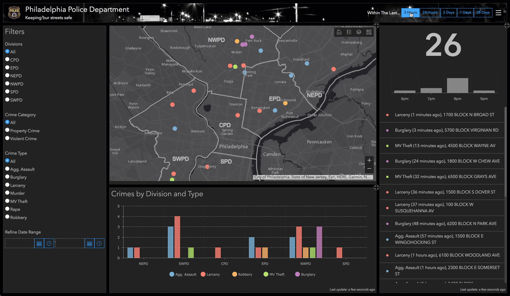
Why are interactive dashboards important? Simply put, they can quickly engage decision makers (regardless of their technical expertise) and provide them with an intuitive experience and communicates information effectively. Decisions are easier to come by, as trends can be highlighted and irregularities can be spotted. Interactive dashboards offer more than just a ‘click-to-filter’ capability; they can provide a way to associate dashboard components in almost every way imaginable. The following dashboard of Philadelphia crime data showcases just some of the possibilities.
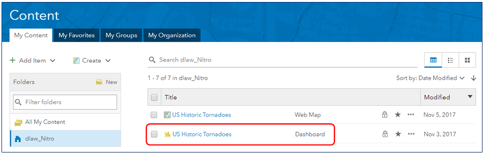
Now that you have an understanding of what an interactive dashboard can be, you’ll want to know how they are created. Before we do that however, let’s review some key concepts. Operations Dashboard (beta) works with dashboard items. These are stored in your ArcGIS organization, and they are used to capture all the information about how data is to be presented at runtime in the application.
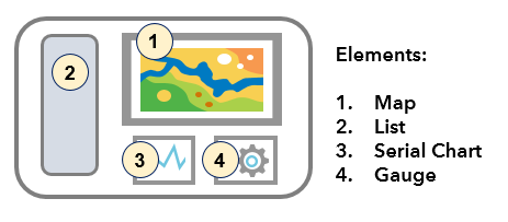
The basic building block of a dashboard is called an element, and examples include: maps, charts, gauges, lists, and so on. Elements are arranged in an efficient layout that can support many different business workflows. For example, in the conceptual graphic below the dashboard is composed of 4 elements.
Dashboard Actions
Until now, dashboard elements have worked independently from one another. They have been pure data visualizations. With this beta update, dashboard elements can be configured to interact with one another. This is done though ‘actions’.
In a dashboard, actions are triggered in response to an event having occurred. There are different types of actions (filter, pan, zoom, and set extent), and different types of events (selection changed, map extent changed). You can expect to see more actions and more events supported in future releases. For example, in the dashboard above, the author might configure things such that when the map extent changes (i.e. an event), the list and serial chart are updated to only display features that match the current map extent. This is a filter action.
Different dashboard elements support different types of events. For example, the map element supports a map extent changed event, and through its operational layers, supports a selection changed event. Another example is the list element; it also supports the selection changed event.
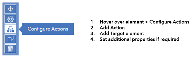
When configuring an action, the dashboard author specifies one or more targets. A target is simply another element in the dashboard. For some actions (e.g. filter), the author must specify how the source and target elements’ underlying data are related. This relationship can either be attributive or spatial. In an attribute relationship, a field or value from the source is used to match field values on the target. In a spatial relationship, feature geometries in the source are used to intersect geometries on the target. The high-level workflow for configuring actions:
Actions can be configured in many ways, and this is their power. It is up to the author to decide the data narrative presented to the dashboard’s intended audience.
Selectors
As part of introducing actions to dashboards, we’re also introducing some new UI elements to further enhance the interactive capabilities of a dashboard. Collectively, we are calling these new elements ‘selectors’. Simply put, a selector describes any dashboard element that supports a selection changed event. Since they support a selection changed event, selectors can trigger actions to occur.
With the ‘supports selection changed’ definition in mind, we’ve already discussed two kinds of selectors: you can select rows on a list element, and you can select features from the operational layers shown on a map. We do not typically refer to these things as selectors, but they do fit the definition.
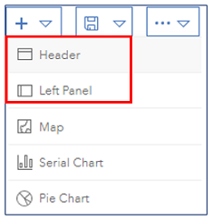
Selectors can be added to panels on a dashboard. Panels are designed to occupy a pre-defined place on a dashboard, and there are two options available: header and left panel. A dashboard can have one of each panel type, and in the case of the left panel, it can be configured to be retractable.
There are three types of selector elements: category selector, number selector, and date selector.

A category selector can obtain its values from a list of static values, from features, or from summary statistics that get calculated at runtime and it can be configured to be displayed as a dropdown, a button bar, or a list of radio buttons.

A number selector can be a fixed value or a numeric range, and can be displayed as an input box, spinner, or slider.

A date selector has many display options. It can be configured to show a list of pre-defined dates/times of the dashboard author’s choosing, or use a date/time picker that allows for a single value or a range. With predefined dates (and similar to category selector), a date selector can be displayed on the dashboard as a dropdown, button bar, or as radio buttons.
Many selectors can be placed on the dashboard panels, and when configured to trigger actions, highly interactive dashboards are possible.
Date 'binning' on Serial Charts
Although the main focus of this beta release is interactive dashboards, improvements in other areas are always happening. One new feature we would like to draw your attention to is our new date binning capability on serial charts.
The ability to parse date fields for display on a serial chart has been around for several beta refreshes and in our most recent refresh, we enabled dashboard authors with the ability to finely control the format of those dates when they appear on the chart.

When configuring a serial chart, the dashboard author specifies how the data is to be divided into categories. A value for each category is then rendered on the chart. There are three options:
• Grouped Values – Multiple rows are grouped together as input to form a single value based on a summary statistic (count, sum, minimum, maximum, etc.).
• Features – Each row of data represents a category and a numeric value from a field is rendered on the chart.
• Fields – Field name represent a category, and the value placed on the chart is a summary statistic applied to all the values.
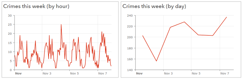
Before this release, when grouping values to create categories, we made no distinction between date fields and other categorical data. Now we take the additional step of ‘binning’ date-based data by the minimum period specified before calculating the summary statistic. This is useful for taking data that has been captured at one level of granularity (e.g. down to the minute or second) and displaying it at a coarser level of granularity (e.g. by hour or by day).
The following two charts represent crime counts. Crimes can happen at any time, and when stored in the database, their granularity might be down to the minute, or even the second. Binning such data to a coarser level of detail (e.g. hour or day) makes for nicer looking charts that are easier to interpret.
We hope you enjoy these new features and please continue to share your feedback with us on the Esri Early Adopter community forums.
Sincerely,
The Operations Dashboard for ArcGIS Dev team
- Mark as Read
- Mark as New
- Bookmark
- Permalink
- Report Inappropriate Content
Hello all,
Do you know when this new dashboards elements will be available in arcgis enterprise?
thanks
- Mark as Read
- Mark as New
- Bookmark
- Permalink
- Report Inappropriate Content
Hi Edward,
The next generation Operations Dashboard for ArcGIS will be available for ArcGIS Enterprise 10.6, as a separate post-install deployment in Q1 2018.
Hope this helps,