- Home
- :
- All Communities
- :
- Products
- :
- ArcGIS Dashboards
- :
- ArcGIS Dashboards Blog
- :
- What's Coming in Operations Dashboard (April 2018)
What's Coming in Operations Dashboard (April 2018)
- Subscribe to RSS Feed
- Mark as New
- Mark as Read
- Bookmark
- Subscribe
- Printer Friendly Page
- Report Inappropriate Content
Operations Dashboard is a configurable web app that's included with the ArcGIS platform. Dashboard offers a comprehensive and engaging view of your data to provide key insight for at-a-glance decision making.
Following our initial launch inside ArcGIS Online in December 2017, and support with ArcGIS Enterprise 10.6 in January 2018, we are poised to release a new update in April 2018 with some exciting new capabilities.
While we are putting the finishing touches on this release, we'd like to preview the key new features that you can expect to see:
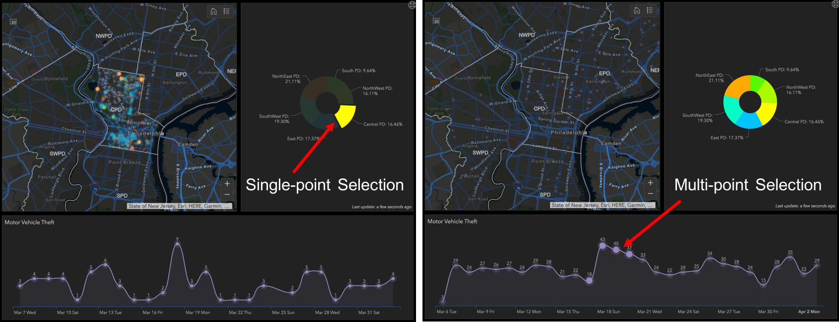
Selection on Charts
Dashboards are composed of elements such as maps, lists, gauges, indicators and charts that bring your data to life. Not only do the elements within your dashboard update when your data changes, providing an effective yet static decision support tool, but you can configure elements to communicate with one another to provide better understanding.
With this release we are adding charts as a source of actions for both pie and serial charts. You can select a single data point, or multiple data points in your charts and have their selection trigger actions in other elements like maps or lists.
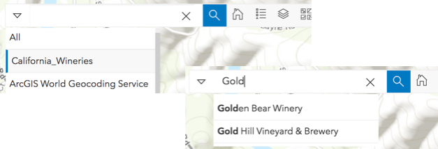
Search Map Tool
Within the map element, you can now add a new Search Map tool. This allows the user of a Dashboard to find locations or search features on the map. Search capabilities are derived from the search settings configured in the web map that you create. The Search tool will expand/contract when you click on it so that you can maximize your use of the map. Likewise, if you would like to search based upon a layer or a specific location you can click the drop down to maximize your search results.
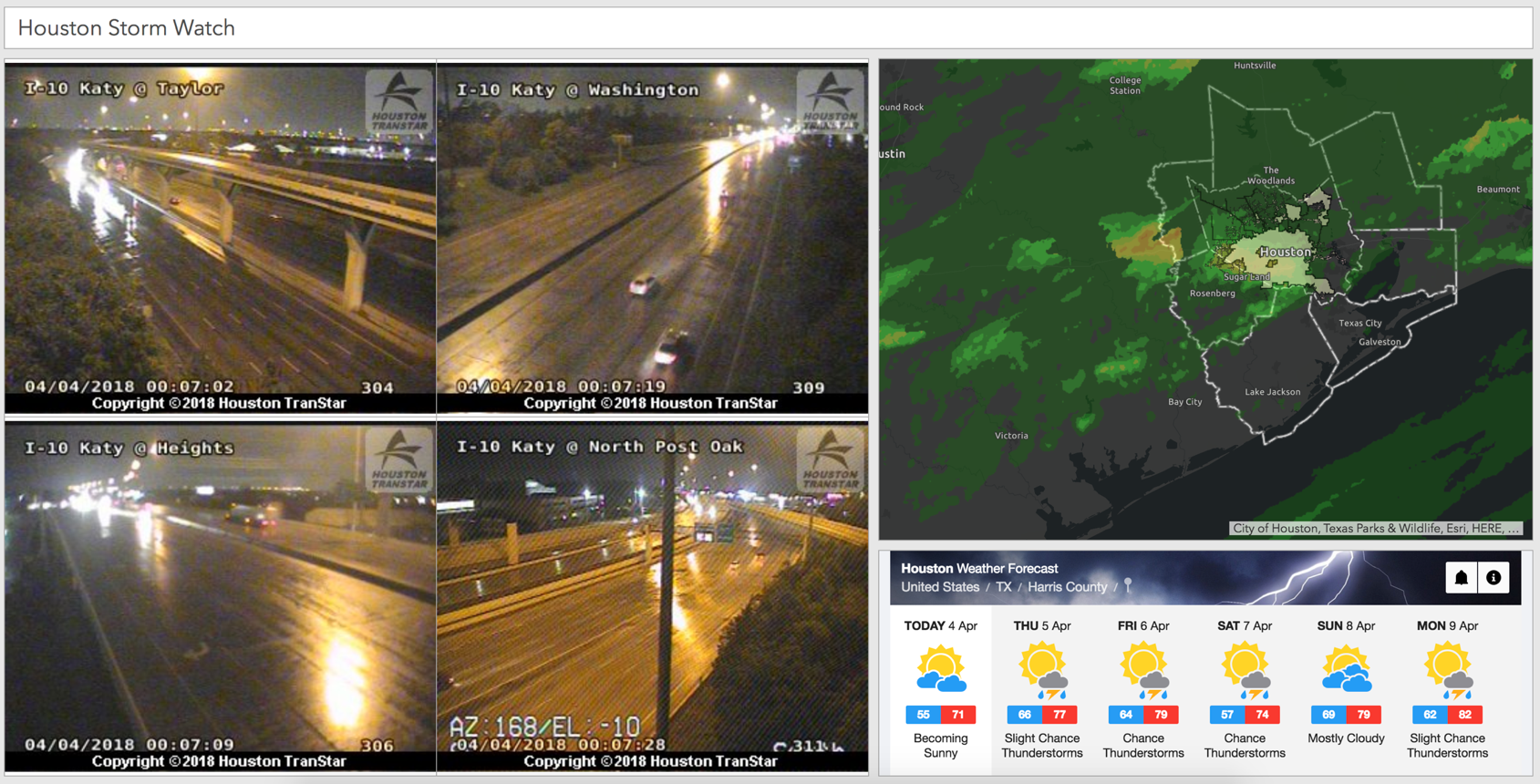
Embedded Content Element
The new Embedded Content element makes it easy to embed documents, images and video into your Dashboard. Embedded content can be static, in which case all you need to provide is the direct URL of the content you wish to display. If you want to embed weather information, a video from YouTube, or even a web scene or Survey form, simply enter the URL as a document.
Second, you can embed content from features. This means that each feature’s attribute information can be used to dynamically construct a URL at run time. When embedding from features, the embedded content can be the target of an action such as selection on a map or list. This is a great way to display content from external web pages that are based upon a common key, shared in a feature attribute (like images from CCTV cameras for example).
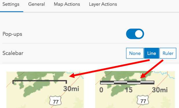
Scale bar on maps
Included with the map tools, you can now add a scale bar to your map. There are two styles: a ruler style or a line style. When you choose a style, the scale bar will appear in the bottom left corner of your map element.
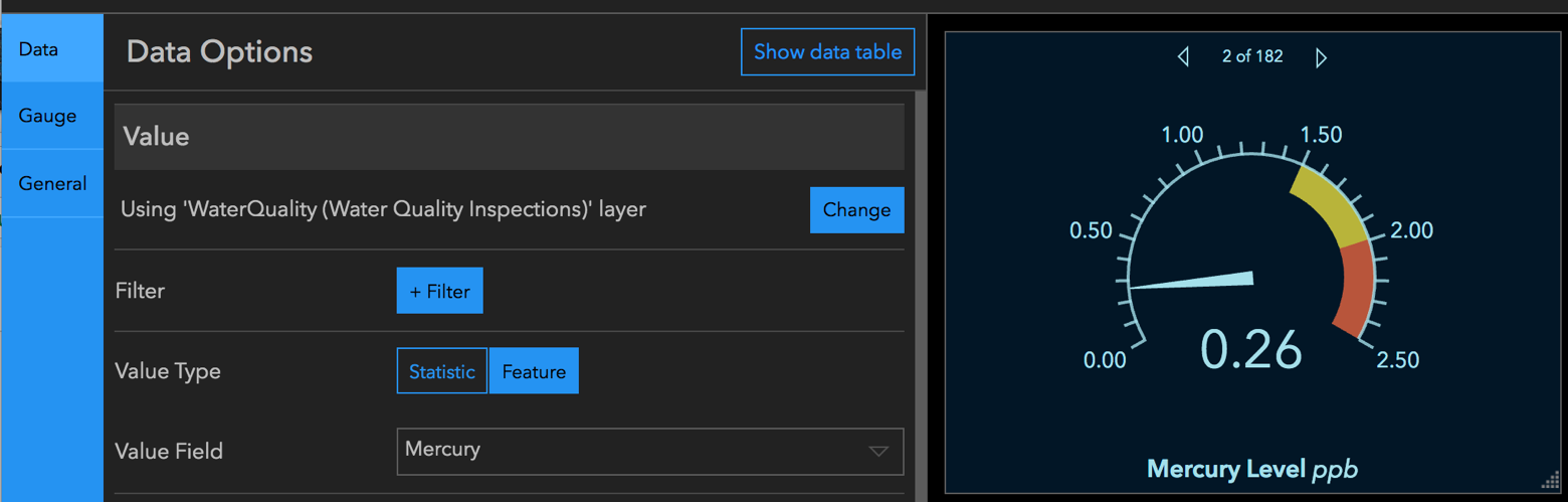
Feature-mode for Gauges and Indicators
Until now, you could only configure a gauge or indicator using a statistic value such as an average or a sum. With this release, you can now drive the value type, as well as the minimum and maximum values directly from attributes of a feature.
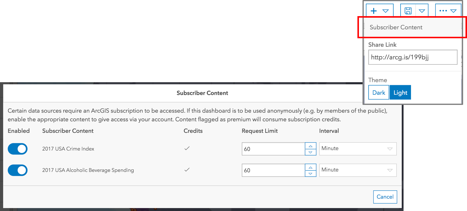
Sharing Premium Content in Dashboards
ArcGIS comes with ready-to-use map layers that require an organizational subscription account to access. Some of your subscription content, premium content, will consume credits as well. You can include subscription content in your Dashboard, provide seamless access to it, and if needed, limit the number of requests it can receive to manage costs.
Switch Languages
Depending upon the region you are in, you may need to override the locale settings of your browser to display your Dashboard in a different language.
Now you can use a query parameter on the URL of the Dashboard to load it in the locale of your choice. By appending the two-letter language code to your Dashboard URL, you can load the Dashboard into the locale of your choice.
Default Language:
https://<portal>/apps/opsdashboard/index.html#/4f539791b2f1418cb5403891f1a7be50
French Locale:
https://<portal>/apps/opsdashboard/index.html#/4f539791b2f1418cb5403891f1a7be50?locale=fr
New SVG Icons
When adding an icon to your Indicator or Gauge, you will find that we have added over 100 new icons to the collection. Of course, you can continue to add your own icons as well. Also, now you can use an SVG icon as the logo within the Header element as well!
![]()
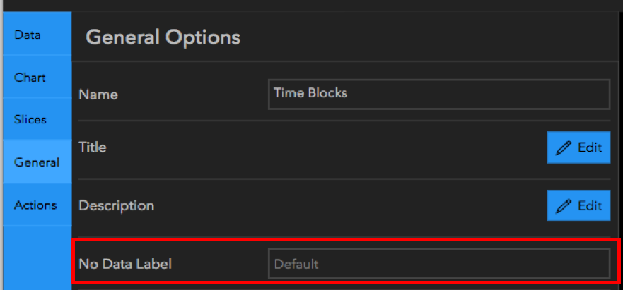
No Data Label
It is possible that your visualization may not have any data to display. It may be driven by an empty layer awaiting data to be added from field apps like Collector, or, it may be the destination of a selection within another element. If the element is void of any data, Dashboard would fill the empty space with a “No data” label. Now you can provide your own text that makes sense to your users and potentially gives direction on how to populate the element with data.
In addition to all the new features mentioned above, we slightly changed the configuration user experience as well. Actions are no longer a separate button from the rest of the configuration experience. They are now available in a unified configuration experience so that they are easier to find and manage.
We look forward to seeing the Dashboards that you create using our April release! If you would like to share your Dashboards with us, or provide feedback directly to our development team, please email Dashboard4ArcGIS@esri.com.
Thank you,
Dashboard Team
You must be a registered user to add a comment. If you've already registered, sign in. Otherwise, register and sign in.