- Home
- :
- All Communities
- :
- Industries
- :
- Education
- :
- Education Blog
- :
- Exploring Potential Changes in World Climate Using...
Exploring Potential Changes in World Climate Using Web GIS
- Subscribe to RSS Feed
- Mark as New
- Mark as Read
- Bookmark
- Subscribe
- Printer Friendly Page
- Report Inappropriate Content
Exploring Potential Changes in World Climate Regions. In this activity, you will dig deeper and examine change over space and time, while keeping a focus on regions.
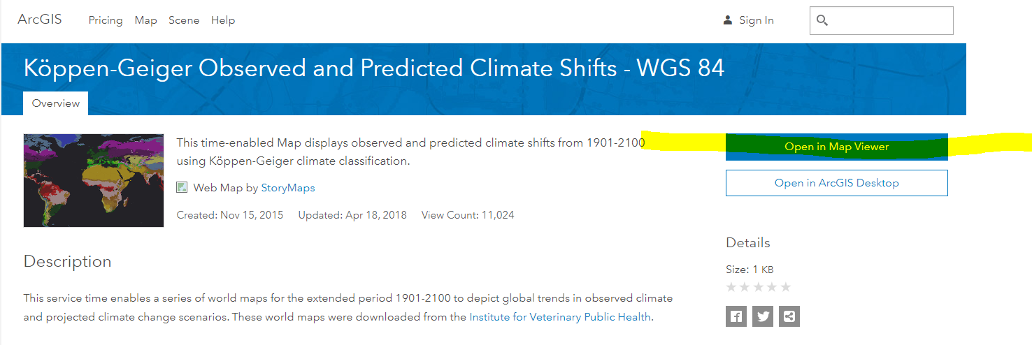
Understanding the Köppen-Geiger Observed and Predicted Climate Shifts data set. Access the following map: Köppen-Geiger Observed and Predicted Climate Shifts - WGS 84:
http://www.arcgis.com/home/item.html?id=4034d0ab3eb64d0db7ad688927920f74
Skim the metadata, which in part gives the following information: This service time enables a series of world maps for the extended period 1901-2100 to depict global trends in observed climate and projected climate change scenarios.
The climate classification comprises a total of 31 climate classes described by a code of three letters. The first letter describes the main classes, namely equatorial climates (A), arid climates (B), warm temperate climates (C), snow climates (D) and polar climates (E). The second letter accounts for precipitation and the third letter for temperature classes. The Map Service author also added 3 attribute fields to decode the letters for simpler use; in the attribute table, Main Climate, Precipitation, and Temperature correspond to these original coded letters. The legend also reflects these attributes rather than the coded letters.
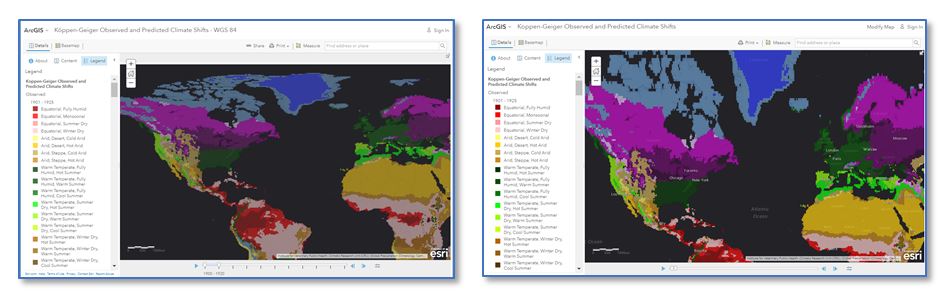
Map projection investigation with the Köppen-Geiger Observed and Predicted Climate Shifts data in ArcGIS . Access the following map: http://www.arcgis.com/home/item.html?id=4034d0ab3eb64d0db7ad688927920f74 . Select "Open in Map Viewer”:
The map displays in ArcGIS . Notice that it is in a different map projection than many of the other maps you may have examined. Here, the map is cast in the World Geodetic System 1984, rather than in Web Mercator, which has been used in many activities in this module thus far. As you know as a geography instructor, because we are projecting the oblate spheroid 3D shape of the Earth onto a 2D map (whether paper or digital), all maps therefore have distortion in area, distance, direction, and shape—and usually in more than one of these four elements. Map projections are similar to scale in that there is no “best” map projection; it depends on the content you are analyzing and your goals for your lesson. However, the choice of map projection matters for several reasons, such as: (1) The map projection influences the message; the information; that you are conveying. Many projections have been criticized for distorting people’s perceptions of lands and countries (especially those not their own). (2) Measuring areas and distances on maps is dependent upon the projection they are in, which will affect the spatial analysis done in Spatial Technology. For more, see the video “why all maps are wrong” here and see the resources in the Explore Further session of this component.
Climate investigation with the Köppen-Geiger Observed and Predicted Climate Shifts data. Open a new tab in your browser and access the following map. It contains the same content as the one you just opened, but this one is cast in the Web Mercator projection:
http://www.arcgis.com/home/webmap/viewer.html?useExisting=1&layers=7a53584fa55643df969f93cec83788e1
The map you will be using in this activity is on the left, and the map of the same content (after changing the basemap to dark gray) in Web Mercator is on the right. Web Mercator is used for much mapping, including the default in ArcGIS and Google Maps. For studies of neighborhoods or a stretch of beach, the map projection doesn’t matter a great deal, but for global studies, the projection can make a big difference. For example, compare the size and shape of Greenland and Scandinavia from the two maps below. Note that ArcGIS can use many types of projections, for example, the one we will use for this climate region study.
Once you open the original Köppen-Geiger Observed and Predicted Climate Shifts - WGS 84:
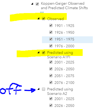
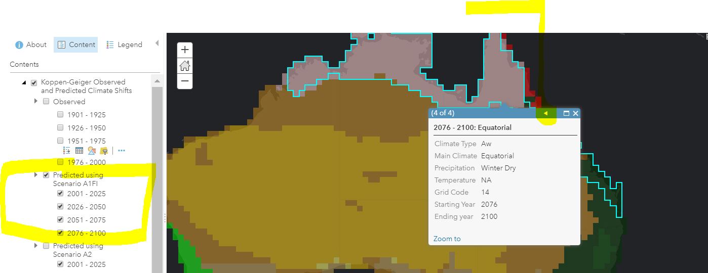
http://www.arcgis.com/home/item.html?id=4034d0ab3eb64d0db7ad688927920f74, under the map, find the time slider timeline. Slide the right slider arrow under the map all the way to the right, so you can examine all of the years predicted in the data set. Teaching tip: Some classrooms lack the bandwidth for 30 students to "Play" the climate shift animations simultaneously, so you might experience better results by using the slider tabs rather than using the "Play" button.
In the upper left, experiment with Show Contents of Map and Show Map Legend. Examine various climate zones to obtain more information about them by clicking on them on the map.
Globally, what would you say are the 3 largest climate zones in terms of total area?
Regional investigation with the Köppen-Geiger Observed and Predicted Climate Shifts data. Greenland. On your map, zoom and pan to Greenland, as follows, turning on the Observed 1976-2000 and the Predicted Using Scenario A1F1. According to the metadata, Scenario A1F1 represents a scenario where economic and technological growth is achieved through intensive fossil fuel use. Make sure left marker on the timeline is all the way to the left and the right marker is all the way to right. Toggle between the Observed 1976-2000 and the Predicted Using Scenario A1F1, as shown below:
Observe the size of the Polar EF climate zone - the medium blue color. EF is Polar Ice Cap. Average temperature of warmest month for the EF climate is 0°C (32°F) or less. Precipitation generally is greater than potential evaporation.
Make one observation about the predicted changes in the EF Climate Zone in Greenland and 2 implications of those predictions. If you have time, explore the other models presented.
Victoria, Australia. Pan to Victoria Australia, click on it, and observe the 2001-2015 climate type, as shown below. It should be listed as Cfb, warm temperate, warm summer:
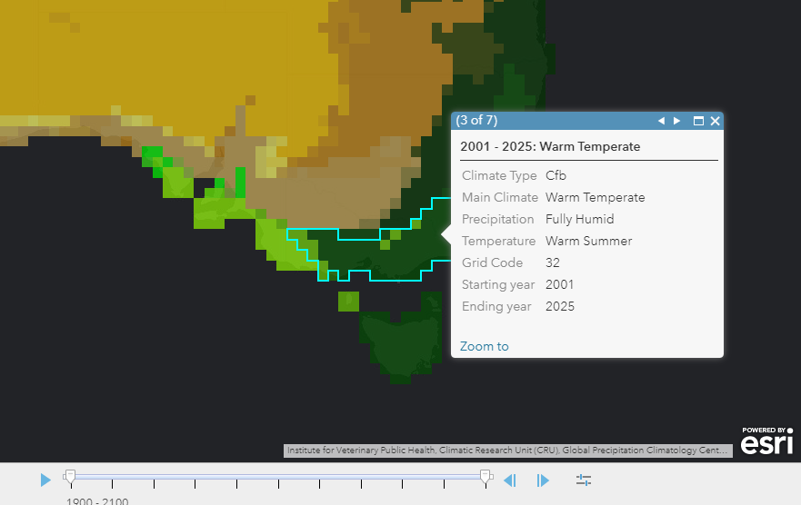
Next, toggle between observed and predicted using scenario A1F1 as you did for Greenland. You should see that Cfa increases (hot summer) while the area of Cfb (warm summer) decreases. Zoom out until you see more of Australia, and repeat the process, noting the size of the Equatorial climate zone in the north and northeast parts of Australia.
Globally, the largest shifts between the main classes of equatorial climate (A), arid climate (B), warm temperate climate (C), snow climate (D) and polar climate (E) on global land areas are estimated as 2.6–3.4 % (E to D), 2.2–4.7 % (D to C), 1.3–2.0 (C to B) and 2.1–3.2 % (C to A).
Examining models in Spatial Technology. As they do for other activities, in this lesson, GIS provides a hands-on supplement to your instructional goals and themes, in this case, about climate and climate change. A critical part of the discussion while using the tools is that these predictions are based on climate models. Discuss with students what a model is and use examples in engineering, biology, physics, mathematics, and geography. A useful phrase to discuss with your students may be, "All models are wrong, but some are useful." As in other disciplines, none of these climate models may be considered as completely "accurate" but are based on best available data sources.
For more discussion, see "Humans and their Models" on PhysicalGeography.net. Making maps of climate and using the geographic perspective is more useful than simply examining tables of weather and climate data from weather stations, ice core samples, and the fossil record. Some students may need a background in the effects of the Earth’s rotation, oceans, land masses, and solar radiation on climate, and for those situations, use this discussion on physicalgeography.net.
You must be a registered user to add a comment. If you've already registered, sign in. Otherwise, register and sign in.
-
Administration
38 -
Announcements
44 -
Career & Tech Ed
1 -
Curriculum-Learning Resources
178 -
Education Facilities
24 -
Events
47 -
GeoInquiries
1 -
Higher Education
518 -
Informal Education
265 -
Licensing Best Practices
46 -
National Geographic MapMaker
10 -
Pedagogy and Education Theory
187 -
Schools (K - 12)
282 -
Schools (K-12)
184 -
Spatial data
24 -
STEM
3 -
Students - Higher Education
231 -
Students - K-12 Schools
85 -
Success Stories
22 -
TeacherDesk
1 -
Tech Tips
83
- « Previous
- Next »