Turn on suggestions
Auto-suggest helps you quickly narrow down your search results by suggesting possible matches as you type.
Cancel
- Home
- :
- All Communities
- :
- Industries
- :
- Education
- :
- Education Blog
- :
- Using Mathematics, Web Maps, and Geography to Inve...
Using Mathematics, Web Maps, and Geography to Investigate Global Temperature Extremes
Subscribe
635
0
03-20-2015 12:00 AM
- Subscribe to RSS Feed
- Mark as New
- Mark as Read
- Bookmark
- Subscribe
- Printer Friendly Page
- Report Inappropriate Content
03-20-2015
12:00 AM
In my last post, I described some simple but powerful activities that you can use with students to engage them in mathematics usi.... What else can you do with mathematics with ArcGIS Online? Using another activity I have written, I invite students to investigate global temperature extremes. The activity begins by asking two questions: (1) Can you work effectively with numbers so that they can understand extreme temperatures around the world? (2) Can you compare and interpret information so that you can understand patterns over space and time?
Students conduct seven mathematics investigations in this activity:
1. Analyze temperature extremes data around the world including the temperature reading and the date.
2. Examine the relationship between the location (primarily: Altitude and latitude) of the extreme temperatures and the value of the temperature, and whether that temperature was a high or a low extreme.
3. Order and compare numbers in temperature data tables and on maps.
4. Round numbers in temperature data tables and maps.
5. Visually represent numbers in temperature data tables and maps.
6. Add and subtract whole numbers and decimals.
7. Compare temperature extremes over time by constructing graphs.
The activity begins by asking the students to describe the hottest and then the coldest day they have experienced, and what they did to cool down or warm up. Next, using a map of temperatures plotted as points on a world map in ArcGIS Online, they describe the spatial pattern of global maximum and minimum temperature extremes. Then, exploring the attribute table in tandem with the map, they answer the following questions: "What is the range of maximum temperatures shown on this map (between the lowest maximum and the highest maximum)? How many times hotter is the highest maximum temperature than the lowest maximum temperature? Round your final answer to the nearest degree. Show your work."
Students then sort the table on latitude and graph the temperatures by latitude, and then create a histogram of temperature extremes by month of the year, using these graphs to make connections between the data, the map, climate, and seasons. They zoom in to selected extreme temperature locations and examine the effect of local topography and proximity to oceans on extreme temperatures. They also examine the temporal components of the data to determine the existence and length of heat waves and cold snaps.
What else could you do with this data or with other weather related data to connect science, geography, and mathematics using ArcGIS Online?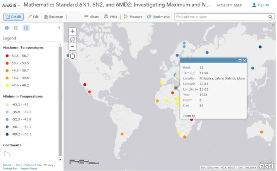
Examining global temperature extremes with ArcGIS Online.
You must be a registered user to add a comment. If you've already registered, sign in. Otherwise, register and sign in.
About the Author
I believe that spatial thinking can transform education and society through the application of Geographic Information Systems for instruction, research, administration, and policy.
I hold 3 degrees in Geography, have served at NOAA, the US Census Bureau, and USGS as a cartographer and geographer, and teach a variety of F2F (Face to Face) (including T3G) and online courses. I have authored a variety of books and textbooks about the environment, STEM, GIS, and education. These include "Interpreting Our World", "Essentials of the Environment", "Tribal GIS", "The GIS Guide to Public Domain Data", "International Perspectives on Teaching and Learning with GIS In Secondary Education", "Spatial Mathematics" and others. I write for 2 blogs, 2 monthly podcasts, and a variety of journals, and have created over 5,000 videos on the Our Earth YouTube channel.
Yet, as time passes, the more I realize my own limitations and that this is a lifelong learning endeavor and thus I actively seek mentors and collaborators.
Labels
-
Administration
38 -
Announcements
44 -
Career & Tech Ed
1 -
Curriculum-Learning Resources
178 -
Education Facilities
24 -
Events
47 -
GeoInquiries
1 -
Higher Education
518 -
Informal Education
265 -
Licensing Best Practices
46 -
National Geographic MapMaker
10 -
Pedagogy and Education Theory
187 -
Schools (K - 12)
282 -
Schools (K-12)
184 -
Spatial data
24 -
STEM
3 -
Students - Higher Education
231 -
Students - K-12 Schools
85 -
Success Stories
22 -
TeacherDesk
1 -
Tech Tips
83
- « Previous
- Next »