- Home
- :
- All Communities
- :
- Industries
- :
- Education
- :
- Education Blog
- :
- Powerful, implementable ways to teach about popula...
Powerful, implementable ways to teach about population with GIS tools and data
- Subscribe to RSS Feed
- Mark as New
- Mark as Read
- Bookmark
- Subscribe
- Printer Friendly Page
- Report Inappropriate Content
Teaching and learning about demographics and population change in an effective, engaging manner is enriched and enlivened through the use of web mapping tools and spatial data. These tools, enabled by the advent of cloud-based geographic information systems (GIS) technology, bring problem solving, critical thinking, and spatial analysis to every classroom instructor and student (Kerski 2003; Jo, Hong, and Verma 2016). Several developments make this the ideal time for educators to embrace these tools and data sets for teaching these topics. First, population patterns change over space and time, providing the perfect data and themes for investigation using 2D and 3D maps in a GIS environment. Second, modern GIS is a platform that enables maps and applications to be saved, shared, and embedded into presentations and multimedia, forming a collaborative learning environment. As analytical and cartographic tools have migrated to the web, they can be used on any device at any time using only a standard web browser (Manson et al. 2013). Third, the open data movement places an array of rich, varied demographic data sets from the local to global scales in the hands of educators and students. These data include those from the U.S. Census Bureau and other national statistics agencies. Fourth, GIS was created to be a tool to investigate real-world issues, and therefore teaching with GIS is conducive to a multidisciplinary, problem-solving learning environment using real data (Milson and Kerski 2012).
Why teach about population change, demographics, and lifestyles? These topics are multi-scale, multi-disciplinary, connected to content standards, and relevant to 21st Century issues. They are interesting, changing over space, time, and scale. They are tied to Problem-Based Learning (PBL), and are aligned with an inquiry-driven approach ("What if we change the classification method? Change the location? Add a variable?"). Teaching these topics with GIS offers the opportunity for fieldwork and collaboration, fostering skills in media fluency, scale, and systems thinking. On the research side, population's dynamic nature and its impact on culture, land use, and the environment make it a continually fascinating and important area of research. On the campus administration side, demographics affect alumni networks, future online and on-campus student number and background, funding sources, and much more.
Here, I describe 10 activities that can be used to teach about population, population change, demographics, and lifestyles. Each can be used in a variety of different courses including those in GIS, environmental science, geography, history, and even business and sociology as single activities or multi-day activities. These 10 activities all use the ArcGIS platform, from Esri, including ArcGIS Online, ArcGIS Pro, ArcGIS Insights, and Business Analyst Web. The advantage of the ArcGIS platform is that it includes (1) spatial data; (2) maps; (3) analysis, classification, symbology, and measurement tools; (4) field apps; (5) web mapping applications; (6) a community of users. Over 1 billion maps are accessed daily in this platform serving millions of data users.
(1) Examining global patterns using ArcGIS Online. The Living Atlas of the World is a curated and growing body of content covering a multitude of scales. Population growth, ethnicity, density, cities, and other themes can be quickly accessed, combined with other layers, queried, and used in presentations. Many of the layers contain data that extends back in time; others forecast into the future. Using this web map of a selected set of variables from the Living Atlas opens the door to investigating population growth rate, life expectancy, birth rate, and mobile phones and land lines for world countries. You might start by showing a more easily understood variable such as total population or population density. You might introduce the topic of population by showing these videos of an area with low population density vs. one with a high population density. Life expectancy can be analyzed over time, by opening the data table and by using the time animation slider bar. I almost always map the Human Development Index (HDI) over time, because it is an index that includes variables about health and education, fostering fruitful, interdisciplinary discussions. For additional analysis, sign in to your ArcGIS Online account, save the maps in your organization, change the symbology or variables mapped, and add other layers from your own tables, the Living Atlas, or from ArcGIS Online.
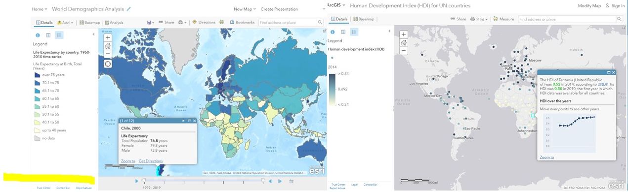
Left: Comparing demographic variables by country using ArcGIS Online. Note slider bar that provides temporal analysis capability. Right: Mapping Human Development Index (HDI) by country over time.
(2) Sub-country investigations. Provinces, neighborhoods, and other administrative and political areas in many countries can be investigated. Start by browsing for population in the Living Atlas or searching for open data hub sites. For example, investigate purchasing power and other characteristics of the population and of businesses in Germany with this interactive map and set of data, from Germany's 16 states to the neighborhood level. With this and other premium content in the Living Atlas, you will need to sign in to ArcGIS Online with your ArcGIS Online organizational subscription to access the map and data.

Mapping total births by neighborhood in Hamburg Germany clearly shows the differences between those without children in the city center (partially encircled by the ring road) and southeast along the Elbe River versus neighborhoods to the northeast and northwest of the city center.
(3) US Census demographics investigations. Start your US Census data investigation with the Living Atlas content authored by the Esri demographics team. At the time of this writing, 78 layers exist covering 89 different American Community Survey tables, each with dozens of field names, covering age, employment, income, housing, insurance, education, veterans status, and even internet connectivity. This already vast array of data will continue to grow as 2020 Decennial Census data becomes available. Use the phrase “current year ACS” to quickly find these layers. You can find these layers by searching the Living Atlas website, or directly within your map by using Add > search the Living Atlas. You can also find the layers within this ArcGIS group that categorizes the layers by topic. The ACS data support field descriptions, have improved boundaries over the boundaries on census.gov, and are accessible throughout the ArcGIS platform, which means you can use it in ArcGIS Online, ArcGIS Pro, Insights, and even in field apps such as Explorer. I was recently working with faculty from the University of Arizona, for example, and we investigated one of these layers, the percent of households in Tucson with no internet access (below). For further information, see these guidelines on how to quickly make an ACS map.
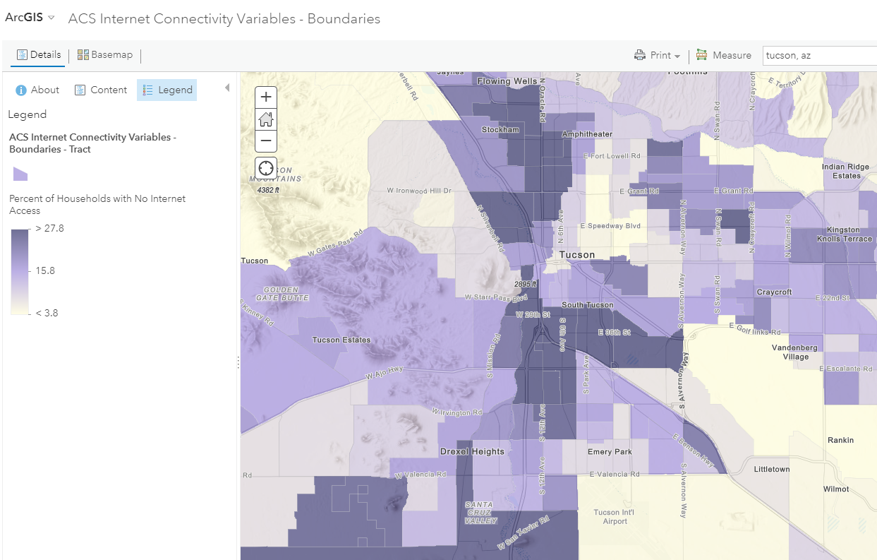
The ACS data on percent of households in Tucson with no internet access mapped in Tucson shows some sharp boundaries.
To access US Census data, you can certainly still use the workflow that was standard fare in most GIS courses and workflows for years: Access www.census.gov, download and unzip the boundary files that you need, such as block groups, census tracts, and county boundaries. Access a different node on the Census.gov site, download and unzip the demographic data that you need. In ArcGIS Pro, join the demographic data to the appropriate "bounding polygons" and save to a new layer. Rename field names from "P01" names to field names that can be more readily understood. Then, symbolize and analyze the data. While this workflow teaches key skills, many steps are required to bring the data to the point at which it can be analyzed. I am convinced that this workflow is no longer completely necessary, as the Living Atlas workflow suggests.
(4) Mapping and filtering census data at different scales. Using the ArcGIS Online map viewer, you can investigate the relationship between such variables as median age and median income, explore consumer and other behaviors, study the patterns of diversity, and examine how many of those variables change over time. Start with the popular demographics web map, and symbolize on a variable of interest. More data is not always better; hence, the filter tool can be very useful to reveal patterns. Below, I filter on the counties where the average household size is 2.75 and above.
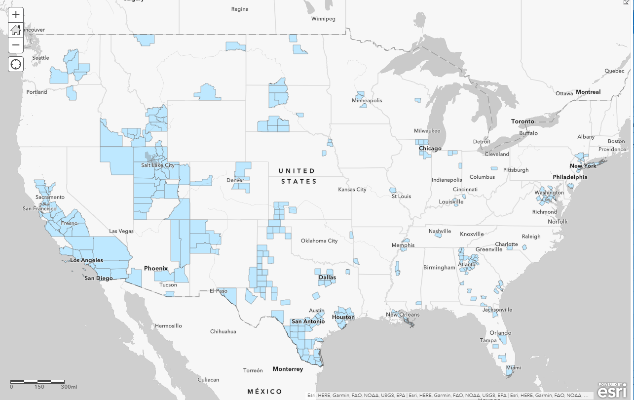
Census map of counties with at least 2.75 people per household. Note the suburban areas around Chicago, Atlanta, and Washington DC, some Native American-predominant counties in South Dakota and Arizona, and counties in Utah, Texas, and California that appear for a variety of reasons.
The above layer contains quite a bit of attribute data and layers. If you prefer to begin with a simpler map, use this map that contains a smaller number of layers. Consider using the map to ask questions such as, "Where is the median age lower than the surrounding areas, and which factor(s) are pulling down the median age (certain types of employment, a military base, a university, a prison)? Where does the median income increase as the median age increase, and where does that trend break down, and why? How does your community compare to others of the same population, and what are some reasons for the differences?
(5) Mapping past change and future projections. How has population changed in the past, and what are the projected trends into the future? To investigate these questions, use this map containing 2018 data and projections to 2023. After I opened this map, I changed the scale to the zip code level, and changed the style to reflect changes in 2018 median household income compared to that projected in 2023, as shown below.
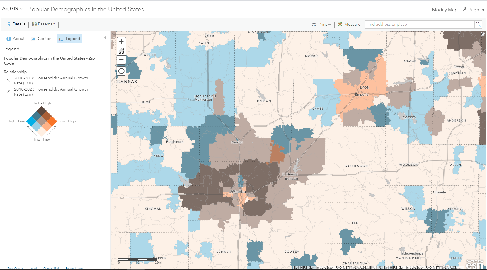
Comparing household growth rate 2010-2018 to 2018-2022 by zip code in southern Kansas, showing areas that have experienced high growth and will continue to do so, where growth will decelerate in the future, where growth will accelerate in the future, and where growth has been slow and will continue to be slow. This uses the relationship type of symbology.
(6) Deeper analysis in ArcGIS Pro and ArcGIS Insights. All of the data described in these guidelines can be brought to ArcGIS Pro and ArcGIS Insights. The primary reasons to consider teaching and conducting research with census data in ArcGIS Pro and ArcGIS Insights are to teach additional GIS skills, and to take advantage of the many analytical tools that exist in these products. ArcGIS Pro has the most tools of any ArcGIS product, including a bridge to the R statistical package and spatial statistics functions such as Build Balanced Zones, Spatial Autocorrelation (Global Moran's I), Cluster and Outlier Analysis (Anselin Local Moran's I), Hot Spot Analysis (Getis-Ord Gi*), and Colocation Analysis. ArcGIS Insights has the advantage of unique visualizations for data such as chord diagrams. In the example below, I brought in the popular demographics layer into an ArcGIS Pro project and am now using the Enrich tool to add some behavioral data that was not in the original popular demographics data layer.
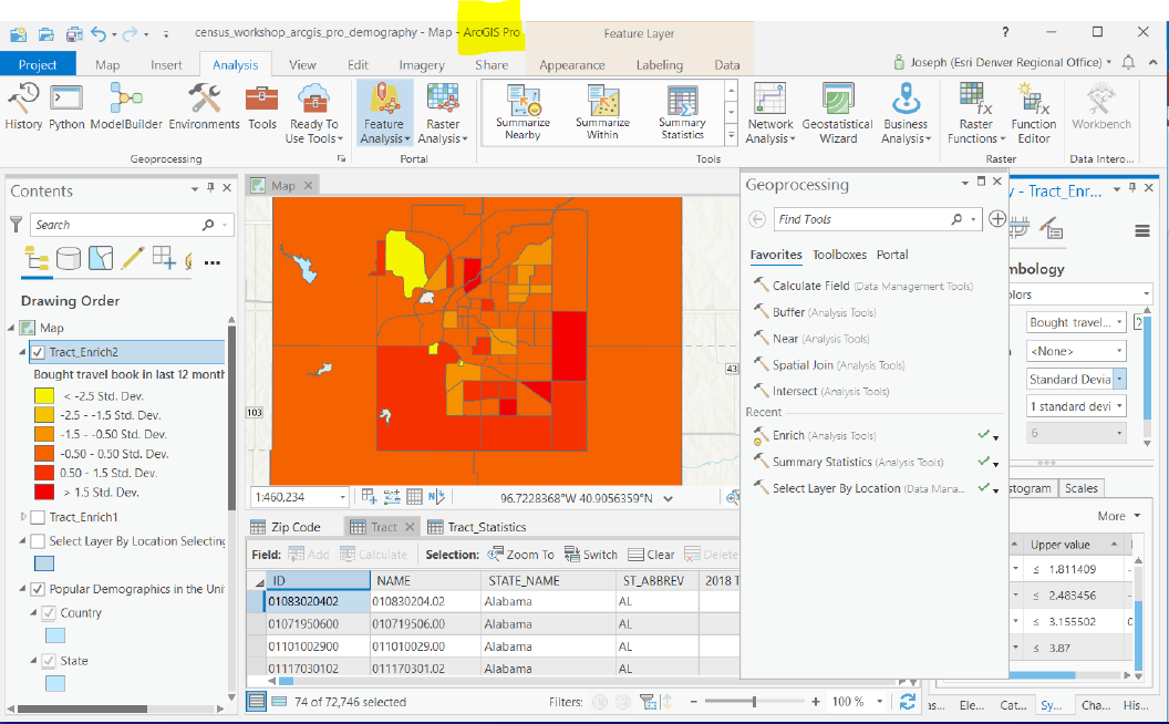
Analyzing census data within ArcGIS Pro, here showing the patterns of people who "bought a travel book in the last 12 months" in Lincoln, Nebraska, after running the Enrich tool. In my case I am using this in a lesson that invites students to consider an optimal location for a new bookstore and coffee shop.
(7) Demographic and lifestyle investigation using Business Analyst Web. Business Analyst Web, an Esri Software-as-a-Service (SaaS) toolset, is also extremely useful for population analysis primarily because of its (1) demographic data; (2) lifestyle and consumer behavior data; (3) business location data; (4) mapping and spatial analysis tools; and (5) ability to create customized demographic reports and infographics. Its data covers multiple countries at multiple levels of geography. The lifestyle and consumer behavior data includes hundreds of variables, ranging from pet ownership to health insurance coverage, from commuting patterns to work and leisure activities, tapestry segmentation, and much more. It also includes millions of business locations, sales volume, and other data, literally from A to Z - automotive repair shops to zoos. Everything you need to conduct analysis with rich sets of data are at your fingertips in Business Analyst Web, but it is also a part of the ArcGIS platform, so you can import and export maps and layers from it to ArcGIS Online and ArcGIS Pro.
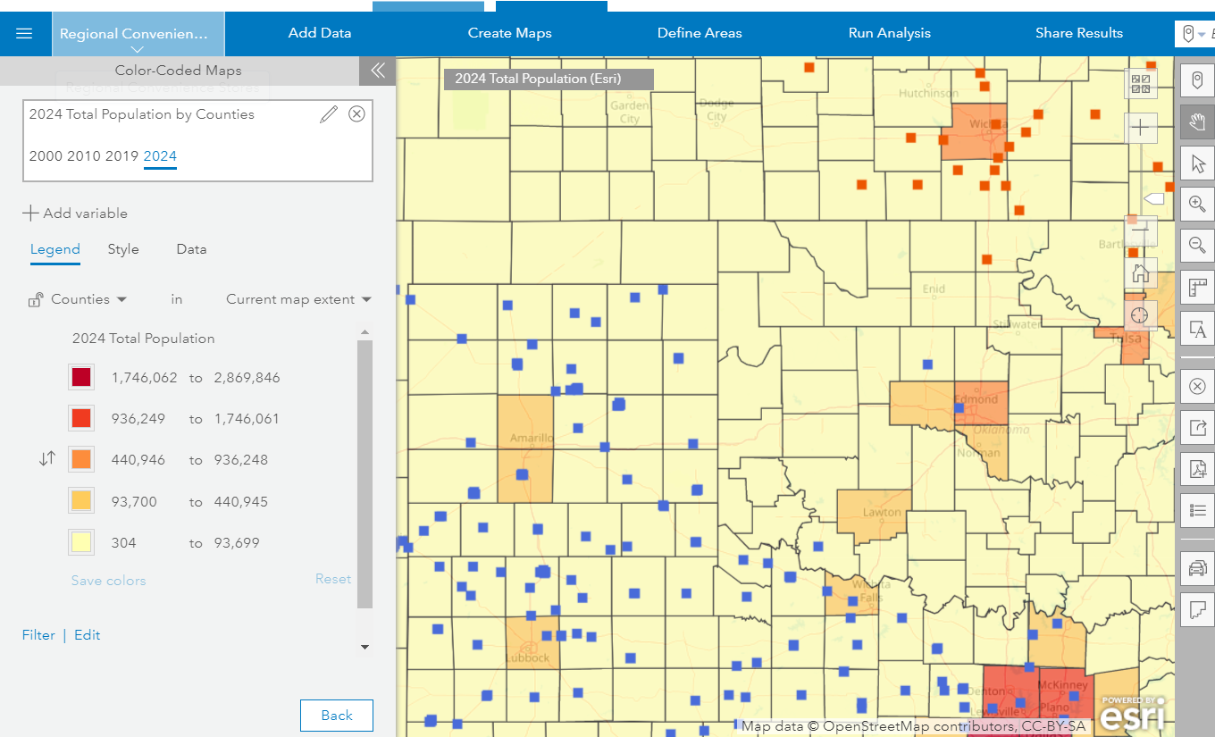
Comparing county population to the locations of two convenience store chains--Allsup's (blue points) and Casey's (red points). This activity is available here.
(8) Visualizing and understanding migration over space and time in 3D. Web mapping applications focused on population data abound. For example, one set of storymaps that can be used to analyze global population and its influence on urbanization, agriculture, and other aspects of our world is the Age of the Anthropocene. Another set of apps is the "cool maps" gallery, and one map in the gallery is a 2D and 3D visualization of incoming and outgoing migration for every country in the world over 4 dif.... This visualization presents estimates of the number of international migrants by destination and origin, using Trends in International Migrant Stock data from the United Nations Department of Economic and Social Affairs. Use this visualization to compare one country's change over time in terms of numbers, and in terms of where migrants travel from and to. For example, you can visualize the increase in Australia's immigration from South Asia and East Asia relative to its traditional immigration from western Europe, and the increase in the absolute numbers of migrants as well. The same map can be used to investigate the immigration to the UAE to support the infrastructure development there, as well as the continuing challenges facing Somalia and the resulting out-migration from there. Ask students: Which patterns did you expect to see, and which were surprising to you? Why?
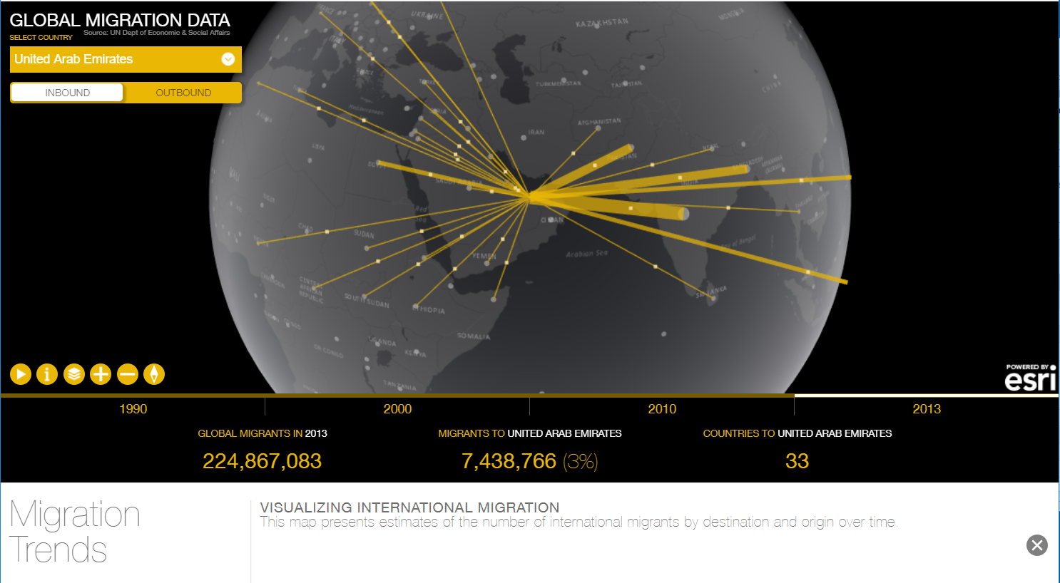
Visualizing incoming migration to the UAE across space and time with the Global Migration Map.
(9) Comparing demographic patterns across 100 global cities. The Urban Observatory is a mapping and visualization tool that allows for over 100 cities around the world to be compared across more than 50 themes. Created by Richard Saul Wurman (founder of TED), RadicalMedia, and Esri, it is an easy-to-use, powerful teaching tool. Themes include work (such as zoning), movement (such as roads, transportation noise, airports, and traffic), people (such as population density and growth), public (such as the ParkScore and health resources), and systems (such as current temperature and flood zones). Click on "Launch App" to compare cities and themes of your choice. These will be displayed in three side-by-side maps that are interactive and at the same scale. Because some variables are from real-time feeds, you can use the Urban Observatory to teach about commuting, time zones, and seasons. How does the site and the physical geography of each city affect population density? Which of the urban geography models apply to each of these cities? I use the data service's senior population theme frequently in conjunction with population pyramids to compare Tokyo to Accra, for example. Why is the senior population for Tokyo so much higher than for Accra or Lagos? If you find the Urban Observatory data fascinating, and want to dig deeper with additional data, see my colleague Jennifer Bell's published layers in ArcGIS Online.
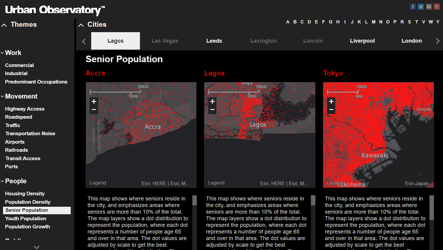
Comparing senior population in Accra, Lagos, and Tokyo using the Urban Observatory.
(10) Additional web mapping applications. Other population web mapping applications that I frequently use while teaching include the following. For more detail about these tools, see this ArcWatch article and this GeoNet essay.
A new story map on the theme "Where are people moving? I particularly like investigating the county-by-county migration map toward the end of this story map.
The NASA SEDAC CIESIN Global Population Estimation Web Mapping Application allows for population pyramids and other information to be queried for any user-defined area on the planet, allowing regions to be easily compared. One of my favorite parts is its use of population pyramids, in my opinion one of the best tools ever invented to teach and learn about demographics.
State to state inflow and outflow migration, mapped with the distributed flow lines tool in ArcGIS Pro. Why do Texans tend to move to other warm states? Why do people who move out of North Dakota tend to move to Minnesota? Popup graphics allow exploration for how the flow changes over time. There are even selected county inflow and outflow maps, too! The US Census Bureau flow mapper shows county-by-county in and out migration in a queryable map format. The state-by-state migration map and set of charts from the New York Times shows migration in yet a different cartographic style, also shown here.
I also make frequent use of the Esri Wayback imagery and the Esri USGS historical topographic map viewer to examine how urban and rural areas have changed (or not changed, as the case may be) over time. The Wayback immagery shows high-resolution satellite imagery for the past 6 years, globally. The Esri USGS map viewer shows topographic maps for the past 80 years for the USA. I also ask students to use the Landsat Lens web mapping application to examine changes from human impact around the world using 20 years worth of Landsat image scenes, starting with Abu Dhabi with stops at the Aral Sea, Shanghai, Las Vegas, the Arabian Desert, and elsewhere. I also frequently ask students to make swipe maps with 2 different time periods of an area using the Landsat Explorer web mapping application. Maps with rich and deep content are sometimes tied to lessons, such as this map showing counties in farms, rainfall, and population change during the 1930s Dust Bowl, part of the Geoinquiries library of lessons.
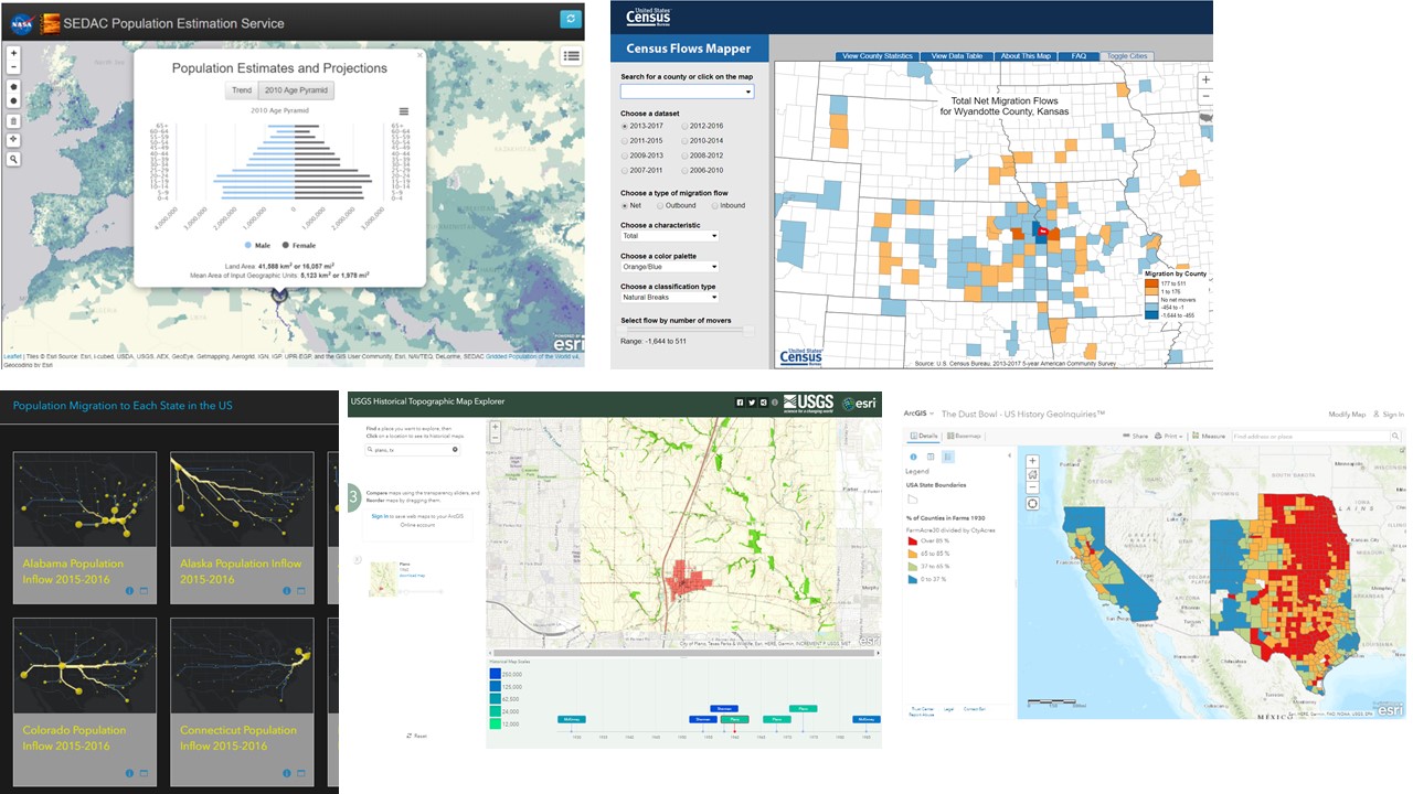 Graphic showing selected additional useful population analysis tools. Clockwise from upper left, CIESIN, US Census Flow Mapper, ArcGIS Online Geoinquiries Dust Bowl, USGS Esri historical topographic map viewer, and state inflow and outflow migration maps and data.
Now start exploring these data sets, methods, and tools, and I look forward to reading your comments.
-----------------------
References
Jo, I., J. E. Hong, and K. Verma. 2016. Facilitating spatial thinking in world geography using web-based GIS. Journal of Geography in Higher Education 40 (3): 442–459.
Kerski, J. J. 2003. The implementation and effectiveness of GIS in secondary education. Journal of Geography 102 (3): 128–137.
Manson, S., J. Shannon, S. Eria, L. Kne, K. Dyke, S. Nelson, L. Batra, D. Bonsal, M. Kernik, J. Immich, and L. Matson. 2013. Resource needs and pedagogical value of web mapping for spatial thinking. Journal of Geography 113 (1): 1–11.
Milson, A., and J. Kerski. 2012. Around the world with geospatial technologies. Social Education 76 (2): 105–108.
-----------------------
You must be a registered user to add a comment. If you've already registered, sign in. Otherwise, register and sign in.
-
Administration
38 -
Announcements
45 -
Career & Tech Ed
1 -
Curriculum-Learning Resources
179 -
Education Facilities
24 -
Events
47 -
GeoInquiries
1 -
Higher Education
519 -
Informal Education
266 -
Licensing Best Practices
46 -
National Geographic MapMaker
11 -
Pedagogy and Education Theory
187 -
Schools (K - 12)
282 -
Schools (K-12)
185 -
Spatial data
24 -
STEM
3 -
Students - Higher Education
231 -
Students - K-12 Schools
86 -
Success Stories
22 -
TeacherDesk
1 -
Tech Tips
83
- « Previous
- Next »